HOME | DD
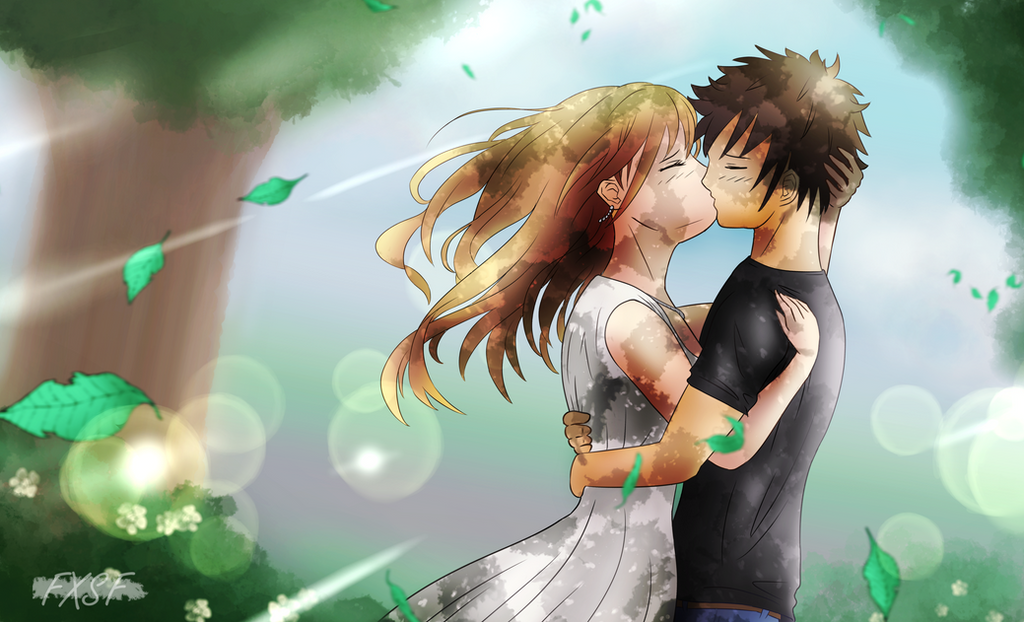
 FXSF — Alice

#alice #fightergirl #yellowhair #swordartonline #armouredgirl #alicesynthesisthirty
Published: 2020-02-07 18:45:14 +0000 UTC; Views: 1053; Favourites: 43; Downloads: 0
Redirect to original
Description
Alice Synthesis Thirty [pronounced in messy japanese way]. Definately one of my favourite strong female characters. Cool, intelligent, dependable and has authority, yet good at heart.
The piece is heavily reffed (and took forever to create), yet I'm really glad with the outcome. Metal and silky bits were really tricky. Like the contrast, though.
Unrelated: if you like my artwork (and bad puns), go check out Wave, my ambitious visual novel at fxsf.itch.io/wave (all free!)
Related content


Comments: 24

👍: 0 ⏩: 1

Thank you for the ideas! This is a fanart piece, so I went to make her look like the original to the best of my ability  (Smile)")
👍: 0 ⏩: 0

Hey FXSF, I'm a member of :IconProjectComment:, and I'm glad to meet this piece of art
First I have a word to say : Congratulations ! You really depicted Sword Art Online well, I knew at first glance it was this anime even if I dont watch the show. I have to tell you that the shading is breath taking, and the overall drawing is very likeable, bravo !
But since this is a constructive advice, I'll point you some flaws I think you could improve.
First : the hand seems a bit too small. Here is a little trick : When you got your sketch, you can resize it by cutting some parts and use the resize tool of your drawing software. That way you can resize your work before lining it and it wont lose any quality.
Second : The Shading. It is actually good, BUT I think it would be better with a "two shades" work. Put a darker layer and paint the darker zones with darker colors then smooth it to get a pseudo gradient shading. That would make it more "3D" I don't know if you get it x)
Third: Personal opinion, but I like to color the lineart in a color darker than the color next to it. It makes the drawing a bit smoother, and good looking.
Anyways, this is a great piece of work. Good job !
👍: 0 ⏩: 1
Thanks for the insight! I agree about the hand size - gotta watch them proportions! If I got this right, smoothen out the edges of the shadows? Or add in another layer of shading? About the lines, still trying to find my own liking, but I guess it tends to draw towards black
👍: 0 ⏩: 1
sorry for the delay, i didn't see your answer x) yes, smoothen the edge looks always better if you don't want your drawing looks too much like just an anime screenshot and it's better for more elaborate drawing^^ For very reflective plane (such as sword or armor), hard edges are better, but for soft plane (skin, hair, etc), you don't want the edge of the shadow to be to hard 😊
👍: 0 ⏩: 0

Hi FxSF! I'm a member from and i'm here to critique your work!
The character design is incredible! Her color scheme is very well made, and the line work looks so sharp and clean! Both the armor and the sword lood very well detailed! (Not too much and not too little amount of detail). Very well done on that! However I can see some issues in certain areas that can be fixed^^. To start off, I think her hands look a bit too small.Generally, hands are a bit tedious to work with (For me personally). If the program you are using has something called "Lasso tool" you can use that to reshape and resize your artwork! (So you can get it in the right portion if you feel lie something is off instead of erasing and redoing the entire thing). The other issue are the shoulder pads on the cape. I'm not sure with what you did was accurate, but usually the cape is above the pads. you could still show off both cape and the shoulder pads, but have the cape be more behind her (Hopefully that makes sense). This final comment is about the hair. I personally like how you did with the hair, but there is this technique I really like (You don't need to do this, it's more of a preference).
www.youtube.com/watch?v=dubyWb… To me, this makes it look more detailed! But as I said, it's really up to you whether you want to try it out or if you're happy with what you already make. Anyway, that's about it. I hope you find these tips useful! Keep doing what you do. This is overall a marvelous piece!
👍: 0 ⏩: 1
Thank you for your thoughts! Easy to have a good design with fanart  (Wink)")
")
👍: 0 ⏩: 1
You're most welcome, buddy! Of course, it's fine if you're going with an anime-ish style^^ Keep up the good work! OwO
👍: 0 ⏩: 0

👍: 0 ⏩: 0

Aah and by the way, I just want to also say this is an interesting character. I would be willing to hear more about her if you wish to tell me.
I just like knight girls in general, so... yeah.
👍: 0 ⏩: 1
The main heroine from Sword Art Online: Alicization. Definately suggesting watching it (a sequel of the original SAO)! Adding to the description of the piece, it's really interesting that they actually kept her from becoming a sort of fan service figure (which happens with the most girls in the series... and many other series, too).
👍: 0 ⏩: 0
Hey, here's from ProjectComment. I'm new to this whole concept, but this particular piece caught my eye.
First off, great details on the armor. The mix between visible cloth and the golden metal gives this a rather holy look. The colors are also a good mix, the gold and blue mix really well together.
Anatomy is good, and the proportions are just right. Background is simple, but effective, and gives a nice contrast in conjuction to the character.
Shading is also great.
Only thing I can really nitpick on is the detail of the left hand. It's not nearly as well-drawn as the rest of the piece, and that's a shame.
But overall, great job.
👍: 0 ⏩: 1
Thanks for the feed! Colors etc are easy when doin' fanart
About ProjectComment - make sure to follow the minimum word amounts (this critique will be considered too short, likely). Not sure if that tag is correct either (coul'd be a new one, though).
👍: 0 ⏩: 0


A very cool illustration, apart from fantastic !.
Very good work with the proportions, the small details and with the shadows in this illustration.
👍: 0 ⏩: 1
