HOME | DD
 Gareque — Gon's Rage

#anime #enhancer #hunterxhunter #manga #shonenjump #gonfreecss #copicmarkers
Published: 2017-02-03 22:40:50 +0000 UTC; Views: 1247; Favourites: 17; Downloads: 0
Redirect to original
Description
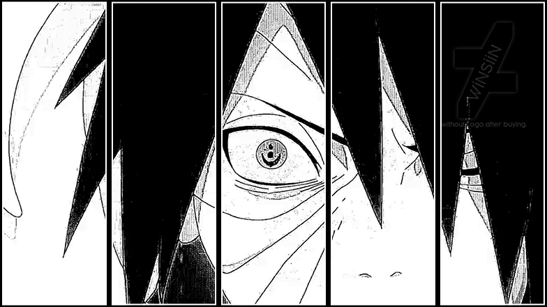
Done on Bristol Smooth, first time using the paper.Total time spent, roughly 3 hours.
Love the paper, but it feels like it saps ink from markers...
Related content


Comments: 28

Overall
Vision
Originality
Technique
Impact
Hi! This is a comment from a.deviantart.net/avatars/p/r/p… " alt=" " title="ProjectComment" />!
First of all it is well recognizable that this is a fanart from Dragonball but I am not sure which character, maybe a fan oc of yours?Anyway I like how you did the anatomy and the shading, it is very obvious where the light is coming from andthere is some bounceback light too. I think you could have added more bounce light, you did it well and added those to the right places at the character's left side but there should be more. About the background: I like the color, it is in great contrast with the character and makes the subjet pop out. However if you use such a vivid color it particularly pops out that you did not add blue reflections to the character, in order to make it part of the background. A little bit of a color with a light blue marker or a colored pencil could have been an extra! I am also not sure what are those lines at the character's clothes and back, if it's dark magic or some sort of skill, it would be nicer to blend these to the background (at least the edges). The lines on his forehead are also a bit confusing, not sure it it's hair or what. Overall I find this a decent fanart, despite of the flaws it has. Keep practicing! e.deviantart.net/emoticons/s/s… " width="15" height="15" alt="
 (Smile)")
👍: 0 ⏩: 1

Thank you for the critique
It's actually from an Anime called Hunter x Hunter, rather than Dragonball, although the style is very similar
Duly noted on the adding in colour of the background to the shading etc. I kind of decided to add in the background on the spur of the moment and didn't actually plan to do so. I was initially going to give it a box frame like most of the other pieces I've done recently. But, I will make note of that for future projects
The lines on the forhead are kind of how the show indicates another hint toward anger/rage and it's the same with the 'flame' like markings around the char.
👍: 0 ⏩: 1
Oh, sorry for the late reply, here it goes ^^ I have not seen the show though I heard of it. Anyway, a picture with background is better than one without it, so it's good you decided to add one. Box frames are cool but can be monotone if somebody always does this to their pictures instead of trying something new.
 (Wink)")
👍: 0 ⏩: 1
I'm still yet to settle on my own style, but I'll get there eventually
👍: 0 ⏩: 0

Overall
Vision
Originality
Technique

O_O Please don't kill me. Please. * ^ * I like how the dark clouds in the background look. It compliments with the negative emotion of rage. e.deviantart.net/emoticons/s/s… " width="15" height="15" alt="
Here is a list of things that you can improve on:
- The face is sort of disproportionate. First, the chin is uneven. That's a start. :/ Second, it looks too long. Maybe have it rounder and shorter.
- I think that the black eerie stuff doesn't represent rage well. It symbolizes fear and corruption. I think you should use more warm colors to symbolize anger and rage. Also, I think the expression just doesn't cut it with rage. Maybe have the pupils a little smaller will do the trick. e.deviantart.net/emoticons/s/s… " width="15" height="15" alt="
I think it's very good. I like the way the skin looks! e.deviantart.net/emoticons/s/s… " width="15" height="15" alt="
e.deviantart.net/emoticons/s/s… " width="15" height="15" alt="
👍: 0 ⏩: 1
Why would I kill you?
The face should indeed be a bit shorter, but as I'd inked it in by then, I tried to make the features larger to accomodate it. I need to be more patient in my sketch before inking it in! Just always worried that too many eraser marks will cause the markers to look awful.
Regarding the black, eerie bit, as you put it, this is the style done in the show, though granted I haven't really done it justice.
Thanks for the critique
👍: 0 ⏩: 1
Oh, I'm talking about the guy in the art piece. He looks like as if he's going to kill me. * ^ *
Anyways, you're welcome!
👍: 0 ⏩: 1


I actually really like this, There isn't really anything that I see that is wrong with it. Tue shading is very solid and well done, and the colouring in general are very good. The style is consistent and good, and I especially like the background, the blues blend nicely and the clouds are nice and not too bright, which is something that I see as a common problem when people put clouds at night. The light sourcing is also very consistent.
The only thing I would suggest to you is to work on the line work, IE the collar bones, ears, and face outline, and make them smoother and straighter.
Another thing, it's a little nit picky, but the shadow under the neck comes a little too far down on the left side.
👍: 0 ⏩: 1
Thank you very much
I am surprised you liked the background as I only added it as an after thought tbh, I wasn't planning on doing it. On checking again close to the image though, I am liking the amethyst purple added around Gon himself has added to the aura, so it worked out better than I'd expected
Line wise, I was tempted to do the forehead lines using a ruler, but didn't want to make it look too unnatural. My freehand work is getting stronger, but I've still a way to go
Agreed on the shadow. In truth, the neck is about a cm too long, but I didn't compensate the shadow to accomodate.
👍: 0 ⏩: 0

This is an anime that I've been meaning to watch. I've heard a lot of good things about it. You did a wonderful job on the coloring as well. Keep up the good work!
👍: 0 ⏩: 1
Thank you very much and thanks for the watch too
The show itself is very good, but around the mid-way part it gets very slow. The final arc takes up about 80 of the 160 or so episodes and aroud 60 of those move at a very slow pace (compared to the rest of the show anyways). It does have a very good end though and is well worth a watch!
👍: 0 ⏩: 1
Welp, looks like I have a new anime to watch
👍: 0 ⏩: 0

Hi there sent me. I love the work you have one here and you have really captured the rage that Gon expressed during the Cimeara ant arc. I assumed that us why you chose black to represent his aura instead of the Gold that was his Aura. Your use of colour and shading is on point looking like it has been perfectly blended and fitting together seamlessly my only point of criticism would be that while the majority of the scene is expressing rage and leaking menace unfortunately his mouth is more of that of disappointment or mild upset. While it still works a more dramatic expression showing the grinding of teeth or something similar may have just made the piece stand out even more so. Lastly, Congrats on getting him looking so similar to the anime, it really is beautiful.
👍: 0 ⏩: 1
Thank you for your comments
In the source and anime, his aura tends to go black rather than gold when it's pure, unadulterated rage, such as his fight with Pitou when he's left waiting.
Mouth's do indeed seem to be one of the places I need to work on a bit more
👍: 0 ⏩: 0

Hello! Nice work")
Ok so the first thing I would think about is the background color - Even if it's a night sky with stars and clouds I think you could get away with using a lighter blue, or lighter color in general...the black anger lines (not sure what they are ) are not very visible but enough so you wonder what they are - and wish that they were more visible. SO either make those a different color OR the background. The portrait is light so you could choose either.
I don't know what the thin lines in the middle of his forehead are, is that part of the anime style, I think it is? to show anger? It's interesting but there are some other ways that could be clearer if you like example 1
example 2
In these examples they chose EITHER the simple thicker line, OR the thin multiple lines alone, I think that it works better if you don't have both. But maybe I don't know this anime well enough to appreciate it
Although the colors are very dark in your reference I still stand by what i said earlier because this is just a still in a video clip whereas you are making a single image- intended to be seen on it's own- therefore it would be nice if it was a lighter color in my opinion...but of course it's all up to you!
A small thought, his face looks a little thinner in yours but again very small detail.
I hope this helped you or at least gave you some ideas
👍: 0 ⏩: 1
Hi and thanks for the in-depth comment
Regarding the forehead lines, I messed them up tbh as I wanted to try and do them free hand. What I should have done is used a .05 liner pen and done them using a ruler. But, you live and learn
Also, it's the small things that make up the actual feel of the image, so nitpick away
The face in the source should indeed be squatter, meaning mine looks thinner, but I only clicked this after inking it in lol.
👍: 0 ⏩: 1
Happy it helped out a little
I know this is traditional so you can't really edit it, BUT if you are brave you can cut out the portrait and try different backgrounds like with collage
Also if you have a scanner you can turn it into a mixed media piece and add digital work on top of it
👍: 0 ⏩: 1
I certainly might give a digital edit a try
👍: 0 ⏩: 1

(On behalf of )
Oh, boy...there's a lot of stuff to talk about, so let's get to it. (I don't watch a lot of Hunter x Hunter, so my critique on this is based solely on the artwork itself and not what the artwork is supposed to represent.)
Let's start off with the art style. After doing a bit of research, I could say that your way of drawing Gon is unbelievable, to the point where it looks like you just got a screenshot of the anime. The lineart, though it gets a bit jittery at times, looks really clean. The colors are another story, though. While you filled in the colors really, really well...it appears to be a bit inconsistent. Some shaded parts of the skin coloring seem to be mixing in with each other strangely, and makes the marker coloring a bit more obvious.
The shading as well seems to be a bit inconsistent, and not only that, it looks kind of unfinished. For example, the picture is telling me that the light is coming from his right side. But the left arm doesn't seem to follow that, because there's a bit of some light around his arm, as if there's another smaller light just glowing there. The same thing goes to the left ear as well. While I can see that the inside of his ear is shaded, shouldn't the left ear be fully shaded? The top part of the ear seems as if ANOTHER smaller light is glowing to it.
Lastly, I would want to talk about the background...it's kinda smudged. The stars are really nice, but the sky seems too obviously colored in markers. Like the skin color, the different shades of color in the sky seem to blend in with each other awkwardly, making this a really strange-looking night sky. That doesn't make the background bad, but I think a little more polish could've been made.
With that said, this was a really well done piece of art, and I hope to see more in the future. Keep up the good work.
👍: 0 ⏩: 2
Also, thanks for the 
👍: 0 ⏩: 0
Hey and thanks for the comments
Line art is something I am working on, getting long sections straight with no jittering is damned tough!
Regarding the shading, if you mean the blotchiness, I've no idea what happened. The paper is supposed to be great for markers (Bristol Smooth, 250mgs), but adding the second part, areas just went patchy despite the first layer being smooth as hell ")
On the background, if you mean the patchy, dark bit around him, that was done using purples on purpose to reflect the residual aura that they give off. I actually thought the stars were the worst bit lol.
I'm currently working on a piece for Touka from Tokyo Ghoul though, so hoping to finish that this week.
👍: 0 ⏩: 0

👍: 0 ⏩: 1