HOME | DD
 GAVade — Gav's Web Sample
Published: 2009-12-07 18:32:21 +0000 UTC; Views: 3313; Favourites: 24; Downloads: 108
Redirect to original
Description
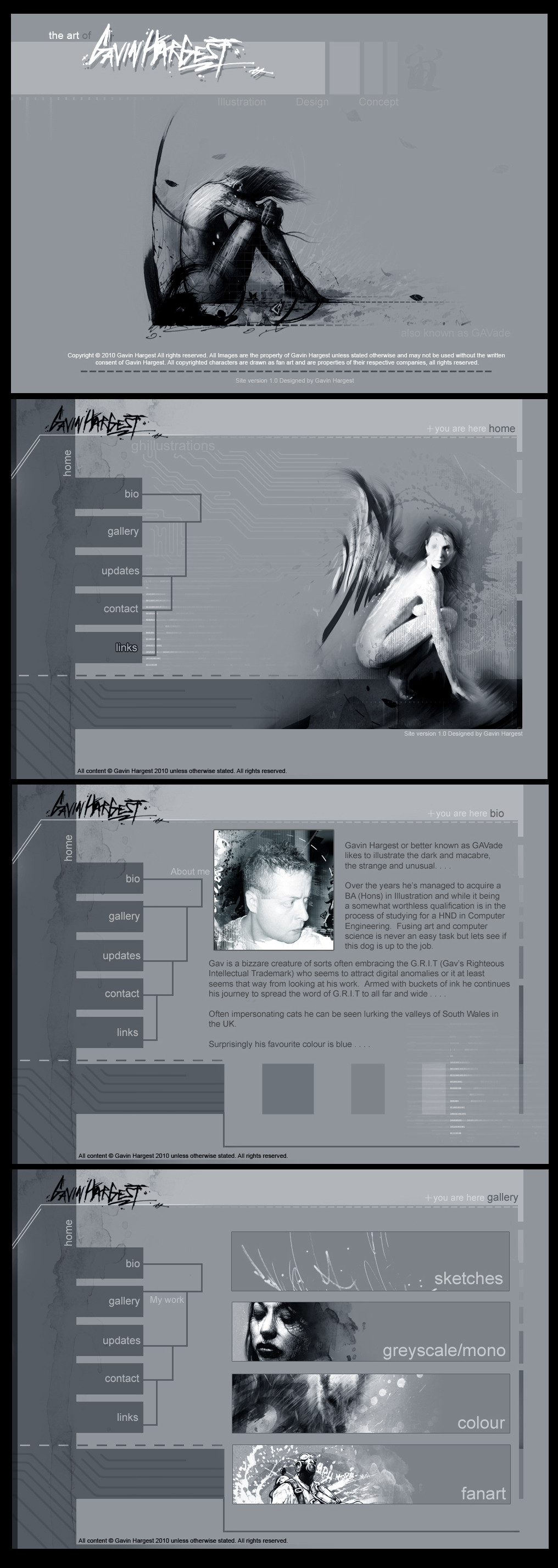
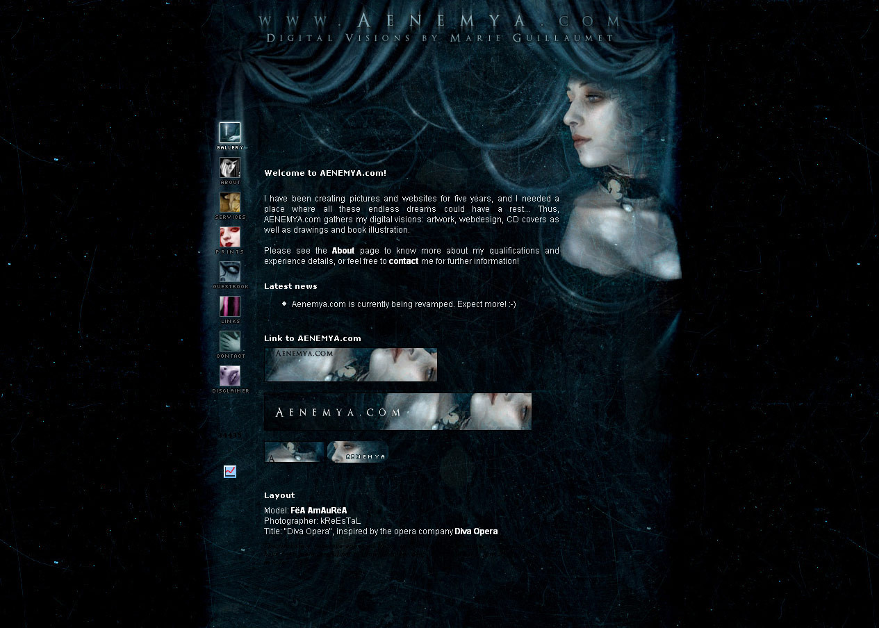
Sample of my current web design overhaul I'm doing as part of my University course . . . .I've opted for a more elegant feel, less gritty with less obtrusive text as this site is being marked with basic web standards in mind....
Welcome, homepage, bio, gallery shown . . . .
Any crits and ideas are most welcome . . . .
Photoshop CS3/7 . . . .
Related content


Comments: 59


Love the design: Simple, clean, elegant, yet dirty on the sides. Very representative of your work.
👍: 0 ⏩: 1

looking good. not to sure how it will look when coded. have you got a version up on the internet yet?
👍: 0 ⏩: 1

Thanks.....
Should look 99% the same when implemented, not coded yet that's will be part of the next assignment.
👍: 0 ⏩: 0


I thought of that but that would radically go against the visual aesthetics of the site. Colour thumbnails in the colour page will be coloured however....
👍: 0 ⏩: 1

nice brow...
is it going to be your site for real? (I mean, will you buy a domain?)
")
👍: 0 ⏩: 1
")
Yeah I'll replace this design once built over my existing one, already have a domain here it is:
[link]
👍: 0 ⏩: 1
cool websita, but man... this is really small and its on the left side...
👍: 0 ⏩: 1
Yeah I know its crap that's why I'm about to change it
 (Wink)")
👍: 0 ⏩: 0

Simplistic. It's easy to read, Not blinding, And very creative. Good job.
👍: 0 ⏩: 1

Can i say this is nicer than your current?
yeah, like everybody said, its good to see pages like that, with everything's clear to see
btw, what's the font? Arial? or Helvetica?
one bad thing(maybe) that i can tell is, the BG, its nice, yeah, but seems to eat up a lot bandwidth(causing slower page loading). Probably you could consider a bit plainer BG(since that watercolor splat texture could use bit more bandwidth i think)
even after a decade, dA still only have circle, square, and simple shaped buttons. with all squarish text field too 
")
👍: 0 ⏩: 1
Yeah you can say that friend cos I also think the same
Font is indeed Arial, nice and simple.....
With the navigation being the same on each page the rest of the image only weighs in very little KB, most of the site is made up of solid colour so little memory will be taken up, this will load a lot faster than my current crap site....
The backdrop on the browser will match up with the HEX colour code so I can still trim down the backdrop size even more....
Thanks for your input dude
👍: 0 ⏩: 1
hahah, that ain't crap xD
thought the splat texture you used everytime had a big size...
yeah, more solids, less memory, and viewers might happy to come back because they can load the page quickly
👍: 0 ⏩: 0


I like it! I did BA in Animation with one of the modules being illustration but I quit a year and a half into it. How are you getting on with the computer engineering? I am SOOOO useless when it comes to tech stuff.
👍: 0 ⏩: 1
Ah cheers mate
The course if good, can be a little hard with weekly maths tests, programming in Java but I love the HTML side to it, hard but rewarding and hopefully when I complete it I can actually get a descent job!
How did u find the Animation?
👍: 0 ⏩: 1
I am dislexic when it comes to maths, I don't envy you.
As for the animation I did it exactly 10 years ago now and it was still very much on the traditional side. Computers were used to capture etc but we didn't really do any computer generated stuff...I may have gone on to do that in the final year, I will never know. Overall I didn't get what I wanted out of it. I should have stuck to just illustration I reckon.
👍: 0 ⏩: 1
I suck at maths, I find it boring and most of the calculations we do is not practical, just mindless problem solving you will never do in the real world
You would have nailed the illustration course!
")
👍: 0 ⏩: 0

I love your art so much man.
You're such an unappreciated artist.
👍: 0 ⏩: 1


for me it's really great.  (Smile)")

👍: 0 ⏩: 1

I'm not sure about the font. It seems a little too plain to be on your site, ya know? Other than that it looks good.
👍: 0 ⏩: 1
Font is Arial and I've had to design the site with basic web standards in mind, ease of use and disability and all that....
While its not as rough and gritty as my previous fonts its a lot more clean and readable...
👍: 0 ⏩: 1
Understandable, just doesn't suit you is all.
👍: 0 ⏩: 1
Yeah I know what u mean, its a little clean for my taste. Does this mean I have to work in less gritty fashion from now on!
👍: 0 ⏩: 1
Don't even joke, that's a scary thought.

👍: 0 ⏩: 1
| Next =>