HOME | DD
 gavi-gavi — Lack, Rum and Captain

Published: 2013-08-01 01:10:23 +0000 UTC; Views: 1604; Favourites: 57; Downloads: 0
Redirect to original
Description
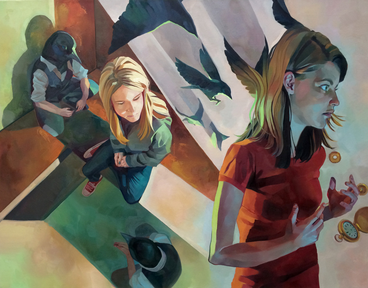
Here's 's character commission of her three character (in order of the title).I really like the clothing designs. That transparent shirt/dress combo is something special I wish I had style ;^;
This is actually kind of psychedelic because I have a character name Captain too. Well that's his nickname, but for the life of me I can't recall his real name and that's bad seeing how he's a prominent character in my webcomic
Comments/critiques are welcome as always~
---
Photoshop
I do these commission things .
Related content


Comments: 6


Nice color scheme! The girl on the front left looks really natural and awesome (I like the boots!) 
👍: 0 ⏩: 1

Thank you!
And I'd have to agree with you one both accounts...
The guy's face was a bit of a challenge in and of itself to get the right stand-offish look while trying to give him a definite ethnicity. Do you think it's the nose or the eyes maybe?
The hand I had originally had more covered up so the minimalist look worked more, but with it more exposed it does look rather unfinished, huh?
Thanks for the critique, it's hard to see a bunch of stuff when you've been working at the same thing for a while! ^^
👍: 0 ⏩: 1
I'm guessing you were trying to make him look Asian? In that case, I think the problem is the nose. It's not necessarily "bad" on its own, but it looks strange next to the girls' noses, which are more stylized/simple/anime-fied. I think the bridge of his nose is too defined and the nostril area too large...it makes the nose the focus of his face (which can make a drawing look odd, because when we look at faces in real life, we tend to focus on eyes).
I think you could fix it pretty easily if you just trimmed the bridge of the nose and made it not "cover up" the far eye so much. I know that IRL a nose at that angle would obscure the far side of the face a bit, but it clashes with the more cartoony style you used for the other characters.
Sorry if I wasn't specific enough in what I meant

👍: 0 ⏩: 1
I can see what you're saying, although I think going along and pulling emphasis off of the bridge might help with most of it without messing with the other side of the face... I suppose I'll just have to find out. xD
Thanks again, by the way! ^^
👍: 0 ⏩: 0