HOME | DD
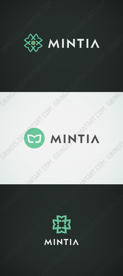
 gbindis — Mintia logotype
Published: 2012-06-21 14:07:20 +0000 UTC; Views: 1576; Favourites: 19; Downloads: 15
Redirect to original
Description
My attempt(s) to create a logo for recently opened Mintia.com - platform for collective designing. I didn't win, but I'm quite satisfied with th eresults, so I'm sharing.Done in Inkscape.
Related content


Comments: 19

I have worked in Inkscape too (all my vectors) but always had a feeling that the edges look too sharp and maybe Illustrator doesn't have that problem. But your work here looks so smooth.
 (Smile)")
👍: 0 ⏩: 1

They were merged and scaled, that's probably the reason. But yes, in a full view they are a bit too sharp.
👍: 0 ⏩: 1

")

I'm not sure which symbol I like most but they're all pretty sweet. What I find particularly striking though is the typeface; it looks so nice and sharp. With the softer color tone it gives the logo a fresh and modern look.
Is this the website of the agency you did this logo for? If so they made a terrible choice. If not, I'm very curious what the winning design was because your work is striking.
👍: 0 ⏩: 1
Thanks for the great comment! Good you like the typo, I saw on your profile that you're particularly experienced when it comes to fonts(and you're doing a great job!)
And yes, that's the website. The winning work was a surprise for many people
👍: 0 ⏩: 1
It's quite ironic to me how a website for crowd sourcing logos and such doesn't know what's good for their own brand. This Mintia branding [the one they chose] is almost as neutral as possible, which is no good for a brand.
👍: 0 ⏩: 1
I thought the same thing after I saw the results. There were a few better projects, but you know - it's still their choice.
👍: 0 ⏩: 0


W 1 nie podoba mi się to kółko w środku, zamieniłbym to na coś innego, a jak koniecznie kółko to z obrysem a nie wypełnieniem. Jakby nie to, to wybrałbym 1 propozycje.
Bardzo fajnie  (Wink)")
👍: 0 ⏩: 1

")
To 'M' stylizowane na dwa listki (mięty). W kilku wariacjach.
👍: 0 ⏩: 0
