HOME | DD
 GBWhisper — Creating EVA fan art tutorial
Published: 2010-02-10 23:39:39 +0000 UTC; Views: 2554; Favourites: 29; Downloads: 72
Redirect to original
Description
Please click the link below to see the final version ==>[link]
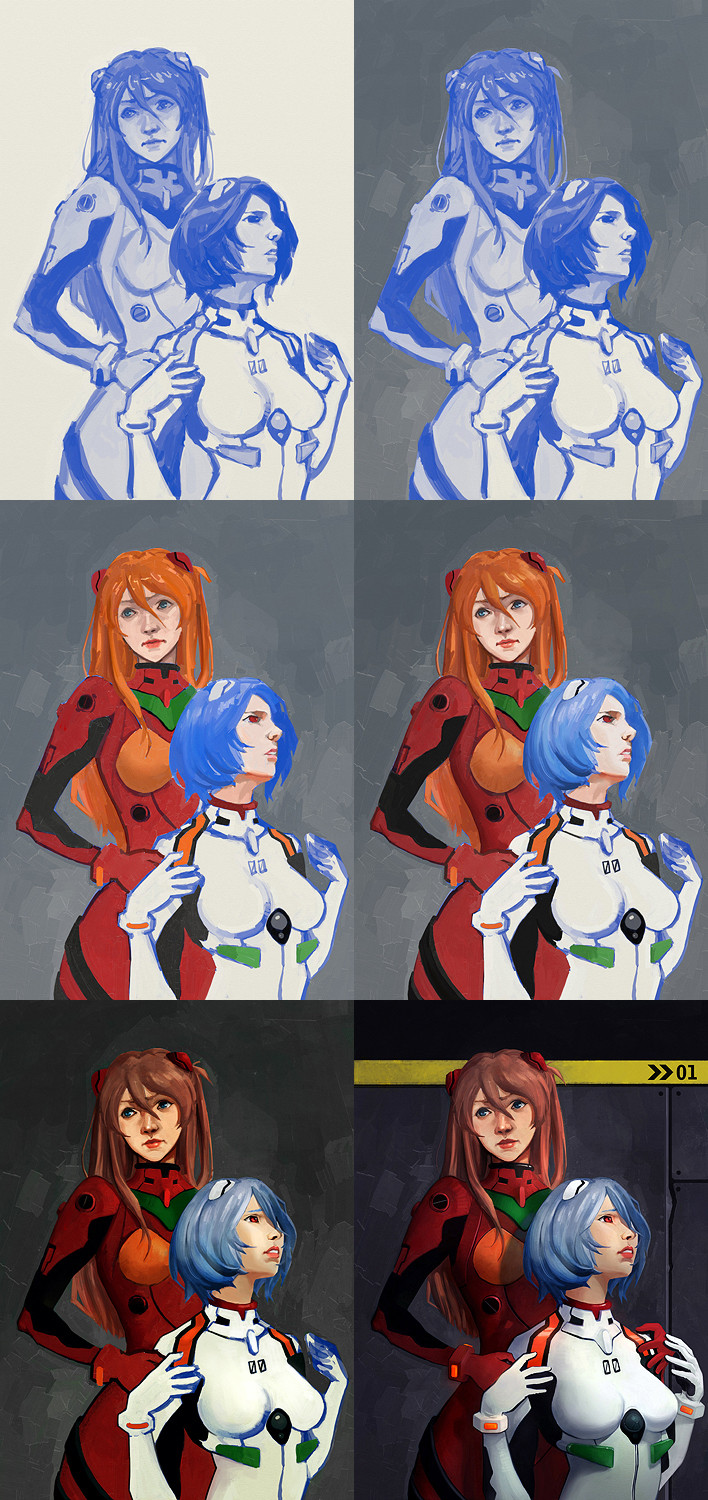
I used ArtRage 3 for this work.
1. Using inking pen tool (70% opacity, simple round, no smoothing) to draw the basic shape of the characters. Once it's done, never change the composition again.
2. Painting background with roller tool to 'kill white'. Make sure there's no blank canvas left. The contrast between foreground and BG will almost stay the same until the end (unless you paint it again).
3. Adding colours in a new layer. Here I used layer blending mode 'colour' (it changes blue into other colours with the same value), but you can use any modes you feel fit.
4. Starting to introduce form, light & shadow. This step can go really wrong without notice- so please keep the picture simple and not going too much into detail until you are 100% sure. Here I found something wrong on Rei's face (actually quite obvious when I say it now).
5. Adding conrast and fixing more forms. You should change the colour of the characters to fit the environment- never change the environmental colour to fit the character! Also decide how to finish this picture: more contrast? more tint? high light? more BG work?
6. Finish the parts you have not done (I always left their hands in the end). You might need to spend 80% of your time on this stage since there are so many details to do. Background is important as well, even a simple one will suggest the world view.
Related content


Comments: 5

Paintings on ArtRage usually look more "unpolished", so how did you manage to get a finished piece that's so clean and blended, more like in Photoshop? Lovely finished piece, too.
👍: 0 ⏩: 1

I would suggest 'never use the blender' and 'never paint with airbrush'! Most digital artworks look dirty and unpolished because of these two.
Also the original size of it is A3 300dpi. So if you look really close up there might still be...
👍: 0 ⏩: 1

I disagree, it depends how to use it. but , yes, too much smudge makes colors lifeless and flat. only be careful.
👍: 0 ⏩: 0

I can't believe you have no comments on this, lol! well allow me!
It's awesome!
👍: 0 ⏩: 1
haha thank you
I guess people are more use to Evangelion in 2D. 3D ones are weird I know.
 (Smile)")
👍: 0 ⏩: 0