HOME | DD
 geek96boolean10 — RWBY Tanabata

#blake #festival #fireworks #japan #japanese #lanterns #night #ruby #stalls #tanabata #weiss #yang #yukata #rubyrose #blakebelladonna #rwby #weissschnee #yangxiaolong
Published: 2015-06-26 14:21:23 +0000 UTC; Views: 3460; Favourites: 117; Downloads: 16
Redirect to original
Description
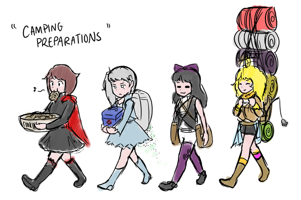
For the RWBY Summer 2015 project, hosted by RWBY .Tanabata is a Japanese festival hosted late summer, and since most people decided to go for a beach theme I wanted to make something more cultural - especially since RWBY is technically an anime.
I received a lot of advice from TwinOfTwins , EnemyField , lu40953 , and Sniper221 . Thank you for your comments and critiques!
Alt ver. fav.me/d8ytl6u
Related content


Comments: 8


This is so good! It turned out really nice too. I'm really liking that shadowy pattern on their kimonos on the bottom. :3 really awesome!
👍: 0 ⏩: 0

This drawing has definitely come a looooong way! When it was just a sketch, I didn't really know what to expect, but the complete version looks great! ")
Sorry, but now it's time for a culture lesson!! Be careful as there are many different festivals with different traditions in Japan! The Tanabata festival involves not only games and food stalls (like in your drawing above), but also writing wishes and hanging them on bamboo. As a result, during a Tanabata festival, the streets and basically the entire venue of the festival are decorated with large, colourful, streamers that resemble papers hanging from the bamboo. So, in the future, be careful about what you call your scenes.
Other than that small mistake (it's okay, everyone makes mistakes, including me 99.999999% of the time), I really think that this is one of your finest works and I look forward to seeing more!  (Smile)")
👍: 0 ⏩: 0

Sorry if this ends up looking like a dissertation, but here are a few thoughts I had on this piece.
First of all, I think it's great that you're experimenting with perspective. This perspective in particular is rather unique; it seems like someone is looking at the girls from a slightly lower level, perhaps a child at the festival.. It is not an easy perspective to pull off, but you seem to have done it with ease!
I also really like the thought you put into the lighting of this piece. The way the lights diffuse out gives a very warm and friendly matsuri-like atmosphere to the whole piece, which is what makes the piece look all the more alive. The glare adds to this effect beautifully.
The detail you put into the scene is also a rather nice touch because there's just so much to look at and discover. Each time I look at the piece, I see notice something different, which makes the scene all the more endearing! However, I find it odd that the shrine and torii at the back have so much color and detail when all the stalls--which are closer to the viewer--are void of this detail. Perhaps if you took a bit more time to make each stall more individualised and unique, your piece would pop with the vibrancy and energy a natsu matsuri has. Your piece is definitely alive, but adding that extra detail would give it that kick that draws in all the more viewers.
Also, if you had more time, I would suggest going back to the lanterns and redrawing those lines on the lanterns to make the lanterns look a little more neat. I realise that the main focus of this piece is definitely not the lanterns, but one can never be too tidy! It's also nicer to look at.
Now I would like to present you with a challenge: I've noticed that you tend to put a lot of thought into where the colors should go and which parts should be darker than others, but try letting go of that and just putting whatever colors you want wherever you want. Instead of making something red, make it red, orange, and I don't know.. purple! Go crazy! Just throw color on the page and forget all about making the piece look realistic. You might be able to pick up a skill that you'll keep.
I'm sorry if I sounded unfriendly, but remember that these are just my opinions. You're the artist, so you know what's ultimately the best for your piece.
You did a great job with this piece. You should be proud of this.
Okay, I'm done now. Sorry it's so long.
👍: 0 ⏩: 0

Perspectives look pretty good, but body proportions need work.
Meanwhile Blake and Yang look like giants in this picture, if only because of perspectives.
👍: 0 ⏩: 1

yeah, realized that about half-way through. definitely using this as a learning experience.
👍: 0 ⏩: 1
It's good you're learning.
👍: 0 ⏩: 0
