HOME | DD
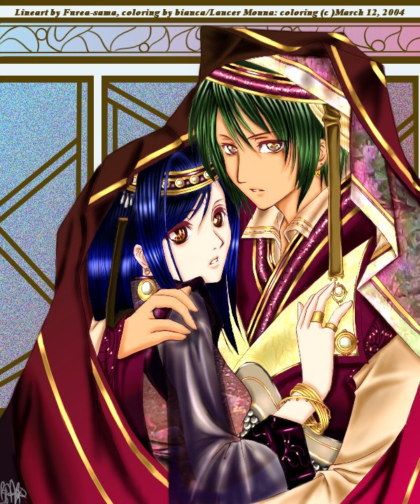
 gem2niki — Behind the Gate

Published: 2005-09-18 20:02:46 +0000 UTC; Views: 17312; Favourites: 815; Downloads: 3352
Redirect to original
Description
Was for Naimoka.com contest. But yeah, like the usual, I didn't win. I really suck at contest >_< I should probably stop entering in any drawing contests, cuz I am never able to win. >3< Must be something wrong with my concept and crap.Anyways, original characters. The theme was "in the name of love" but in my mind, I have this vision of some foggy room and two charas getting into a train or some gate. So yea, that was my idea lol. But I didn't really cg it that way.
I just realize my monitor is really different from the monitor I used to cg this, so it looks darker on my screen but lighter on some others. So now, I don't know what the contrast/brightness actually looks like XD;; (I need a new monitor...dumb bulky 15" XD!!)
*adds this to my print shop X3*
lineart/ mechanical 0.5 | cg/ painter 8.0
Related content


Comments: 150

I love the sense of movement here, and the colors, and the character design, and goodness, it's just a fine piece. great job.
👍: 0 ⏩: 0
I love the sense of movement here, and the colors, and the character design, and goodness, it's just a fine piece. great job.
👍: 0 ⏩: 0

Oooh you chainged your style oo
It looks nice : D!
I luff the smoothness of the compesition oo!
👍: 0 ⏩: 0

Omigosh gorgeous hands! On both the boi and gurl ! X3 I love it!
👍: 0 ⏩: 0

I really like this. The lighting and motion is good and it is well drawn. That said- and noting the "critique discouraged"- I want to make one teensy weensy suggestion. Don't hate me. 
Don't hate me, pleeese. I think it's really good other than that. But all arists need a little critique now and then. I accept as much as I give, I'm no hypocrite. I just believe there is no limit to how much an artist can improve. ^^
👍: 0 ⏩: 1

Lol. Well, its definitely not something I should be offended at all. But I already discussed this with my friend (who like to draw more thicker characters), and well, my style really are very thin elongated body (after being influenced by certain artists who does some lovely elongated body and encouraged by one of my art teacher). So I can't help it, because I've become really accustomed to and will evolve around. But thanks anyways XD
👍: 0 ⏩: 1


wow......you should really keep up your drawing.....expectally entering the drawing conestes.....I really love their hair.....so life-like
👍: 0 ⏩: 0

sugoi!!!!!!!!!!!!!!!!!!!!!!!!!!!!!!! *_*!!!!!!! nice!!!
👍: 0 ⏩: 0

Oh mi gosh did you change your drawing and CG-ing style?
They look so thin as compare to those you've drawn last time!

👍: 0 ⏩: 1
LOL. How many people are going to say my characters look thin XD;;; (hyung-tae influence okay XD) Also it could be the illusion that he is thinner from his clothing ")
And I don't think my cg and drawing changed XD;;; or did it ")
👍: 0 ⏩: 1
Lol whoops sowwy!
Hehe yeah you haven't been posting much... school loads?
But anyway... I was just thinking it has changed because I was comparing that with your previous works... probably my mistake though, but it's just what i see!

👍: 0 ⏩: 0

awesome pic love the design in the background +fav
👍: 0 ⏩: 0


Don't say that u should stop entering Art contests ... u are inspiring a lot of people .. so u are not allowed to Give Up like that (  (Smile)")
It is a very nice job indeed .. i love u character designs and coloring .. the facial expressions and acc. are nice too ( + fav )
U might need to work on concepts and so .. but that's the problem of most artists amateur and professional alike
so cheer up and Best of Luck
👍: 0 ⏩: 1
so u are not allowed to Give Up like that
D: no fair >_< ahah, i hope to get better over time >w< so thanks.
👍: 0 ⏩: 0


ei... such lovely work... ^_______^
if it's not much, i'd like to add it to my favorites...
oh, by the way, don't worry about losing, just keep in mind that you liked what you do and you rock!

👍: 0 ⏩: 0


Dont put yourself down so much, Your art is so freakin awesome. It seems as though some of the most undeserving peices always win in contests... dunno why thou...
👍: 0 ⏩: 0

The guy is really skinny O.o Your a damn good artist! I'm putting this in my favs.
👍: 0 ⏩: 1
lol *counts how many time she hears the word "skinny" and "thin" *
thanks :3
👍: 0 ⏩: 0

wow it's so awesome nancy...*_* shouldve win manz!!! gahhh!!!!! anyway lovely...and it just looks great. >_< vvv
👍: 0 ⏩: 0


really kool and nicely done  (Wink)")
👍: 0 ⏩: 0

Beautiful. I wish I could draw like that O.O
👍: 0 ⏩: 0

I really love their hair... both of them! ^^ I also like how you draw chins... mine are always super round. Hehehe. Love the poses too! ^^
👍: 0 ⏩: 0

i like this alot you are such a talented artist
👍: 0 ⏩: 0

the outfits are serioously realy interesting though
👍: 0 ⏩: 0


the guy is so smexy *___*
and i like the colors~
is naimoka that french site? awww the winners aren't so good <__<;;
👍: 0 ⏩: 0

cool!
👍: 0 ⏩: 0

i like the clothes, theyre fantastic 
👍: 0 ⏩: 0


Oooh wow...this is awesome...you should have won...you can color better then me....boo people for not leting you win...XD
This pic rocks!!! So i'm gonna 
👍: 0 ⏩: 0

very nice, I like the layout and the colouring especially ^_^
👍: 0 ⏩: 0

Wow I didn't know guys could go that thin! But I really love the design in the back... though I must agree for the colors it looks slightly off or like the colors don't match up the mood of the picture.
👍: 0 ⏩: 0

Wow, everything about this piece is just excellent. It's so...pretty....*pets the prettyness* XP Keep up the fantastic work. *thumbs up*

👍: 0 ⏩: 0

very awsome work, i love the poses and the design!!

👍: 0 ⏩: 0

wow! nicely done on the colours. Perfect.
👍: 0 ⏩: 0

>feeds man< He looks a little bit skinny, but I guess that's intentional. Very pretty!
👍: 0 ⏩: 0


Awesome pic! Can't believe ya didn't win with this!
👍: 0 ⏩: 0

I lovre this drawing!!! its so cool , the colors,skins.........
👍: 0 ⏩: 0

very pretty. My friend entered that contest too. It's very well done. I like the dynamics of both their bodies. ;3
👍: 0 ⏩: 0
| Next =>