HOME | DD
 General-EbonRose — Sovri Form Referance
Published: 2012-06-22 10:08:40 +0000 UTC; Views: 2348; Favourites: 84; Downloads: 13
Redirect to original
Description
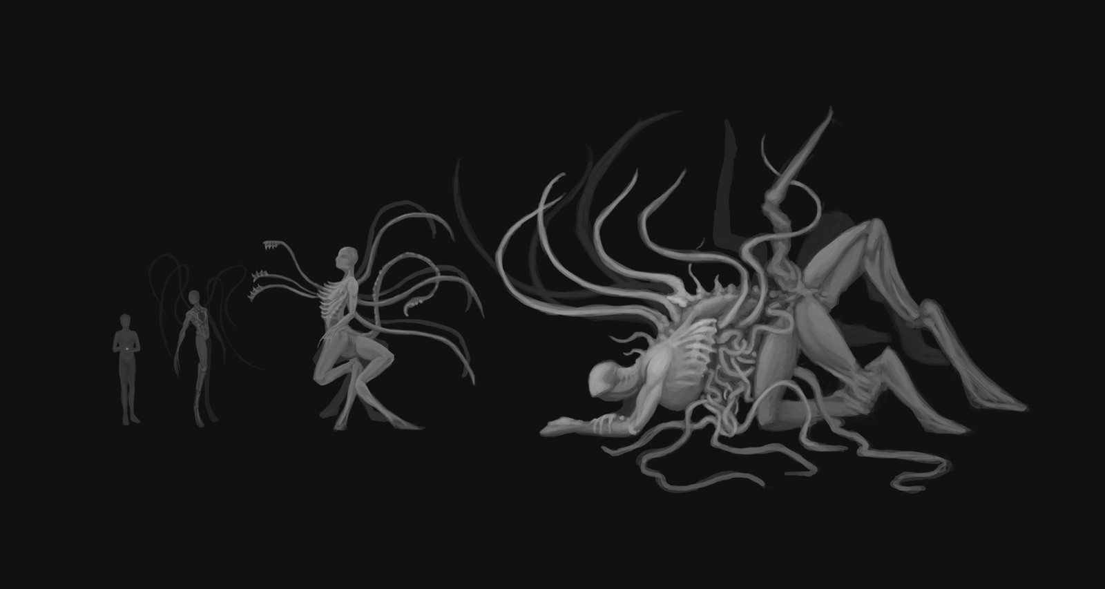
Wanted to do some design work. Although Sovri is an NPC in my campaign, this was mainly for my personal benefit, since none of this is likely to come into play (as much as I love the horrible bastard, there are other things that must be done).So here's Sovri. Still not a proper portrait of him. A reference of different stages of shape-shifting-ness. Sovri is incredibly selfish, and really quite vain. If he had any concept of honor, looking human would be a major point of honor for him, so he's the only one of the seven demons who retains his human face and a roughly humanoid shape no matter how degraded his form gets.
On the left is him at human size; none of the images have any real detail since I just wanted to get the basic shape down. He has a long scar running down his sternum even in human form. It's his mouth.
The next one is a shape he considers acceptable for most company, and what he looks like when he's fighting (or running away, rather, because he's a dirty coward) - fast and agile. The gaping hole in his chest is the aforementioned mouth. Not illustrated are the three tongues.
Next is if things are getting really hairy. His chest is split wider (I did draw in the tongues here, they have teeth on them
 ) He doesn't like fighting, so most of his energy is going to be put into running away and avoiding things, but lots of limbs and multi attack can make short work of most enemies.
The last one isn't likely to happen, since it's big and hideously disgusting and ugly and nearly immobile. See, he's just as deadly as that tiny little human, but staying in that form under pressure is hard. The last form would be the result of some kind of injury. That's as large as he'd ever willingly let himself get, though he's theoretically larger (not even he knows how much as he stays human and not much else all the time). Anything past that is likely to just being a horrible unrecognizable mess.
I gotta admit. I love working in grayscale. I also dig the light painting on the dark background. It's kinda backwards, but I loves it.
EDIT Looking back on it, I'm not a big fan of this one. The first three are what I want, but the last one is a little silly, I think. I'll definitely have to work on it more.
Related content


Comments: 13

Certainly very interesting designs! He feels like he could fit right into a Silent Hill game.
In my opinion the last design isn't silly, it just feels like he's either missing something or something needs to be subtracted.
")
👍: 0 ⏩: 1

Wow, effective and great design work. I definitely wouldn't want to meet this guy on a dark, stormy night! (... Nor probably any other...)
👍: 0 ⏩: 1

Thank you! Haha. No, I don't think I'd ever want to encounter Sovri, no matter the time nor weather.
👍: 0 ⏩: 0

Your greyscale is cool, but the first two forms are a little hard to see because they're so dark. The last two are cool, though (also horrifying XD).
👍: 0 ⏩: 1
Yeah. They are pretty dark. I did the 3rd one first, actually, and when I did the 2nd one it ended up a bit darker, so I thought I might make it a trend - but the 2nd one is a little too dark. I think the first one is OK maybe? Because there's not really anything to see about it.
Thank you. Horrifying is good
👍: 0 ⏩: 1
Yeah, I think you're right, the first one is okay being a little dark. Might be cooler that way, actually.  (Smile)")
👍: 0 ⏩: 1
Aye, so I can just brighten that one figure up easy.
👍: 0 ⏩: 1
That's good.
👍: 0 ⏩: 1
It is a bit, though I've never really done any highlights on black like this with real media. The thing I've done that most reminds me of working with a real pencil or brush is: [link] The brush set is the in comments, and I absolutely love it.
The drawings take a bit longer to do, but for some reason it's loads and loads of fun. The b/w works like this are fast and easy. Good for getting ideas down.
👍: 0 ⏩: 1
I'm favoring black and white lately, too (though it doesn't look like it, I add color later). It is very fast and easy, I agree.
👍: 0 ⏩: 1
I always tell myself I'll color them after... haha
👍: 0 ⏩: 0