HOME | DD
 GingerOpal — Un Flambeau, Jeanette Isabelle
Published: 2007-12-12 06:39:14 +0000 UTC; Views: 4614; Favourites: 83; Downloads: 0
Redirect to original
Description
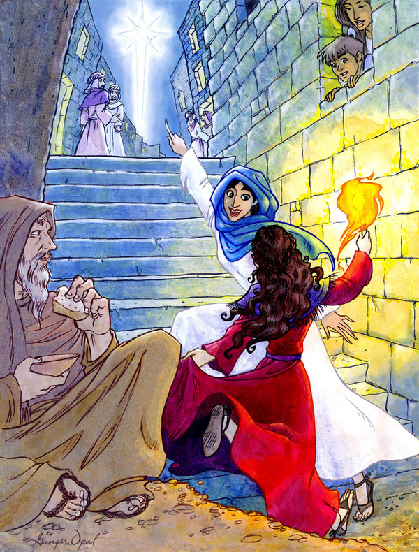
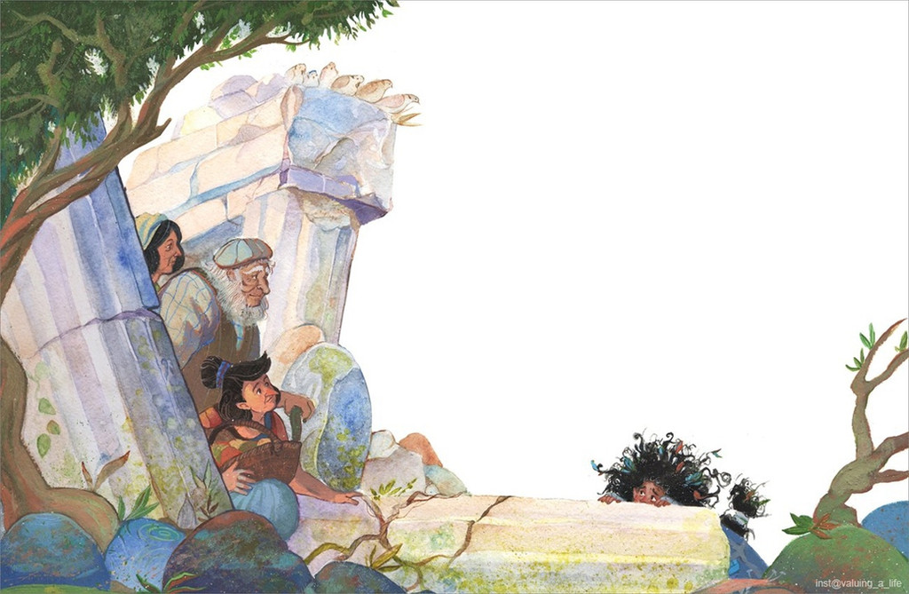
I colored it! Please forgive me, but i am not kidding when i say i haven't watercolored in YEARS! I figured if i put my mediocre watercolor skills and my mediocre digital skills together, that i might come up with something sort of good. Like...mediocrity times 2! Wait...maybe i DON'T want that. Painting is not my forte.This is from a French Christmas carol, Bring a Torch, Jeanette, Isabella. Here are the lyrics. [link]
")
Line drawing here, [link] in case the lousy paint-job is hurting your eyes.
 (Wink)")
Related content


Comments: 49

It never fails, every Christmas season when I hear this song, I think of this illustration.
👍: 0 ⏩: 1


This is a great rendition of a scene from the French legend and song I was named after.
👍: 0 ⏩: 1

Thank you very much!

👍: 0 ⏩: 0

I was listening to the MOTAB version of this just now!
👍: 0 ⏩: 0

Omigod! I love this! and I love the song too! It's my favorite foreign christmas carol!
👍: 0 ⏩: 1
Thank you so much! And you have great taste in Christmas carols!
👍: 0 ⏩: 1
Your welcome! and thank you!
👍: 0 ⏩: 0

AHH THE COINCIDENCE OF LIFE!
Just yesterday I had a choir winter/christmas concert and we sang this song! And I love singing this song especially since I learned 2 years of french so I can sing it pretty easily. But omg this made me soo happy! haha if I find a recording of it, I will def show it to you x3
Plus this painting/drawing is beautiful and so full of life! You captured the scene and era/period perfectly and i love how your colors focused on the girls and the star. Phenominal, I have this print this and show my choir teacher haha
👍: 0 ⏩: 0

Wow, I love the movement and coloring here... it looks great.
👍: 0 ⏩: 0

Absolutely beautiful! The coloring job is great!
👍: 0 ⏩: 0

I actually really like the colouring here
👍: 0 ⏩: 0

This is one of my favorite songs!! It's so truly beautiful. This is one of your strongest pieces, because of the color theory at work and definitely the intense angle!!
👍: 0 ⏩: 1
Thank you so much! I've always thought it was one of my better pieces as well, for all the reasons you listed. And it's one of my favorite carols too, and it should be sung way more often than it is.
👍: 0 ⏩: 1
I absolutely agree! It has such a gorgeous melancholy tone, you know?
👍: 0 ⏩: 0
I've always liked this carol, so it's cool to see an visual interpretation of it!
I couldn't paint to save my life, but for my two cents I think you did quite well with the painting.
👍: 0 ⏩: 1
Oh thank you so much! I'll make sure to invest your two cents.
👍: 0 ⏩: 0

Hey, that would make a fine card - is that what you are doing with it? I like your ambient colors (blue on the red dress, etc). Good one!
👍: 0 ⏩: 1
Um...no. I just felt like painting something i drew...for once.
Thank you muchies!
👍: 0 ⏩: 0

Beautiful use of watercolor. You did a wonderful job with the light and the way it hits the stone - some really beautiful and subtle textures there.
👍: 0 ⏩: 1
Thank you so much! I really had to tax my mind on how to get the texture right with watercolor. I'm so glad it worked out.

👍: 0 ⏩: 0


Wow! ")
👍: 0 ⏩: 1

WOW I had no idea you could do watercolor like this! It reminds me exactly of professional work in children's books. And I just adore the state of excitement everyone is in. Most people depict the people on that day as just being solemn and reverent, but Christmas gets me SO excited!
👍: 0 ⏩: 1
Christmas reverence is fine with me, but Christmas day also was--and IS--a HAPPY day!!!!!!! *bounces off walls with excitement*


Thank you so much!
👍: 0 ⏩: 1
You ARE? EXCITEMENT! Oh my gosh how COOL.
👍: 0 ⏩: 1
Yeah, but i won't recieve the manuscript for a few more months. But things will defenitly be looking up.
I need to learn how to spell defenitly right, since i seem to use that word a lot.
👍: 0 ⏩: 1
I could never spell that word either! And "because". I have trouble with that one too.
👍: 0 ⏩: 0

Wow Ginger this is very nice! The two girls are the only ones with bright colors but you used the girl's body movement to draw the eye away from them to the star. Nice!

👍: 0 ⏩: 1
Yeah, once in a while i actually think things through. Now if only i could start doing that with my real life!
Thank you so much! You're freakin awesome too!

👍: 0 ⏩: 0

I thought you did a great job, especially the fire light.
👍: 0 ⏩: 1
Thank you so much. The fire light was the thing i was most worried about when i painted it, and it turns out to be the best part of the picture. Go figure!
👍: 0 ⏩: 0

i think you did a great coloring job! the light from the torch is great.
👍: 0 ⏩: 1

I think the manner you did this came out great.  (Smile)")
Though I must ask you. I first saw this and wondered - Why you used an unsaturated blue in the background for your cool, unlit tones, and the unsaturated earth tone in the foreground? I first think you need a more harmonious palette to draw attention to your focus, but then another part of me sees how it separates the foreground and lets it sit in a color grouping wonderfully with the warmer focus. It also lets the background fade into space better. Just curious.
Don't mind me, I overthink these things sometimes.

👍: 0 ⏩: 1
Depth was my goal. And working with a cool and warm light source. Usually i'm a chicken and only deal with one light source. Mostly i was trying to apply pretty much the only thing i learned from my $300 oil painting class, "that red brings things either back or forward." In this case it brought the forground forward, despite most of it's in shadow. It's so unsaturated because 1. The old man isn't important. 2. it's in shadow. The only truly intense colors are the torch (the focal point of course) and parts of her dress and hair. You'll notice that the red dress is actually quite desaturated, save for where the torchlight touches. The background is so blue and unsaturated so it will shove everything else forward.
I've got to milk that $300 small piece of knowledge for all it's worth.
As for the harmonious palate, I only used four colors for this one. Ultramarine, Cad Yellow Medium, Quinacridone Rose, and Titanium white. (Quinacridone is the BEST color in the world of paint!)
I don't mind that you overthink things at all. On the contrary, you forced me to think about how i did whatever i did. Thank you!
👍: 0 ⏩: 1
Ah yes, I see!!! Thank you for sharing, I need to learn more on how color can affect and lead one through a composition.
Your knowledge from a painting class sounds similar to what I got out of my painting class. Though you spent less money. Lucky.
I love my Permanent Rose too! I adore Ultramarine Blue too, if I could only have one color, that would be it.

👍: 0 ⏩: 1
I hate it when colleges make you take classes they no longer require.
I've never used hansa, is that anything like cad yellow light...or lemon? (I like lemon
I also impressed my art professor by discovering the ingredients to a perfect "Weezer" green. Viridian green and cad yellow light...or lemon. Works well if Weezer is part of what you're painting.

👍: 0 ⏩: 1
yeah, I haven't used enough brands Lemon, but Hansa is handling a lot like it, a little less green, and the da Vinci brand I have seems to have some staining tendancies.
Oh I love how Prussian looks! And it handles so fun, it gives you fantastic water blossoms, but I have trouble working it into my stuff. You'd think I could use it for works but I have yet to be happy with it in a variety of mixes. I think it would work perfectly in works you wanted deep color in, but not be blue/violet cool. Sounds like a great try to substitute it for Ultramarine, that sounds like fun!
Oh yeah! I never thought of that color being Weezer though!

👍: 0 ⏩: 1
I usually use prussian for more serious pics (yeah, like i'm ever serious 
👍: 0 ⏩: 1
I've been painting a little more with Pthalo, it's boldness is so seductive to me, but dangerous too!
👍: 0 ⏩: 0


The way you drew the face of the one in the blue looks like Princess Jasmine. LOL. your work with light effect in this is simply stunning.
👍: 0 ⏩: 1
thank you
Yeah, I noticed she looked like Jasmine when i started painting it.
👍: 0 ⏩: 0

what are you talking about, doo-doo for brains? The watercolor turned out fine...'specially the torch light! But the sky could be a little darker.
👍: 0 ⏩: 1
Haha, the first thought that came to my head was "Duhr, 'cuz dere's a big star in de sky."
But i agree with you. Then the buildings wouldn't stand out too much, 'cause they're not very important. Thanks yous.

👍: 0 ⏩: 0