HOME | DD
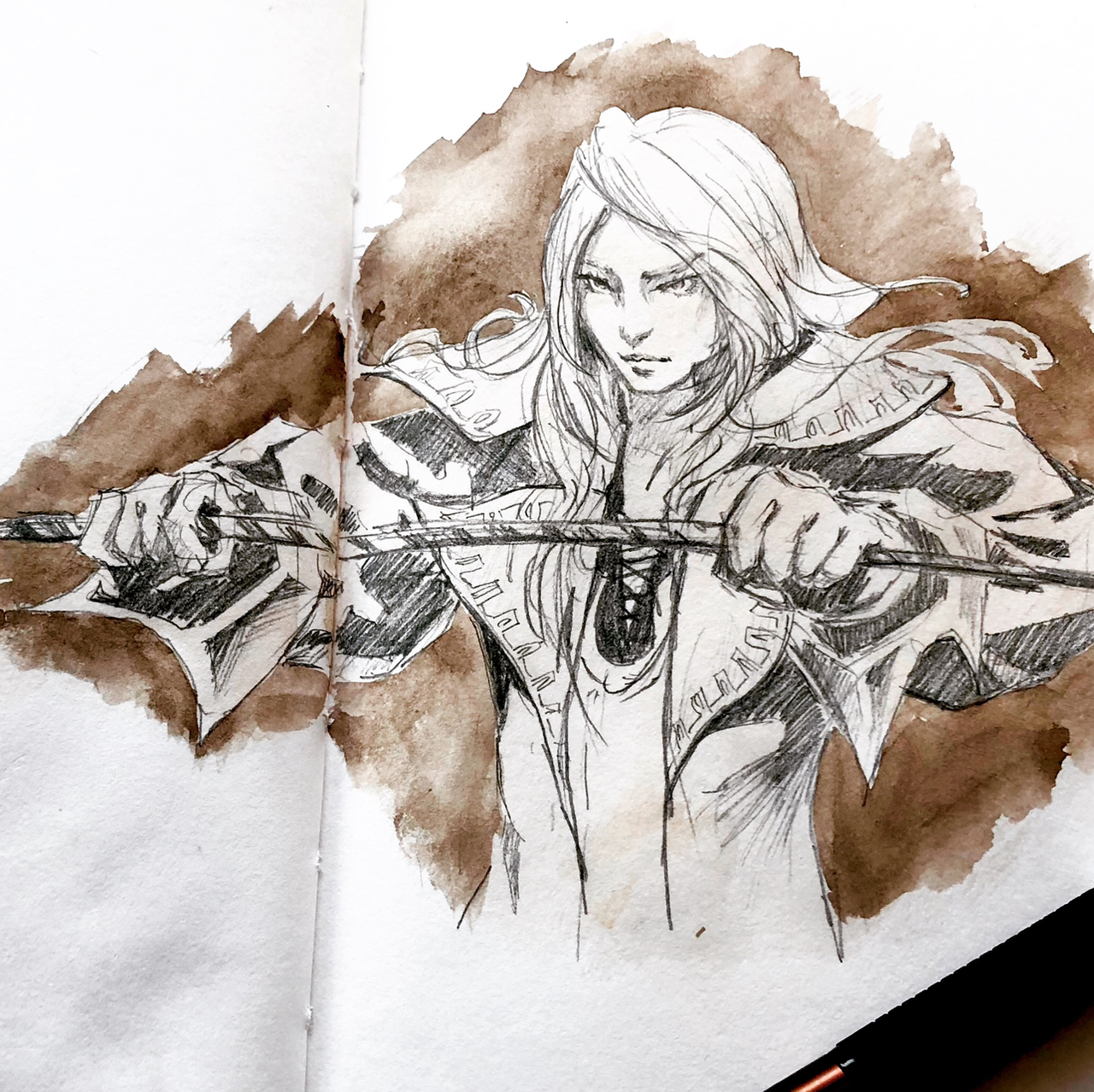
 GiraffeMeow — Portrait Study Based on Ayami Kojima
#ayamikojima #pencildrawing #portrait #watercolor
Published: 2020-03-21 21:07:25 +0000 UTC; Views: 732; Favourites: 49; Downloads: 0
Redirect to original
Description
I used watercolor to seal the pencil to prevent smudging. I think the effect works out well!")
Related content


Comments: 16


This is a terrific piece. I've provided some general observations plus one potential area of improvement for you to consider. I hope you find these comments helpful.
Vision (a clear controlling idea)
To me this looks like more than a portrait. It looks like a scene from a story where you have captured an important moment in time. The combination of the facial expression, the extended staff or sword, the garment which is a little more ceremonial than battle dress and the position of the hands give the sense of accepting some great honor. Perhaps she has been given an important quest and is accepting the honor with a fierce pride and sense of duty.
Originality (fresh insight or approach)
A character holding a sword is a pretty standard subject for people to draw so in order to stand out, a character needs to look like an individual with their own personality or character. I think you've managed to do that here through the combination of the facial expression and a pose for the body that is consistent with the facial expressions. In short, I am seeing a person, not a subject which makes the drawing interesting to look at.
Technique (composition and technical execution)
I like the scale you chose to do the drawing and your willingness to cross pages in the sketchbook to accommodate a larger scale than you might otherwise use. The shape, tone and texture of the eyes and mouth work together to reinforce the same emotional expression. The cross hatching for the shading throughout the drawing is excellent.
If there was one area for improvement, it would be in the proportions of the body. It is very subtle and not noticeable at first glance, but it appears that the shoulders are larger in comparison to the head and the main body. It looks like the sleeves are meant to be like a billowing cloak, but even allowing for that, it seems like there is just a bit too much mass there. Again, a very minor point but some slight adjustments here to improve the balance across all parts of the body would probably make the expression of the person's inner power stand out a little more as the facial expression would be a little more prominent.
I like the compositional choice of the half figure. It reinforces the idea that you are seeing a snapshot or a memory of a story. The drawing would fit very well in a graphic novel. The brown wash for the background is a solid color choice giving a good contrast to the black lines of the figure while keeping the whole picture centred on a dark and white contrast.
Impact (viewer experience)
People seeing this piece will be impressed. They will feel the impact of the scene right at first glance. It is an outstanding piece of work. Well done!
👍: 0 ⏩: 1

Thanks for the kind words! I'll take anatomy/proportion more into account next time  (Smile)")
Also this is a study of Ayami Kojima's work (the illustrator for castlevenia series) ")
👍: 0 ⏩: 1
I took a peek at her pictures and I can say you did a terrific job. In fact, it looks like everyone here thinks you did great!
👍: 0 ⏩: 1

Amazing! So much done with so little colour, this is astonishing~ ^^
👍: 0 ⏩: 1

👍: 0 ⏩: 1
Yes it's a study of ayami kojima's castlevania art
I tried to make the color look like it's from an old document lol so I actually adjusted the value digitally to make it darker
Thanks for the suggestions!
👍: 0 ⏩: 1
👍: 0 ⏩: 1
I think he's Juste Belmont. But to be honest I also thought he's Alucard at first
👍: 0 ⏩: 1
👍: 0 ⏩: 0
That's a great piece. I see you've requested a Critique on this artwork. Is there anything specific you would like feedback on in a critique?
👍: 0 ⏩: 1
I usually put request critique on all my pieces in case ppl want to give feedback
👍: 0 ⏩: 1
OK. I'll take a deeper look this weekend and leave you a critique.
👍: 0 ⏩: 1