HOME | DD
 gizmodus — Monastero

Published: 2007-09-05 18:40:17 +0000 UTC; Views: 8807; Favourites: 255; Downloads: 0
Redirect to original
Description
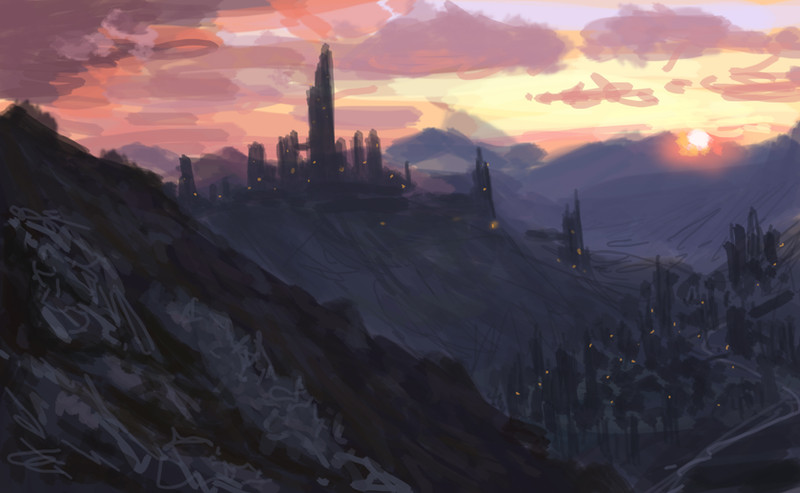
Interpretation of a monastery in Italy (after a photograph)...My goal was to keep it quite realistic though I wanted to add a special feeling of beauty and spirituality somehow.
Commissioned piece.
Related content


Comments: 24

OMG ! YOU MUST EXPLAIN ME HOW TO DO THESE IM DYING TO DO STH LIKE THIS D: D
")
👍: 0 ⏩: 0


It's sometimes amazing to think what you can do with four simple colors. I mean, that's all that this is, but it creates an entire lovely setting.
👍: 0 ⏩: 0
 (Smile)")

the monastery looks georgeous and the colors match wonderfuly
👍: 0 ⏩: 0

This is beautiful. It looks like a grand piece of classical wall art, something that should be hanging in a gallery!! It's the color that definitely wins me over here. However the detail is what keeps reeling me in, just to see what exactly is going on with that monastery.
👍: 0 ⏩: 0

great piece,maybe we dont see where the light come from ,the bottom of quite dark and its suddenly turn to shiny green, but thats fine
👍: 0 ⏩: 0


omy gosh the sky is beautiful!!! Gorgeous picture

👍: 0 ⏩: 0


nice job with the light and colours.. I especially love the sky

👍: 0 ⏩: 0


i like that transition of dark to light. it adds to the spirituality.
👍: 0 ⏩: 0


It's beautiful! I like how the monastery is lit and everything else is dark.
What program do you use?
👍: 0 ⏩: 1

Thank you! I use Photoshop CS3
 (Wink)")
👍: 0 ⏩: 0

very nicely done, although its digital, it feels very traditional in the tone of the colors. great work!
👍: 0 ⏩: 0

Fantastic... and it doesn´t quite look like foto-refed, because yes, it has a great feeling to it. Nice painting!
👍: 0 ⏩: 0

It looks like you tried to add that special feeling using lighting and color. I think it worked.
👍: 0 ⏩: 0

very nice colours, and a nice contrast between the upper and the lower part.
👍: 0 ⏩: 0
