HOME | DD
 GlassMouse89 — Before and after: Willowisp

Published: 2012-09-28 20:33:04 +0000 UTC; Views: 1771; Favourites: 25; Downloads: 2
Redirect to original
Description
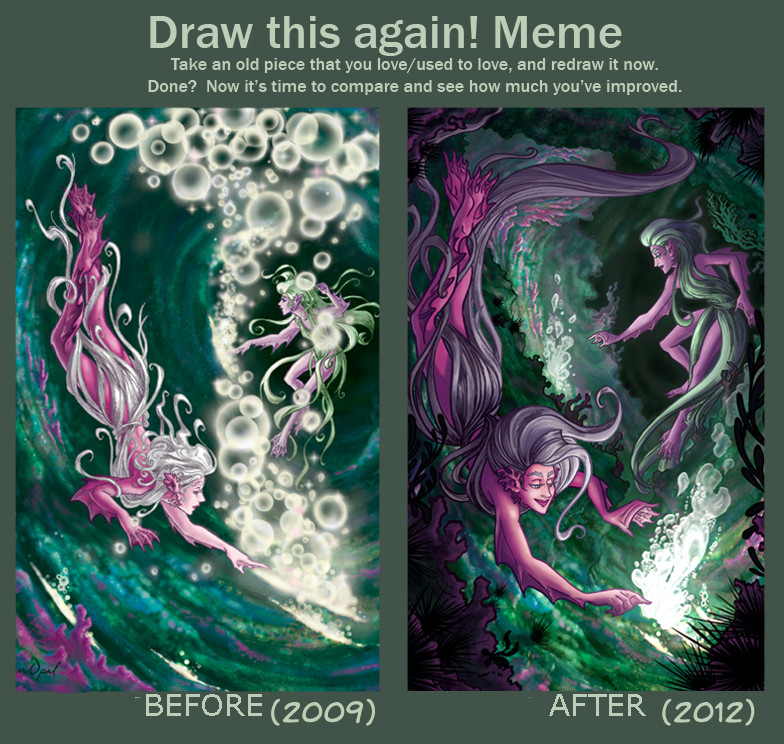
2010: [link]2012: [link]
You just know I had to do this
 (Smile)")
Blank: [link]
EDIT: Since everyone seems to prefer the original version's people and atmosphere, I tried to edit and recreate some of what people liked about it. The newest version is here: [link]
Related content


Comments: 15

Amazing how you developed your digital skill. I like the idea for transparent... thing? shost? She's intriguing!
👍: 0 ⏩: 1

Thanks a lot! I really wanted to make her more esoteric the second time around. Redesigning classic fairy tale creatures is fun
👍: 0 ⏩: 0
You're not alone. I'll keep atmosphere more in mind in the future
👍: 0 ⏩: 1

With art people always tend to add as much as they can and it ends up making the overall piece ugly compared to something less detailed which can be really easy on the eyes, I add things but if it makes it look worse I always fix it no matter what because I have a mental block that doesn't let me upload something unless I'm 100% happy with how it looks, but I think it's like that for everyone
👍: 0 ⏩: 1
You're right, and I'm personally a huge fan of simple artwork (such as that in Sinfest). I may have pulled a few stops too many here, considering this was "show off what you can do!" thing.
In any case, it's a very good thing to keep in mind, thanks
👍: 0 ⏩: 1

I like the older one's mood and atmosphere much more, however it is obvious of your improvements in the new one!
👍: 0 ⏩: 1
I can see what you mean, and you're not the first to point it out (I edited and tried to make it a little better here: [link] ). Thanks a lot for your comment and the kind words
👍: 0 ⏩: 0

Very nice improvement, I really love the Willowisp in the newer one, your anatomy's a lot better
Though I think one thing I prefer about the older one is the couple.. maybe that they're a bit farther away, kinda obscured. Not sure why though.
👍: 0 ⏩: 1
I've heard that four times now, so I'll have to accept it, haha. I think it's because it creates more distance between willowisp and people, and casts her as an observer rather than a participator. There's also more freedom in regards to their personalities and relationship. At least that's what I think, based on the feedback.
In any case, thanks a lot for the comment - both the nice words and the well-thought-out critisism. That's a rare, very appreciated thing
👍: 0 ⏩: 0

I love both of them! Although I prefer those two people in that older drawing.
👍: 0 ⏩: 1
Thanks for the nice words
 (Wink)")
👍: 0 ⏩: 1
Well they just fit in the pictures theme better, I think
👍: 0 ⏩: 1
That makes sense. Thanks
👍: 0 ⏩: 0