HOME | DD
 GloomFlowerArt — Windowlight

Published: 2007-05-20 22:28:52 +0000 UTC; Views: 766; Favourites: 18; Downloads: 15
Redirect to original
Description
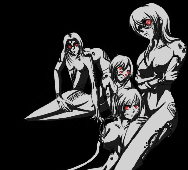
Perhaps I should not post every single concept drawing for The Fragile here instead of doing it, but what the hey, I can always delete them later.I enjoy doing stuff in this kind of high-contrast style. More than I should.
Related content


Comments: 7

Yes, this does look amazing this way, it's the best effect that you could come up with, solid contrast between black and white, and a few highlights of red
 (Smile)")
👍: 0 ⏩: 0


I like it. Very blame. High contrast BW 2 tone is pretty popular these days, Tim Armstrong just did a bunch of videos in the same style.
👍: 0 ⏩: 0

Black white and red is such a great color scheme.
👍: 0 ⏩: 0


Oh, you know how it always goes, you're a military clone getting blown to shit, assumed KIA and generally disregarded being replaceable and all. Instead of dying you end up in a hospital as a Jane Doe, patched up with a low-end prosthetics and tossed into the society with a nasty brain damage leading to homicidal psychosis, and being subjected to a experimental personality rewrite that essentially just jams two separate personalities in your head. The usual.
👍: 0 ⏩: 0

Sure, black & white just owns here. Nice solid inking and clean lines...
 (Wink)")
👍: 0 ⏩: 0