HOME | DD
 Gmarconato — GMstudio Layout v3
by-nc-nd
Gmarconato — GMstudio Layout v3
by-nc-nd

Published: 2007-11-30 01:19:26 +0000 UTC; Views: 4588; Favourites: 16; Downloads: 133
Redirect to original
Description
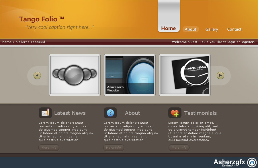
GMstudio Portfolio Layout v3Status: Unfinished
----
This Logo sucks!
----
Mais um layout de treinamento, procurando um estilo de layout perfeito para meu futuro portfolio...
Sugestions & Favs, are welcome and repaid!
Thanks!!!
© 2007- Gmarconato. All Rights Reserved.
Related content


Comments: 24

Nice Layout but Specially Color Scheme Manage Its Looking Nice....
👍: 0 ⏩: 0


I will upload it, and send a not to you!
👍: 0 ⏩: 1

só escurecer mais um pouco as cores dos botões do menu que vai fica melhor ainda.
👍: 0 ⏩: 0

")

I love this lay, very professional and impressive. compliments, you are great ^-^
👍: 0 ⏩: 1


topo e botões mto grandes
acho que falta harmonia entre os elementos do layout
👍: 0 ⏩: 1

A escrita About Me está desalinhada com o Contact e o Home, ela tá 1px acima.
De resto está ok :} Simples e agradável.
👍: 0 ⏩: 0

foda, lembra um poco da thunder por causa das cores e da textura do topo, curti pacaraio
👍: 0 ⏩: 0

the logo is really not the best but the layout and the colors are cool!!
👍: 0 ⏩: 0


OH...MY...GOD! (saying it slow lol) This is amazing! I love your colours!
👍: 0 ⏩: 0

The blue header (with the pattern) is good ! but the colour of the other blue is too shine...
👍: 0 ⏩: 0


I like the colour scheme!
The curved blue part of the layout is a little pixelated though. Mm, yeah. The logo could be better. Other than that, this looks pretty neat.
👍: 0 ⏩: 0