HOME | DD

asherzgfx — Tango Folio

Published: 2009-10-14 21:17:12 +0000 UTC; Views: 3407; Favourites: 26; Downloads: 0
Redirect to original
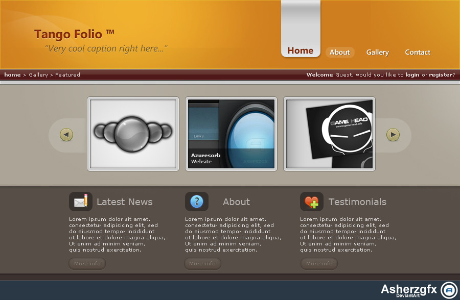
Description First site I've done in a while, used some different colours and a different layout...

Think it turned out ok, it's nice to get something finished for once

Credits:

Developer icons: [link]

Some much needed inspiration from Ejsing and his great blog: [link]
Related content
Comments: 31

gopalb [2010-06-25 12:40:41 +0000 UTC]

Hi! Your work have been featured in my blog...[link]

👍: 0 ⏩: 1

asherzgfx In reply to gopalb [2010-07-05 18:27:49 +0000 UTC]

Cool blog, lots of nice designs in there honoured to be apart of the collection

👍: 0 ⏩: 0

alNseem [2010-06-13 16:28:19 +0000 UTC]

i love it ..oO

👍: 0 ⏩: 1

asherzgfx In reply to alNseem [2010-07-05 18:28:01 +0000 UTC]

cheers!

👍: 0 ⏩: 0

Criminal-2k8 [2009-10-15 19:04:27 +0000 UTC]

Good job man its look good keep it up mate

👍: 0 ⏩: 1

asherzgfx In reply to Criminal-2k8 [2009-10-16 16:18:19 +0000 UTC]

thanks

👍: 0 ⏩: 0

EnzuDes1gn [2009-10-15 12:02:42 +0000 UTC]

nice colors, some details could have been done with more love, but as it's your first in some time this can be overlooked

👍: 0 ⏩: 1

asherzgfx In reply to EnzuDes1gn [2009-10-15 17:59:09 +0000 UTC]

Cheers Which details do you mean? And I'll check them out when I update it

👍: 0 ⏩: 1

EnzuDes1gn In reply to asherzgfx [2009-10-15 18:38:35 +0000 UTC]

Well little things really, eg: the bread crumb section, it's kind of boring and could use some polish. The main navigation while different is not making sense the fonts are different size to the selected state, and the selected state also seems to sit higher up. You need to allow for more padding between the image previews imo, it's just too cramped for a layout of this style. Same goes for the boxed text section along the footer area, too cramped, let them breathe give a little more space to each. Also maybe a nice indent for the previous and next button bg's would be kind of nice too The footer is in dire need or polish, as it's soo flat and boring, give it some more life, to bring it up to standard with the rest of your layout.

Pros for me i this layout ( the colors ) just love them, the rest i wrote above needs work, to be at the same standard

But yea off to a great start bro

👍: 0 ⏩: 1

asherzgfx In reply to EnzuDes1gn [2009-10-15 18:44:50 +0000 UTC]

Cheers, I really appreciate all the advice... I'll work on it more this weekend and take into account all of your notes

Thanks again!

👍: 0 ⏩: 1

EnzuDes1gn In reply to asherzgfx [2009-10-16 12:07:54 +0000 UTC]

welcome bud

👍: 0 ⏩: 0

dainix [2009-10-15 06:26:03 +0000 UTC]

nice - lovely colors and really interesting header navigation!

👍: 0 ⏩: 1

asherzgfx In reply to dainix [2009-10-15 17:59:30 +0000 UTC]

thanks Glad you like the colours

👍: 0 ⏩: 0

timsilva [2009-10-14 23:29:19 +0000 UTC]

Looks really nice, a bit small though.

👍: 0 ⏩: 1

asherzgfx In reply to timsilva [2009-10-15 18:01:44 +0000 UTC]

Yeaaa... I got a bit lazy When I get some time I'll have ago at making it bigger, I'll probably add a blog section or something

👍: 0 ⏩: 0

Axertion [2009-10-14 23:29:16 +0000 UTC]

I like the colors (except the maroon). You need to work on your padding You need to add more spacing between the elements imo

👍: 0 ⏩: 1

asherzgfx In reply to Axertion [2009-10-15 18:00:56 +0000 UTC]

Thanks for the advice And yea I'm not particularly keen on the maroon either

👍: 0 ⏩: 0

coreper [2009-10-14 22:37:58 +0000 UTC]

this one looks really nice man!
good job!

👍: 0 ⏩: 1

asherzgfx In reply to coreper [2009-10-15 18:00:06 +0000 UTC]

Cheers Glad you like it

👍: 0 ⏩: 0

SKUFF [2009-10-14 21:37:13 +0000 UTC]

Very sleek i like it alot keep up the good work !

👍: 0 ⏩: 1

asherzgfx In reply to SKUFF [2009-10-14 21:42:04 +0000 UTC]

cheers

👍: 0 ⏩: 0

RGC3 [2009-10-14 21:36:25 +0000 UTC]

Pretty small bro, but very nice.

👍: 0 ⏩: 1

asherzgfx In reply to RGC3 [2009-10-14 21:41:51 +0000 UTC]

size doesn't matter but yeah I may work on a larger version soon

👍: 0 ⏩: 0

ejsing [2009-10-14 21:25:19 +0000 UTC]

The header reminds me a little of my latest blog layout [link]

But it looks good. A shame it's so small.

👍: 0 ⏩: 1

asherzgfx In reply to ejsing [2009-10-14 21:32:56 +0000 UTC]

I was wandering where I got the idea from, I couldn't remember I just had an image in my head,

Hope you don't mind, I'll add you under the credits aswell I really love that blog, and yea I know it's small but I just needed to get something finished, may make it a little larger later on.

👍: 0 ⏩: 1

ejsing In reply to asherzgfx [2009-10-14 21:35:37 +0000 UTC]

Of course I don't mind, hehe. I am just glad you felt inspired.

Well, keep going mate!

👍: 0 ⏩: 1

asherzgfx In reply to ejsing [2009-10-14 21:41:00 +0000 UTC]

thanks, appreciated

👍: 0 ⏩: 0

SmarTramS [2009-10-14 21:21:04 +0000 UTC]

Very nice work man

👍: 0 ⏩: 1

asherzgfx In reply to SmarTramS [2009-10-14 21:24:12 +0000 UTC]

Thanks, glad you like it. I was reading your interview, I like your pot theory

👍: 0 ⏩: 1

SmarTramS In reply to asherzgfx [2009-10-14 22:49:57 +0000 UTC]

Np man. I wish I could take credit for the pot theory, but that is from the mind of the Guifx guru, my boss, Morgan. I'm guessing you are referring to this article, right? It's a cool theory. [link]

👍: 0 ⏩: 1
asherzgfx In reply to SmarTramS [2009-10-15 18:02:53 +0000 UTC]

Indeed it is, very cool )

👍: 0 ⏩: 0