HOME | DD
 Gneiss-chert — TSDS Book 1 Concept Final
#anthro #bookcover #fantasy #magic #novel #kingjustinarisdale #anthropomorphic #thesilverdolphinssaga
Published: 2016-03-03 17:41:33 +0000 UTC; Views: 1453; Favourites: 14; Downloads: 0
Redirect to original
Description
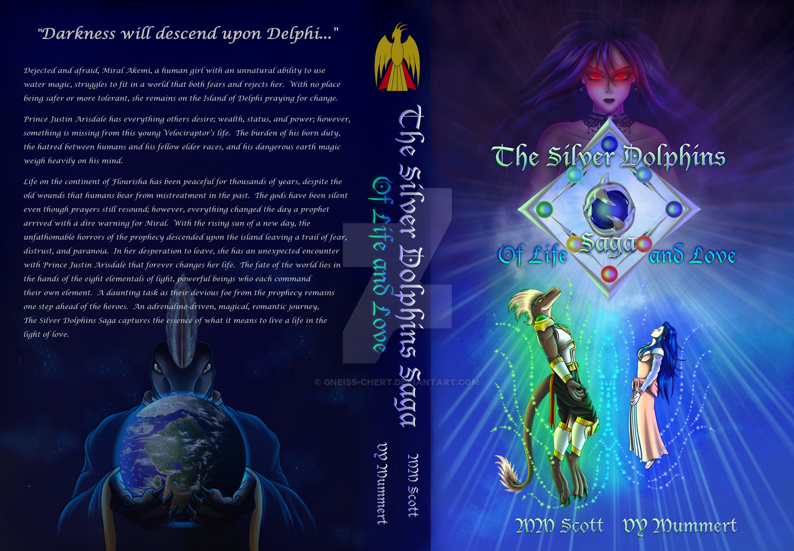
**UPDATE**Added the summary to the back! What do you think?First of all, thank you all for your feed back! We greatly appreciate it!
After taking all the suggestions and making the tweaks this is what I have come up with.
As far as the Arisdale bird at the top, after talking with a good friend I decided that it is staying as is. I faded it so it wouldn't be as bright and adopt the back ground color of blue. However, it is a mark for the branch of the series that is tied to King Justin and will identify this branch of the series as that visually. There will be more and they will have a different mark. There are other book authors who have placed a flat mark on their books based on the book series. If anyone still thinks its a problem. I will look it over and take suggestions once more.
((Why does Da make my image look so crappy.....looks so much sharper on my screen off of DA =/ ))
Original Concepts
Novel series The Silver Dolphins Saga © since 1996 Michele Scott Gneiss-chert , and ©Victoria Mummert. BloodAngel28 All rights reserved. My work may not be reproduced, copied, edited, published, transmitted or uploaded in any way without my written permission. My work does not belong to the public domain.
Related content


Comments: 29

it looks a lot more complete with the text
I think making the villain (sorry, I don't know her name, but she looks ominous enough to be the villain!) transparent is a lot better as well! good job!
")
👍: 0 ⏩: 1

Thank you kindly!
Ah ha! Glad it does and her name is Queen Irana Delphi! ^.=.^
👍: 0 ⏩: 0

Time to give yourself your second big hug!!!!
The "oomph" its dangerously FANTASTIC! So much effort to this! My question is what size is your font for the summary? :3
👍: 0 ⏩: 1
DAwww ty Sarah!
Huzzah! I do love my IP! Its about 4.2 I tried 4.5 but it gets to the bottom of the page =/
👍: 0 ⏩: 0
Huzzah thank you Melian! Now to build my website!
👍: 0 ⏩: 1


That font!!!! Frickin love it!!! <3 <3 <3 <3
Yup, this baby got OOMPH!!!
Lovely skills, my dear

👍: 0 ⏩: 1
YAY! <3
Thank you much for the feedback!
So much oomph its dangerous! XD
👍: 0 ⏩: 0

Just to warn you, on the second line, "fears" & "and" were accidentally fused
👍: 0 ⏩: 1
Yeah just saw that XD its fixed! TY. Is that size good for the font though?
👍: 0 ⏩: 1
Excellent! Thank you much! ^.=.^
👍: 0 ⏩: 1

OH it is gorgeous! You are so incredibly amazing!
👍: 0 ⏩: 1
Thank you milady Melian! ^.=.^
👍: 0 ⏩: 1
You are so welcome!
👍: 0 ⏩: 0

Much better than the last! 
 (Smile)")
👍: 0 ⏩: 1
Excellent! Glad that is over with! Moving on! Oh yeah I had to look at multiple ways people rendered with cycles to finally fine one that looked good then decided to add similar lighting to the logo and words and image. ^.=.^
👍: 0 ⏩: 0

is perfect lady not more to add very formal and nice first picture of justin inmediately captures you interest because looks like if you read this you gonna travel to another world a deepest world and interesting also the back cover is perfect I dont know if many people do but I always do that everytime that I buy a new book I always see the cover and then the back to think or better know about the book and if in the back you will fin the villain and the heroes below inmediately you think in something interesting about that battle into the history is so cool dear really cool let me say whatever cover you choose will be awesome
👍: 0 ⏩: 1
Thank you kindly my good friend! Oh travel ye shall and quite the journey it will be!! Oh yeah my husband does and a lot of people really do look it over to judge it.
👍: 0 ⏩: 0

Now the cover definitely gives the right impression about everything. Perfection achieved indeed.
👍: 0 ⏩: 1
Huzzah and thank you kindly! ^.=.^ That is a good thought indeed!
👍: 0 ⏩: 0
OMG THIS is PERFECT. VERY well balanced now and extremely pleasing to my eye. I even asked Hannah what her thoughts on the first and the second one, and she most definitely likes the second one! Ah Justin looks so much better now that he has a bit of space!
I can't wait to hold the this book!!! :'D
As for the that type on the back that really supports the title! VERY WELL DONE. Give yourself a BIG HUG.
👍: 0 ⏩: 1
YAY!!!! Perfection achieved! Thank you Sarah and Hannah!
I can't wait for you all to hold it!
OH GOOD! Its lucida script and the title is Lucia blackwater figure that worked! Glad it does. OK *GIVES SELF BIG HUG*
THANK YOU SOOOO MUCH!!
👍: 0 ⏩: 0
...
...
AHAHAHA!!!
Bloody beautiful!!
This is going to look great on my bookshelf...after its been in my hands for lord knows how long xDDD
Im glad you kept the Arisdale mark too! If Im pointing to the book to refer it to a friend who is starting, all I have to say is "The one with the golden bird on it" ^.=.^
Oh man, and Justin on the back is so fitting! Holy, I loved the first cover but this one really points out "Hey! Irana is bad news! (Love those eyes, guilty pleasure) There is a big story to be told about King Justin and Lady Miral! The shine of the silver dolphins means that this book means business <3 Heehehee
Gah! This is so exciting! 
Beautiful skills indeed ^.=.^
👍: 0 ⏩: 1
HUZZAH!!!
Iam really excited too! Its all coming together and this makes it official! Twill be in your hands soon enough and no one will be able to pry it from you! ^.=.~
Yes! Look for the golden bird! Thank you Kayly!
👍: 0 ⏩: 0

That's it! If only the lighter and the darker part on the front of the cover could sort of... entwine, then it'd be perfect! You know, to make it seem less like there's a border in between them.
👍: 0 ⏩: 1
You know I agree with you! Ill adjust that thank you!
👍: 0 ⏩: 0