HOME | DD
 golfiscool — Intoxicated Drawing
Published: 2006-10-13 17:58:51 +0000 UTC; Views: 106825; Favourites: 2734; Downloads: 5074
Redirect to original
Description
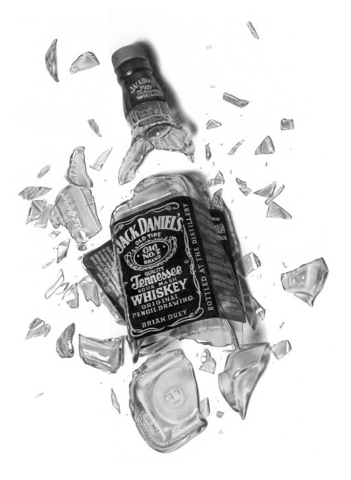
I originally got the idea for drawing broken bottles from a pencil artist that I greatly envy and respect, Matti Kataja. His piece "Break Away" was total inspiration for this drawing I have done. So I just wanted to make mention of him and thank him.I am finally done with this. It has been on my desk for about 2 months I am guessing. I have countless hours into this project. I have to admit it's a great relief to finally have it done. I did enjoy the drawing but I am ready to move on to something else now.
I know alot of people will probably ask me how I went about setting this up and rendering it so I will explain it. I have been wanting to draw a broken bottle for a long time. I was over at a buddy's house a few months back and noticed he had an empty Jack Daniels bottle on his bar. So I asked if I could have it and he agreed. When I got home I grabbed a cardboard box and placed a decent sized rock in the bottom of it. I then stood up and dropped the bottle onto the rock from about 7 feet. So I had all the shards contained in the box when it shattered. Then I took the box full of glass to my drawing table and started laying out the pieces how I wanted them and playing with the lighting. When I liked the composition I took some pictures of it and set the box aside.
For the most part I have been working from the photos while drawing this. However there were times when I wasn't happy with the highlights or something so I would change them in the drawing. I still had the still life scene set up in the cardboard box also throughout the drawing so if I didn't understand something going on, I would just refer to the real life set up.
The most tedious part of the entire drawing was probably the lettering on the label. It took a long time to negatively draw around all the letters. During the WIP I asked everyone what they thought about me putting some custom lettering on the label and everyone said I should go for it. So at the bottom of the label I put "Original Pencil Drawing" "Brian Duey". So it should be fairly hard for someone to try to rip this drawing from me.
Thank you for all the support throughout this drawing. I appreciate all the nice words from everyone and the helpful tips along the way. I hope you all like the drawing. Time to start something new
")
14"x20" Fabriano Hotpress
3B, 3b mechanical, 2h, b pencils
blending stumps in some places
Approximately 60 hours
Please check out my website at [link]
Related content


Comments: 599

Only one word comes to my mind...
PERFECT
Your talent is just amazing and left me speechless...I really admire your patience, your desires to improve; The way you've worked not only in the drawing but on its achievement...from the very beginning getting the bottle, breaking it and arranging everything according to your expectations...I know you've copied something from a photo but in this case this is different...it's like when someone draws something from their minds; you've made a thought true  (Smile)")
Keep it up, you're my idol!!!

👍: 0 ⏩: 1

Gosh, I'm going to have an ego the size of Texas if I get comments like this.
👍: 0 ⏩: 1
Oh dear!!! You should be really proud of what you've done, seriosly 


PS: Forgive me for my English, I'm not an English speaker and also, and above all, I'm so amazed that I'm not able to write properly

👍: 0 ⏩: 0


Damn!
and 60 hours! well I can see that.. You're crazy!!

👍: 0 ⏩: 0

this isamazing it looks so real. My brothers friend was over my house and he came over to me to see what I was doing, and I happen to be looking at your drawing (it wasn't finished yet). And I'm like, "do you think this is a drawing or a photograph, or a drawing?" and he's like "It's a photograph" and I said no it isn't, he doesn't believe me. He thinks that you just did something in photoshop with a picture. And he is standing firmly by his opinion which I think is very funny.
👍: 0 ⏩: 1
Well, show him the WIP pictures of me working on the drawing. I just moved them to my "scraps". I am very useless when it comes to photoshop.
👍: 0 ⏩: 1
haha well he doesn't know that. I did, but he thinks it's a picture and you just did something in photoshop to make it look like a drawing.
👍: 0 ⏩: 0

How come the background for this is white, but the WIP's background are a shade of grey?
👍: 0 ⏩: 1
Because I was using my digital camera for the WIP but I scanned the final. The drawing is 14"x20" which means that when I scan it, I have to stitch together like 8 different scans. That gets very time consuming and I wasn't going to scan every WIP update.
👍: 0 ⏩: 1
Wow... 8 different scans.
That's got to be troublesome.
Also, what scanner do you have?
👍: 0 ⏩: 1
Yeah, that's why most of the time when I do WIP's on here, I will just use my digital camera because it's easier. No stitching scans together or anything. I am using a Canon Canoscan 8400F scanner. I did a little research on them before I bought one and it seemed like the most bang for the buck
👍: 0 ⏩: 1
Ahh, I see. So, you don't have to adjust the contrast or anything in photoshop?
👍: 0 ⏩: 1
No, not the contrast. But when you are pasting the scanned pieces together you have to adjust the seams so that they aren't noticable. Otherwise it would look horrible.
👍: 0 ⏩: 1
Ahh, I see. Thanks. My scanner must suck because when I scan stuff into it, the white isn't pure white like yours; it's a light shade of gray. Lighter than the ones you get with your digital camera, but still not white.
👍: 0 ⏩: 1
Mine scans the middle portion white if it's truely white but towards the edges it gets gray. But I crop only the white parts when I am stitching scans together.
👍: 0 ⏩: 1
Ahh, I see. I'd figure it must be really annoying stitching them together.
👍: 0 ⏩: 0


it turned out so well Brian. I specially love that you put your name in
👍: 0 ⏩: 1

thats a fav. Those glass shards look amazing, and my friends's jaws dropped when i told them that this WASNT a photograph
👍: 0 ⏩: 1

Really amazing. So very realistic, I'm not sure I can even distinguish if it a drawing, it is so smooth and well done.
👍: 0 ⏩: 1

waw that`s amazing!!!!!!!!!!!!!!!!!!!!!!!!!!!!!!!!!!!!!!!!!!!!!!!!!!!!!!!!!!!!!!!!!!!!!!!!!!!!
👍: 0 ⏩: 1

this is totally breathtaking! this can't be a drawing! man you are the pencil-god!
👍: 0 ⏩: 1

I think that is one of the best draws that I've ever seen O__O
👍: 0 ⏩: 1

Even though i haven't been leaving messages on dA for a while, I've still been following your WIP's of this piece right from start!
When you produce something like this, i CANNOT believe you've advanced this far in only a few years! I look back to your early work, which is what my early work looked like as well, however I havent seemed to advance very much, whereas you are now on a par with the God of Drawing himself- Armin Mersman! This is fabulous... absolutely stunning Brian. You have reached a level I thought was unobtainable, you have given me so much to strive for. Thank you for sharing your masterpieces with us and thank you for keeping my faith and passion alive!
👍: 0 ⏩: 1
Thank you very much. Yeah I look back at some of my earlier drawings and even I am overwelmed at how far I've come sometimes. I really appreciate the nice comment. I really like your work, what's next for you?
👍: 0 ⏩: 1
I've actually taken a turn in my art lately. I've started to devise a new style for myself after browsing some uni's and seeing the work of the students that are taking the fine art courses. I've started to combine abstract and realism in a subtle and simplistic way. It kind of makes the piece my own. I'm also starting to concentrate more on still life.
I've been without my easels and drawing boards for almost 3 months now though! And i'm having severe withdrawal symptoms! I had to ship all that stuff over to australia when I moved here, and i'm finally getting it all back tomorrow! so expect some more stuff to be posted here soon!
I also invested in some Fabriano Hotpress paper, probably in the hope that my drawings may somehow turn out as good as yours if i use the same paper AND pencils as you! but... wishful thinking won't really work... haha!
I have a few commissions to do before xmas, AND a digital art portfolio to complete by mid-november for the digital art course I applied for at uni, so they're my main aims for the next few months.
Do you have any tips about putting together a portfolio by any chance? because I'm a little stuck...

👍: 0 ⏩: 1
That sucks that you have been waiting for all your supplies to get over there. But I will be eagerly awaiting more work from you. I think you will love the Fabriano paper. I still want to try the Arches HP paper but I can't see spending that much on it. I think the Fabriano is quite expensive and the Arches is much more expensive.
I appologize but I could give you no advice about a portfolio. I have never put one together before. I've never been in art school so I have no idea how that would all work. Sorry.
")
👍: 0 ⏩: 1
Damn I saw the Arches paper when I bought the Fabriano... I'd never heard of Arches till now, so i just kinda went with what i knew... is the Arches better?
Don't worry about the portfolio... I think i've got it covered. I've got a few friends who did both digital and fine art in uni, so they've already gone through the whole process, so i'm getting tips from them as i go along
If i never knew you, i'd fall over backwards if you told me you never went to art school. you're drawings are a hundred times better than most of the things i saw when i looked around the art studios at all the unis!
👍: 0 ⏩: 0


OMG, you've finished it
👍: 0 ⏩: 0

hey dude "marvelous" haha..
i admire your decipline. good job
👍: 0 ⏩: 0


That's totally awesome... The drawing looks like a photo! I like the idea to change the writing  (Wink)")
👍: 0 ⏩: 0


Brian,you`re a mindblowing artist!
What could i say to such an unbelievable drawing?
Nothing,i`m without words.I`ve never seen such an realistic drawing of a burst bottle of Tennessee whiskey.
Look at my journal Brian,it`s my "picture of the moment!"

👍: 0 ⏩: 1
Thank you!! I really appreciate it man!
👍: 0 ⏩: 0

*jumps up and down* - it's finished! Wowee, I do love your still life pieces. I especially love how you did the top of the smashed bottle - all the lighting and reflections are perfect!

👍: 0 ⏩: 1
<= Prev | | Next =>