HOME | DD
 gomedia — Speakeasy
Published: 2010-10-08 20:32:04 +0000 UTC; Views: 1961; Favourites: 16; Downloads: 0
Redirect to original
Description
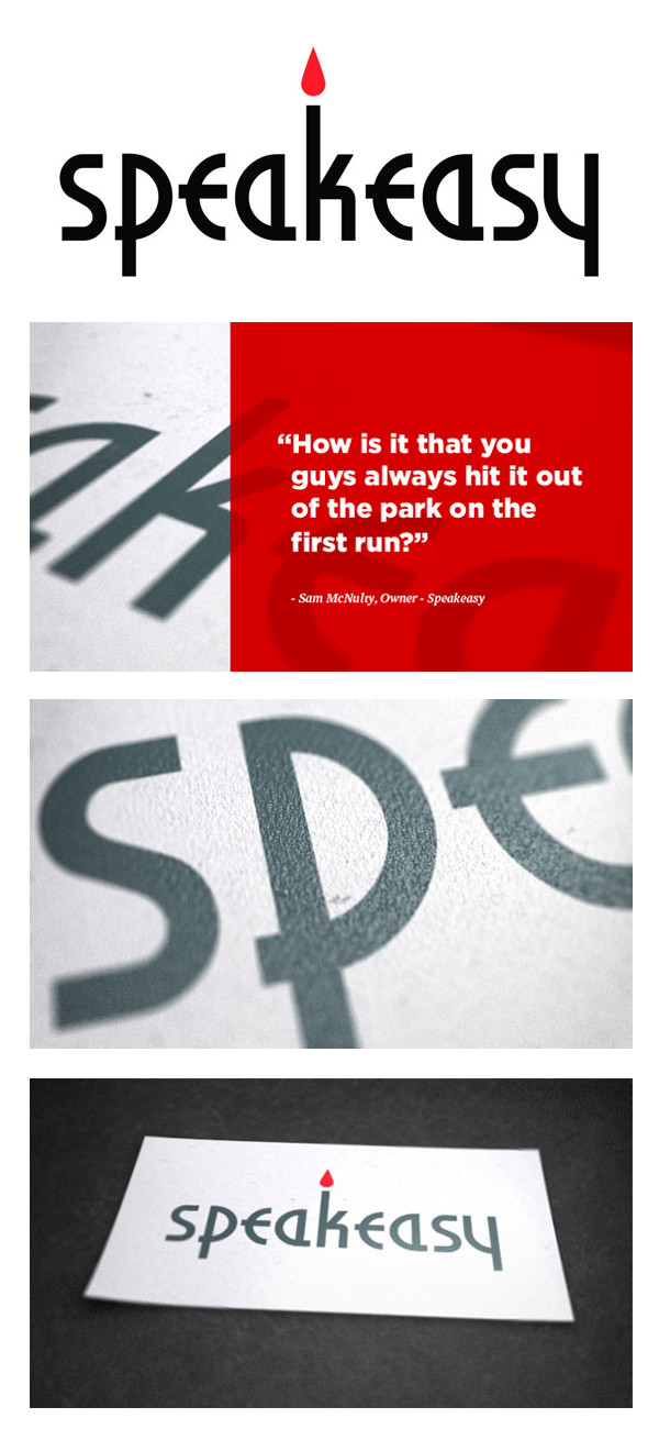
Speakeasy is a bar on Cleveland’s west side located in same building on West 25th that Bier Markt and Cento occupy. I really love both of those places, so when the Speakeasy folks approached us about creating an identity for them, I was beyond excited about it. The bar is in the basement of the building and has low lighting with candles and has a bit of a 1920’s feel. The owner gave us a quick tour of the space, and a light bulb went off in my head for a rough idea of what would become the logo.I started with an art deco typeface that I had downloaded years ago. Normally, I hate gimmicky fonts, but this was a perfect application. The typeface had some odd features which I adjusted and refined to fit the word “Speakeasy.” I placed a red stylized flame above the ascender of the ‘k’ to represent the bar’s candle lighting. The client was beyond thrilled with the results.
– Oliver Barrett
More infos on the Go Media portfolio .


