HOME | DD
 GoPurifyYourself — KJF2008
Published: 2008-08-01 09:15:57 +0000 UTC; Views: 5588; Favourites: 62; Downloads: 0
Redirect to original
Description
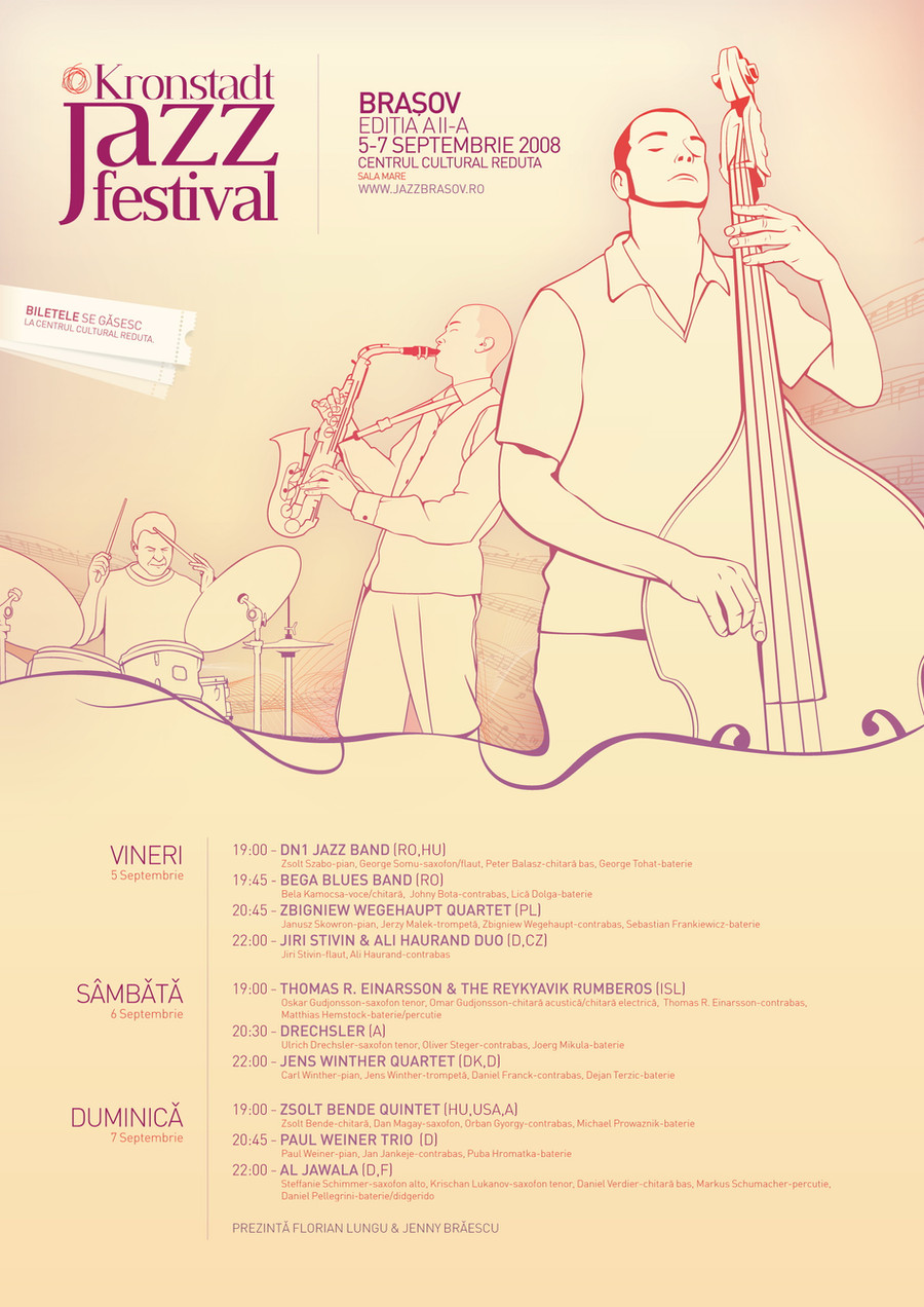
the poster for this year's "Kronstadt Jazz Festival"a couple hours of work, nothing fancy
Related content


Comments: 27


a couple hours of work that made some stunning/clean work
👍: 0 ⏩: 0


 (Smile)")


I 
")
👍: 0 ⏩: 1

thanks!
the font in DIN(-light and -medium) if I remember right
👍: 0 ⏩: 0

this looks very nice..
the illustrations are great.. nice warm colors.. gives it that jazzy vibe hah..
good font choice..
overal great work!
👍: 0 ⏩: 1
thanks
nice comment
have a nice day
👍: 0 ⏩: 0

merci
pai asta e facut cam 99% in illustrator
restu photoshop
👍: 0 ⏩: 0

Wow....
👍: 0 ⏩: 1
thanks
yes.. allthough everybody was expecting me to do one similar to the last years poster, i tried something different..
but it worked
👍: 0 ⏩: 0

Man this is great, love the type. Maybe could have the type at the top aligned better. Overall a great poster
👍: 0 ⏩: 0

this is amazing... nice soft colors, vector draw are really nice ...
 (Wink)")
👍: 0 ⏩: 1
yeh..
I used vector drawing instead of PS because I had very little time..
👍: 0 ⏩: 1
cool! but it looks great!
👍: 0 ⏩: 0


well I'd love to see more flow from the bass on the right to the bottom. justy stylized lines/illustrations as you do it nicely
the typography is great - professional 100%
the illustrations of the band are also great. I love the middle line link to the musicians, but as I've said, I'd love to see it as a flow to the bottom of the poster
cheers!
👍: 0 ⏩: 1
thanks
good comment
i'll keep that in mind
👍: 0 ⏩: 0
