HOME | DD
 greenhybrid — picogen 0.3: Heightmap Editor

Published: 2009-07-09 13:29:01 +0000 UTC; Views: 3279; Favourites: 19; Downloads: 135
Redirect to original
Description
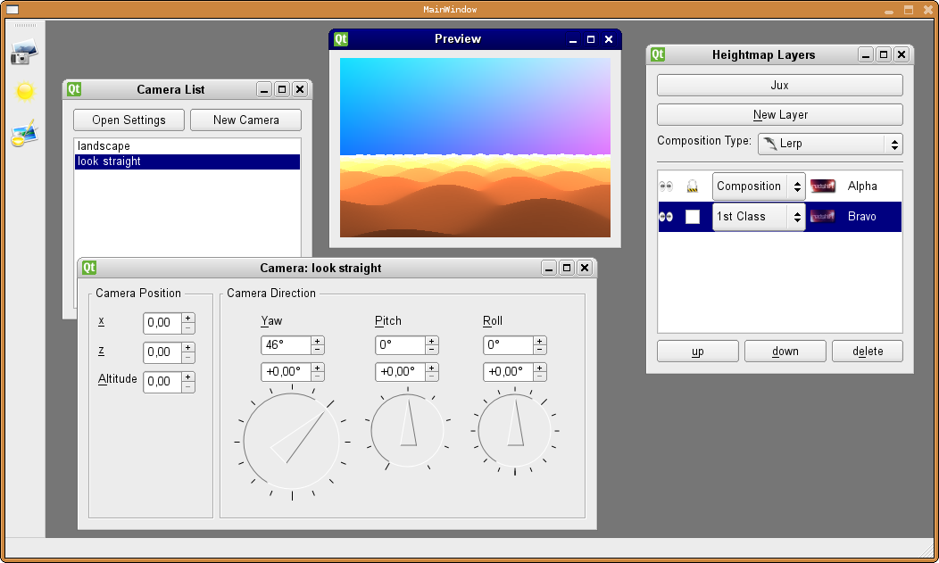
Stepping forward fast (Smile)")
I think it won't last to long anymore until at least this tool can be released as a standalone application
")
Information:
* This is an editor for the creation of procedural heightmaps (*)
* It is mostly animated with a minimum number of pop-ups and flickers
* The big center is the main window, with the graph
* On the lower left, you see either the whole heightmap, or the contribution of the currently selected node (the "sub-heightmap")
* On the lower right, you see the same, but in 3d, so you get a better feeling of the 3d-look, or how it will be in a real, full blown terrain rendition
* The interface is made up of Qt4 and OpenGL
* Further, for you programmers: I use parts of boost (spirit for the compiler; shared-pointers; regular expressions), soon I'll use OpenMP (I already tried OpenMP in tinscape: [link] )
Find more information at:
* [link]
* [link] , [link]
(*) I know, "procedural heightmap" is paradox, maybe "procedural terrain" is more appropriate, tho it's not limited to terrain, but will also be useful to create water-ripples etc.
Related content


Comments: 3

heh, thanks
though I think, when I try to be more objective, it also looks a bit boring, naked, "lonesome". It needs more action or something, or more colours or so :S
👍: 0 ⏩: 1

Well, colours are there, roughly, for attention. Anything coloured in a monochromatic space will immediately draw the viewer's attention to it. So, you need to use colours with care. Use it, where ppl need to view at to get things done. Don't overuse it. Use rather medium or low saturation levels - no full saturation, except unavoidable.
Also use it in a meaningful way. No random colours because of the sake of it ^^
for example, colours a often used to indicate axes. X=red and depending of Yup or Zup (I'm rather used to Zup - maybe, you could make that optional
Don't forget, even though a good GUI IS a piece of art, it doesn't need to look like one.
Art is made for attention.
GUIs are made to work with them.
Stick to the work-with part for now and add fanciness lateron
First the function, then the eyecandy
 (Wink)")
👍: 0 ⏩: 0