HOME | DD
 Grogee — Scream

Published: 2009-03-17 19:59:08 +0000 UTC; Views: 859; Favourites: 26; Downloads: 28
Redirect to original
Description
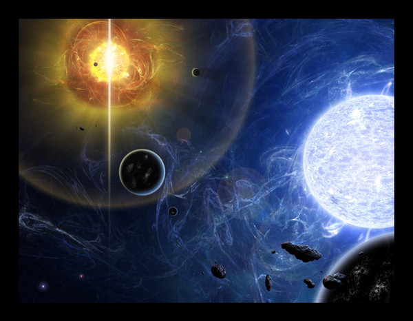
Took me about 10 hours to make, all done with photoshop CS2.This is my first all Photoshop Spacescape. I'm pleased with it, I wish that it was bigger though, but it is my first.
Please constructive criticism is welcome (but also love), I'm trying to better myself so don't be shy. Expect to see more from me soon.
Thanks for viewing!
Related content


Comments: 14

IT's all over the place in awesome! Someone should put a character or something in there!
👍: 0 ⏩: 0

I think the colours and general composition is beautiful, and I'm guessing the bright part to the upper left was intentional, although I feel it provides just a little bit too much of a distraction. A very pretty piece though, love the complimentary colours you have used: orange against blue. Works well.
👍: 0 ⏩: 0

I noticed pretty much the same things in all three of the pictures you showed me, so I'm just going to sum it all up on here if that's okay
Personally, I don't really like the bright pockets of light. I feel like it contrasts too much, and my eyes are really sensitive so it's kind of hard to look at :/ That's probably just me though.
Also, I think the edge of the bottom left planet out to be illuminated just a bit more; compared to the other two celestial bodies, it's a bit dark.
 (Smile)")
👍: 0 ⏩: 1

Appreciate the feedback. This one here was my first one so I don't expect it to be perfect. Although just about all of my pieces are usually going for a surreal aspect. I prefer making dreamlike pieces rather than going for realism.
👍: 0 ⏩: 0

I love the bottom left planet, It looks so surreal. My only critique is I wish it was larger.
👍: 0 ⏩: 0


The contrast on this peice is amazing! Everything just stands out and yet melds in together so nicely, you have a wat with color.
👍: 0 ⏩: 0

wooooow...
You are extremely talented...
This deserves WAY more comments
I especially like the light in the middle of the image - the blue/orange colours work fantastic together - really draws the viewer into the shot.
Congrats. An instant favourite
👍: 0 ⏩: 1
Thanks for the comment, I'm working on another peice ATM, thanks so much for the fave!
👍: 0 ⏩: 1
No problemo! I really love that image... it kinds reminds me of the 'visualizer effect' on itunes... except they're planets... Sorry if that sounds like jibberish
Awesome image - awesome work ")
")
👍: 0 ⏩: 1
I will gladly accept your gibberish.
👍: 0 ⏩: 0

