HOME | DD
 gspott43 — Alcohol Poem

Published: 2009-10-21 16:05:39 +0000 UTC; Views: 11441; Favourites: 18; Downloads: 3184
Redirect to original
Description
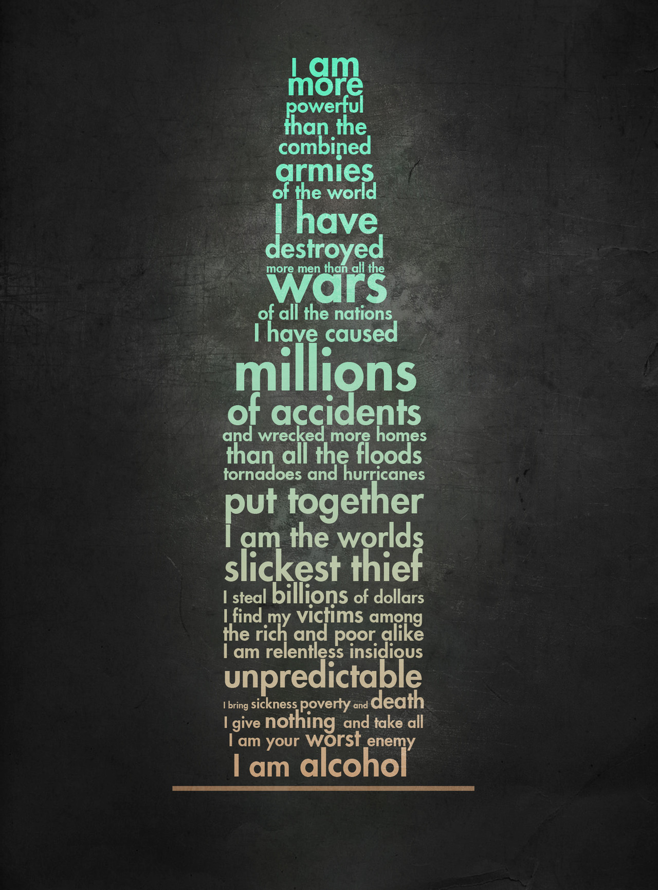
A poem I stumbled upon, don't know the author unfortunately.new version: [link]
Related content


Comments: 7

I can relate to how much this poem shows alcohol affects people, as I'll admit it, both my parents are quite serious alcoholics and finding this was amazng, I can really relate to it! Thank yu for making this!
👍: 0 ⏩: 0


Thats a pretty nice background there.
Did you make it out of stock put together? Or was it like that?
The colours are great indeed. But this "I am alcohol" doesnt fit the rest of the text :-/ But great work!
 (Smile)")
👍: 0 ⏩: 1

thanks, yeh it was from a stock ([link] )
maybe I'll try fix the last two lines when I have a moment
👍: 0 ⏩: 0

Very nice! The color of the type contrasts well with the background and the shape of the bottle is clear. The font is not just readable but easy to read. The tone and texture of the background really add to the dramatic feel.
I also think you've chosen the big words well, though one more in the middle part between "put together" and "unpredictable" might've been good. Perhaps "victims"?
I imagine the bottom may have been difficult to fit well into the shape, but the empty space above "alcohol" still bothers me. I see that you've insisted on not having any two lines end and begin on the same row, and this indeed makes the poem easy to read. Unfortunately the last verse is so short that "I am", while powerfully centered above alcohol, also leaves empty space on the left and the right. Overall though, this really is rather minor.
👍: 0 ⏩: 1
thanx for taking the time to write that! first critique I've ever got on DA ")
space was the main issue with the sizing on each line and I agree that the gaps on the second last line create a bit of inconsistency but as you say, its not a major issue. ;D
👍: 0 ⏩: 0
