HOME | DD
 h2o- —
Prototype_02
h2o- —
Prototype_02
Published: 2005-05-09 08:07:15 +0000 UTC; Views: 9319; Favourites: 88; Downloads: 2809
Redirect to original
Description
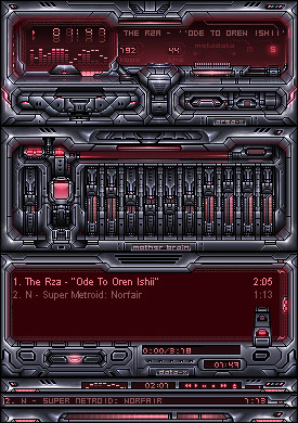
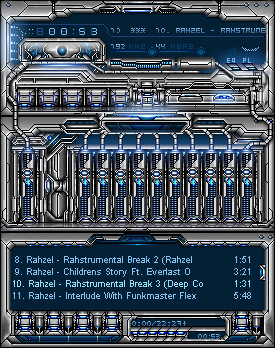
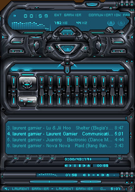
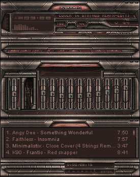
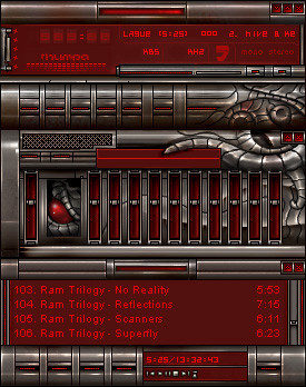
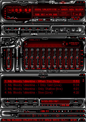
This skin didn't turned how i expected but i like it how it is.hope you will too...
Related content


Comments: 59


")

Wow very detailed. I love a detailed skin
Nice red color also.
 (Wink)")
👍: 0 ⏩: 0

nice work indeed , those details are crazy man , looove the equalizer ..
👍: 0 ⏩: 0

Looks interesting. Maybe somewhat cluttery. But good with red skins. They are kind of different.
👍: 0 ⏩: 0


Cor! It's a bit too crowded for my tastes, but it still looks cocking ace.
👍: 0 ⏩: 0


No world ruler is complete without their death consol.
")
👍: 0 ⏩: 0

The first time I saw this I really did think of Super Metroid....and look what's on the playlist! Holy crap...
I love this BECAUSE it's dark, keep it up!
👍: 0 ⏩: 0

")


Hooollly crap. :0 That's all I have to say. xD; But I really like the kinda metalic feeling to it.
👍: 0 ⏩: 0

I downloaded this song, can I use it? it doesnt look like i can. =/
👍: 0 ⏩: 0

Nice for Metroid and Chronno Trigger Fans! 
👍: 0 ⏩: 0


Wow, this looks really cool! I love the color scheme and the shine. Is it me, or is the reflection of the 0 an 8??? Anyway, great job!~
P.S. Hmmmm, I thought this was a DD before? Maybe it was de ja vu...

👍: 0 ⏩: 0


Wow! This is amazing! What I am wondering though is, is this for something in real life for simply digital?
👍: 0 ⏩: 0

Personally Im more in to the clean minimalistic skins. But this looks really great, very detailed and techy. Looks like you put alot of work in to this one!

👍: 0 ⏩: 0


Drooool...
Ok, now I realise the place to find ultra high quality winamp skins is deviantart..!
👍: 0 ⏩: 0


Hi ^^ i love your skin very much, i could play with the buttons for hours, but theres a amall bug i found...everytime you move the player, the old button upper right comes back, it diappears when you push play.
I small one like I said

👍: 0 ⏩: 0

Very nice, a lot of work , but too much details it makes your eye tired.
👍: 0 ⏩: 0

yeah looks like vida. i like this really much, nice job here. but shouldn't the volume be red in 100% ? anyway nice job.
👍: 0 ⏩: 0


great skin. the amount of detail is excellent.
keep it up!
👍: 0 ⏩: 0

thats awesome. very nice details.
good work mate
👍: 0 ⏩: 0

i really love what you did with the button animations on this skin! the EQ sliders are the best by far. i can tell you put a lot into this one.
👍: 0 ⏩: 0


best skin in last 6 months or more...
great pimpin'

grade 10/10
👍: 0 ⏩: 0

This is a very nice skins.. and original.. but im not sure if I like all the black lines.. keep up the good work!
👍: 0 ⏩: 0

a bit dark for me, but i love the little details everywhere...
👍: 0 ⏩: 0

I can see you made some big changes to it... espacially cbuttons which personally I like better now  (Smile)")
And now the playlist... it's really futuristic and is kinda standing out, like a different skin
ps. the right corner of video window...too bad you haven't aquired such a style in an entire skin design
overall I could easily give you 8/10 ( would be 9 if it wasn't for the playlist buttons
👍: 0 ⏩: 0


it is bbbbbbbbbbbbbrrrrrrrrrrrrrrrrrrrreeeeeee eeeeeeeeeeeeeeddddddddddddddddddddddd
👍: 0 ⏩: 0

Can you tell me how many hours did it take you to do this?
I would really like to know...
👍: 0 ⏩: 1

Mighty fine piece of work. I love Winamp classic skins like this with a lot of effort put into the EQ sliders. Thanks for sharing this with us.
👍: 0 ⏩: 0

| Next =>