HOME | DD
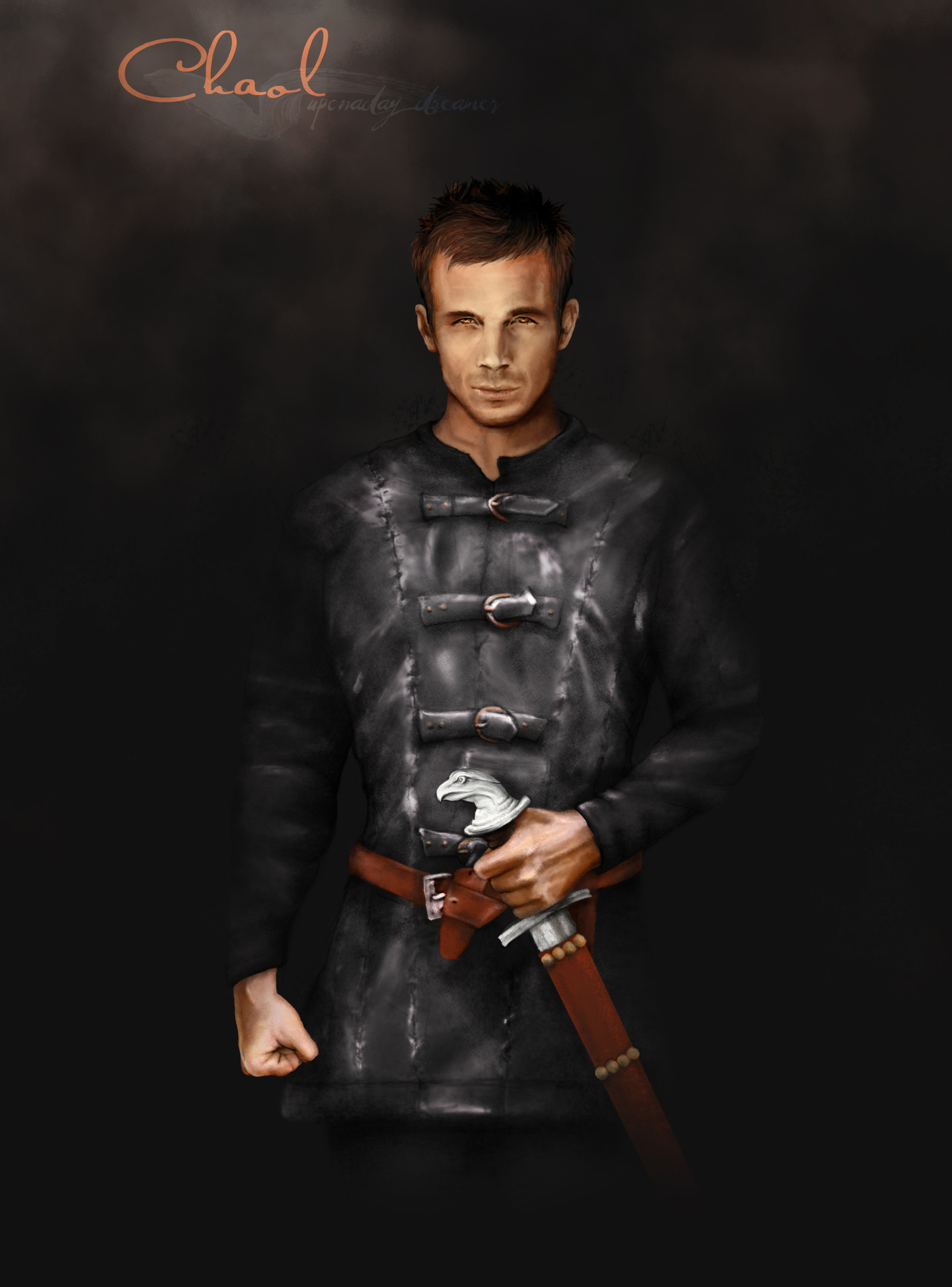
 Haddrian — Portrait of a Nobleman -WIP-

Published: 2010-09-03 02:03:13 +0000 UTC; Views: 811; Favourites: 16; Downloads: 3
Redirect to original
Description
So here is my latest project! It's not yet done (quite far from it actually) but I could use some advices and comments")
Please, comment and leave me feed back!
Related content


Comments: 27

great work! I love every detail, and I just can't wait to see it finished.
👍: 0 ⏩: 1

Thanks! I'll try to finish it this week
👍: 0 ⏩: 1
 (Smile)")

beautiful lighting. i love it. the clothing is great!!
👍: 0 ⏩: 1

Yo! Yo! Yo! Yo! Yo! Trop fou!
Je m'améliore pas comme ça en un an, moi! Ce dessin est tellement intense!
Les vêtements sont MA-GNI-FIQUES! Particulièrement le col rouge, il à l'air tellement réel!
Bon, bon, sinon mes humbles commentaires :
Je trouve que les plis de l'avant de la manche (la main droite je parle, hein?) ne sont pas tout à fait juste. Considérant l'endroit où est situé son coude, il m'apparaît difficile qu'ils ressortent ainsi de la rencontre avec les plis du haut de la manche. Ouais, en fait, c'est surtout l'intersection au coude que j'ai un petit peu de mal à visualiser. (bon en même temps c'est peut-être juste moi hein).
Secundo, j'essaie d'adoucir un mini peu le grain de la peau, enfin, je formule ça tout croche mais tu vois l'espèce de renforcement entre ces deux clavicules (sais pas comment ça s'appelle), ben un peu ça je dirais, ça reste de la peau alors même s'il est méga musclé, je pense que l'ombre ne serait pas aussi franche. Bon, pas une différence intense, mais un tout petit peu. Sur son visage, le côté droit est beaucoup plus lumineux, on remarque qu'il est plus éclairé de ce côté là mais en fait sur son front la partie gauche est vraiment plus gris et on voit la ligne... un peu trop bien je dirais, on voit où tu as ombragé le front. Mais ça c'est peu être juste parce que tu n'as pas totalement fini. Et que c'est seulement si on regarde vraiment son front.
Par contre, ton travail sur les habits est absolument fou et merveilleux, ils sont vraiment très très beau. Que de talent, que de talent! Continue de t'améliorer ainsi! (hum, ça fait sérieux ''ainsi'' dans un phrase! Mais j'avais pas envie de mettre ''de même'' à l'écrit, m'enfin).
@ + toi!

👍: 0 ⏩: 1
Wahou!! Un autre trop cool commentaire!! Chui trop chanceuse! Deux en 1 jour
Merci énormément! Je tiendrai compte de tout ce que tu as écris quand je le continuerai!
Sinon, du côté de l'amélioration... c'est surtout ma patience que j'ai travaillée... je crois que depuis le début j'aurais pu faire beaucoup mieux, seulement je n'avais pas envoie. Pour ce dessin j'ai utilisé des images de références: 1 du modèle en question, 1 d'un portrait de la renaissance et 1 d'Ezio pour les vêtements...
Merci énormément pour ton commentaire! Je plancherai un peu sur le visage... tu n'es pas la première à me faire remarque les ombres faites à la hache...
Bonne Journée! Et continue de te pratiquer! Tu seras aussi bonne bientôt
")

👍: 0 ⏩: 0

I think that this is the best drawing from you so far...really great done.
If you want that head looks much smoother, try to use really big soft round
brush (and I really mean really big). And if looks to much smooth, try to use
hard round brush, which is smaller and draw details, like wrinkles. And if you
want that looks even more detailed, try to draw outlines...I always do that.
You can even use a little of white color and draw highlights...use hard round
brush and you don't have to add too much of white. And if you add white on
the end of his nose and on the lips it'll look like it's shining. When I draw that
I use big opacity around 50-70 %. Hmm...and if you want that metallic parts
of his clothes looks like real you have to use only hard round brush. Because
in the real life metallic objects doesn't have soft gradients...like water. And
you can use white color too, and it'll look even more like metal (and don't
forget to draw reflections...opacity of brush you can have around 50-70 % too).
👍: 0 ⏩: 1
Thank you so much Valentina for that awesome comment! I'll put our wise word to good use!
👍: 0 ⏩: 1


Really! Thanks 
Thanks again
👍: 0 ⏩: 1

It really looks like late renaissance portrait
Nice frame for it and hang on the wall

👍: 0 ⏩: 1

Hmmm the lips arent aligned with the nose, and u need to work a bit on the chin and jaws... the rest is Awesome
👍: 0 ⏩: 1
Ok, Thanks. I'll check theses out
👍: 0 ⏩: 0

This really looks like a portrait of those times! It's amazing! I really love it!
👍: 0 ⏩: 1
I'm glad you could see that. Thanks
👍: 0 ⏩: 1
You did an amazing job! It's impossible not to see it!  (Wink)")
👍: 0 ⏩: 1


when turning the head, the eyes farthest from view does not go up, as it does here, it remains level. This is hard to do, but try combining a straight line and a curved one that follows the skull to get the lining right. Here, it makes his face look funny and lopsided because that eye is higher and tilts up some.
That is the only criticism I can give! It looks great, keep working at it! Beautiful colours.
👍: 0 ⏩: 1
All right! I'll check it out! Thanks a lot
👍: 0 ⏩: 1