HOME | DD
 Hakyness3876 — PS Practice 1
by-nc-nd
Hakyness3876 — PS Practice 1
by-nc-nd
Published: 2010-06-03 18:52:10 +0000 UTC; Views: 458; Favourites: 8; Downloads: 22
Redirect to original
Description
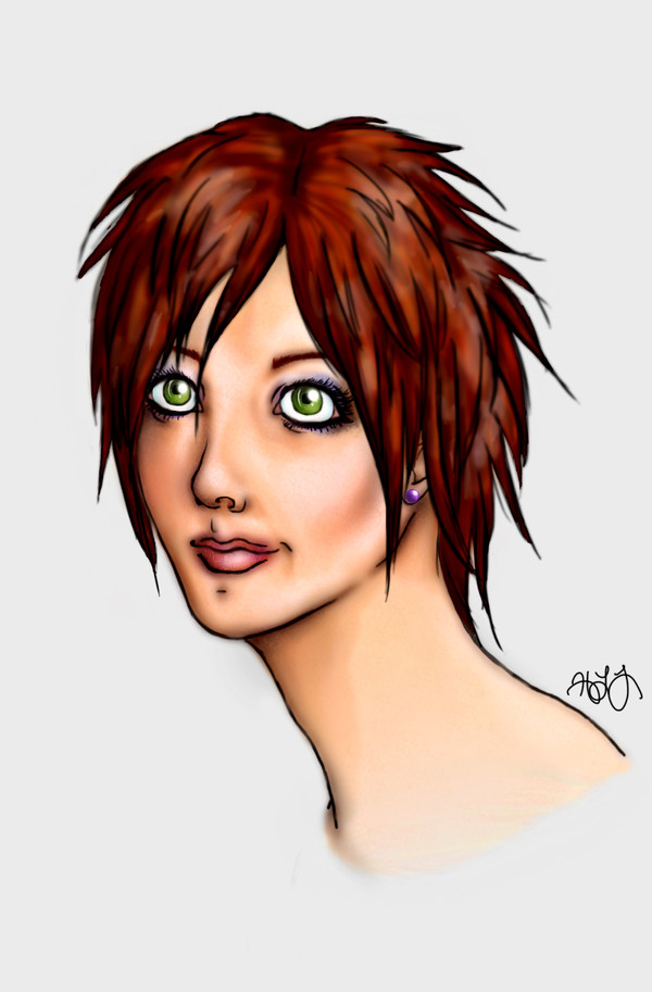
TADAAA!!!!!
Blah. Finally done.

I've been reading some lovely dA tutorials and I am finally learning how to use photoshop! YES!!
I am quite happy about this. Even though it's pretty useless and has no creative value whatsoever, it came out pretty awesome compared to my earlier PS efforts (like Furnished Soul or Prelude, for example).
So...yah. Took forever. Tools: PS Elements 8 and Wacom Bamboo tablet. 100% freehand.
So...enjoy. And if anyone is a totally fantabulous digital artist who would look at this and cringe, then please leave a constructive comment. I will do whatever it takes to shrug off the mantle of "PS n00b."

Is there any improvements I should make to the coloring?
Are there any techniques I could use to make this look more realistic?
In general, any tips on how I can color better in the future?
EDIT: Made some small changes based on the comments I've received. Thanks to everyone who has given feedback!

Related content


Comments: 56


I've never used PS before so I can't give you any tips in handling it...^^
Anyway, I think your efforts are really good and for being a noob you are already quite skilled. The shading of the skin is in my eyes pretty good.
The only thing you could improve a bit is the hair. Maybe it's your style but you could show the structure a bit more by drawing single strokes.
Nonetheless, it looks great!
👍: 0 ⏩: 1

thank you for your feedback
👍: 0 ⏩: 1
You are very welcome
I hope it was at least a bit helpful.
👍: 0 ⏩: 0

Very cool, if you start with a color in the background before you start painting your color its easier to manage the colors your using.
A nice way to paint hair is to start with a large brush at low opacity and dark color, then as the you paint lighter highlights start using a smaller and smaller brush.
Looking cool though, keep it up and im sure you'll get there!
👍: 0 ⏩: 1
thank you for your feedback!
👍: 0 ⏩: 0

as far as the coloring, the skin looks low contrast with the dark hair so close, and should use something besides a blank white bg. so a bit more shading on the skin.
also don't use just white tints for the highlights of hair.
as far as realism, soft brushes are good for general coloring, like laying down big general shaded areas, but try some harder ones for details, because this is drawn realistic but looks colored rather cartoon-ish to me. if you really want it very realistic, try to get it it to look right without the lineart.
my general advice would be mostly adding more details, try searching for tut's about painting realistically (vary the search words) and look at the final result of the tut, if you like it read it and try their methods. sorry, i'm not the best for realistic advise, i use more of a anime like style.
👍: 0 ⏩: 1
thanks so much for the feedback
👍: 0 ⏩: 0

I know people have said this already, but I feel it does help to hear many people that support the same things: I would try to not use black for your outline. You can still do outlines, but try a darker color of the part you are outlining, for instance.
For being as new to photoshop as you say, this is bloody excellent. The anatomy of the face looks great, the eyes are lively, the hair flows naturally, the lips are plump. I can guarantee you I can't do these things in photoshop!
I would also like to suggest you use slightly more muted colors, as to have a more realistic feel to the picture. It seems a little saturated to me.
You've done a fantastic job--keep up the great work!
👍: 0 ⏩: 1
Thank you so much for your kind feedback!
👍: 0 ⏩: 0

i love this painting.
i really love her eyes, and i mean it.
the skin is perfectly coloured.
the eyeshadow and earrings and hair color complement each other well.
now, umm things where i can think you can improve.
the hair. im not saying its bad, but really, detailed hair looks awesome... as in... where you can see the highlights and shadows for each strand. (i dont like the blurred effect on hair 
the outlining. it is ok now... mind my words, i said ok, not good. i think it's too thick... try making the outlines of stuff inside the outermost border thin... (like the nose and lips).
while outlining the lips, try avoiding outlining the whole thing. just a thin "inline", if i may say so, will do the trick.
and if you're aiming realism, get rid of the BLACK outlines altogether. go for darker shades of the same color, such that one won't be able to see it's outlined at a first glance.
and umm the outline of her left nostril looks kinda weird, but hey thats just me maybe
this doesnt involve techniques, but this painting in particular; but i think the neck should be a wee bit shorter in length
👍: 0 ⏩: 2
thanks so much for your feedback!
👍: 0 ⏩: 1
(i asked you to remove outlines because your shading is brilliant and you don't really need outlines ")
forgot to mention this. hehe.
👍: 0 ⏩: 1
oh, i found this...
[link]
hope it helps
👍: 0 ⏩: 0

With a closer look I can see that you've probably caught a few lessons about skin colouring, and on that account I think you've made progress. It is however framed by a black outline that is not doing the skin any favours. I'd suggest trying to learn how to avoid the outline look altogether (which is hard, I'm still learning myself) or soften it's colours so it's more camouflaged with what it's lining.
The hair is also not on the same level as the skin, but as it seems you know how to learn from tutorials and are motivated to practice, you've already got the tools to work on that  (Smile)")
And finally a little note on facial anatomy. It's quite nice actually, when you try and block out that harsh outline, but there is room for improvement. Her eyes are stuck at !!!!!, wide open, and very round, while the rest of her face is gently amiable. You can change her mouth and eyebrows to shock/surprise, or narrow her eyes a bit more to almond shapes to relax them
 (Wink)")
👍: 0 ⏩: 1
Thank you so much for the feedback!
👍: 0 ⏩: 1

Is there any improvements I should make to the coloring?
The hair.
I think it would fantastic without the white blotches. I can see that under these white blotches are detailed strands with individual highlights and shadows (or atleast at the top where her hair parts. The white blotches blocks the detail and don't really contribute to the picture.
Are there any techniques I could use to make this look more realistic?
I love your style, but if you are going for realism, then you shouldn't outline everything.
The neck is too long, and her right shoulder(I mean that bit that comes directly off her neck... i don't know the word for it D
In general, any tips on how I can color better in the future?
Draw from a reference. It wouldn't hurt to see how light affects the face and hair, and you get to see the anatomy as well.
👍: 0 ⏩: 1
Thank you so much for your feedback; it helps a lot.
👍: 0 ⏩: 1

An issue with the coloring is that the hair looks a bit muddy instead of stark and bright. I like the variation in colors and tones in the hair, but what would make this more realistic would be some better defined shine. A lot of the areas in the hair that seem to need to be 'shiny' seem too mushy. A lot of the colors are too close to the original tone.
When coloring digitally, when you get shading and highlight tones, don't pick the same ones that are on a linear spectrum, instead, change the color as well as the saturation and darkness/lightness. Notably, her eyes are TOO yellow, you've picked a darker version of the SAME color of yellow instead of moving it a bit more into the 'orange' area for a more natural color.
This video by Andantonius explains digital coloring in a way that is much easier to explain via text, please watch it to see what I mean. [link]
Hope that helps, and good luck!
👍: 0 ⏩: 1
Thank you so much for the feedback! Very helpful advice.
👍: 0 ⏩: 1
Not a problem! Sorry if it sounded like I was being too picky, I meant to comment that I like the anatomy and the features are well placed. ")
👍: 0 ⏩: 1
Haha, that's okay, you weren't being picky at all.
Thank you!
👍: 0 ⏩: 0


I like the character - she has a lot of personality.
To me, your shading sseems very good - the colouring of the hair, however, is a little strange and almost...dappled, for lack of better description. It reminds me of a tortiousshell cat fur, and this kind of detracts from the picture, so I'd suggest smoothing that out - I think what you tried to do is put in too many highlights. Usually, there is only one main one.
I'm not sure about the neck length, but I think that the neck is a little thick for the size of the head. Thinner and shorter, maybe.
Everything else is fine (apart from the ear, which looks tiny 
👍: 0 ⏩: 1
Thank you for your feedback.
These are very good tips; I will remember them for future projects.
👍: 0 ⏩: 0

looks pretty good, although I miss her emotion. But the anatomy is pretty good
👍: 0 ⏩: 0

looks great! the neck seems a bit long he me but the entire head turned out really well.
👍: 0 ⏩: 1
That's what I've been getting from everyone

👍: 0 ⏩: 1
just something to be improved on is all!
👍: 0 ⏩: 0

Love the colouring job on here! I would puff her cheeks out a little and shorten her neck for anatomy. You really got the skin looking real. For the eyes, I would suggest one bright white airbrush slightly over the iris to demonstrate moisture. For the hair, the overall colour is nice, but it would help to have the hair a little finer. Layer light and dark colours with a thin brush to get that effect. If you feel like trying a bit of a background, that would look cool too!
All in all, I would have to say you have thrown off and vigorously stomped on the PS n00b title.
👍: 0 ⏩: 1
Thank you so much for the feedback!
All very good tips; I will remember them for my next project.
👍: 0 ⏩: 1

O_O_O_O
This is AMAXZING!!!! I've always wanted to be good at PS. But... I haz no tablet. Haha. Very good job!

👍: 0 ⏩: 1
Awww...
I don't know how I'd survive without a tablet.
*magically summons tablet for you*

👍: 0 ⏩: 1
Do you use it a lot? Haha. -loves and cherishes the gift-
👍: 0 ⏩: 1
Yessss. I can't do Photoshop without it.
It makes it so it feels like you're drawing w/ a pencil. But you're not. IT'S JUST AN ILLUSSSIIIOOON. *magical hand motions*

👍: 0 ⏩: 1
An optical illiuuuuuuuuuuuuuuuuuuuusion!
I've always wanted one... But I haz no moneyz.
👍: 0 ⏩: 1
ILUUUUUUUUUUUUUUUUUUUUUUUUUUUUUUUUUUUUUUUUUUUUUUUUUUUUUUUUUUUUUUUION
No moneyz
")
👍: 0 ⏩: 1
Well.. I got a paycheck today, so that's cool.
👍: 0 ⏩: 1
AH. That explains it.
👍: 0 ⏩: 1
Well... That's not the ONLY reason, of course.
👍: 0 ⏩: 1

YAY
...I actually hate them. They were extraordinarily bothersome to draw + color.

👍: 0 ⏩: 1

Of course you hate them, you probably hate everything about that picture, but yes I can see how they would be bothersome.
👍: 0 ⏩: 1
| Next =>