HOME | DD
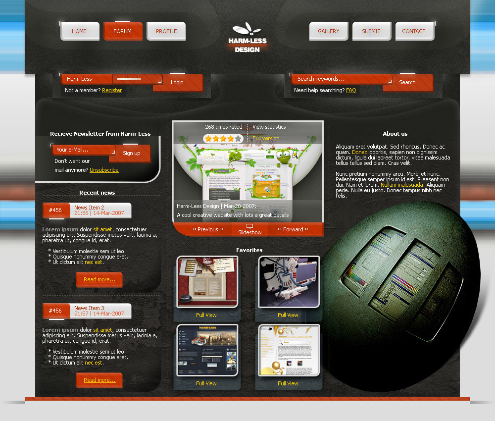
 Harm-Less — Pramari Web 2.0 : Test1

Published: 2007-04-23 14:12:36 +0000 UTC; Views: 1745; Favourites: 10; Downloads: 74
Redirect to original
Description
Submission 1 from Harm-Less- See other one here and other here -
Just a test for the new website of Pramari .
Text and content are just examples!!
This is Web 2.0 style if you didn't noticed
")
Logos for Pramari (by =inde-blokcrew ).
Team:
Related content


Comments: 24

Niceee!
i like this so much!! but the rollover button (documentation) i don't like.....
The colors ...... PERFECT!!
 (Wink)")
👍: 0 ⏩: 0

I like this one better, the visual concept is good but a little bit overloaded on the top part, maybe it's because theres too much text or too much tones. but in a main point of view it all goes together
👍: 0 ⏩: 0

I prefer this one much more then V2!
Therefore, I'll 
But, What's the point of this layout?
like, what is it for exactly?
And it's by you, not Simplistik Media right? So why do you have the whole team up there?
And I must say, Inde came up with a great logo for this one.
👍: 0 ⏩: 1

Thanx man, for your opinion and the fav
This is from our first client of Simplistic Media, the comany na is pramari as you know. They want a new, better looking website, to show on a convention. I really don't understand because there site is beautiful already...so lets hope there happy with this.
*badboythemer is also making a design. We will mix those and that will be the website.
So as far as I know 3 people are working on this. Inde created the freaking awesome logos, yes!!
👍: 0 ⏩: 1
Yea, I love this logo of his.
But yea, this site design is really great!
Congrats on the client and all!
 (Smile)")
👍: 0 ⏩: 0

I hope so to, but I'm very glad you like it
👍: 0 ⏩: 0


Oke, thanx for your opinion, but when is yours coming?
👍: 0 ⏩: 1

i have had headache most of the night man , i am starting to feel sursed by this layout .. lol , but yea it's all good , i will get good sleep tonight and finish tomorrow for sure , but i think i prefer yous to mine , so yea very well done harms
👍: 0 ⏩: 1

Great work, the vibrant greens and blues look great and that smooth, clean style looks awesome with it.
👍: 0 ⏩: 1


