HOME | DD
 Harm-Less — Pramari Web 2.0 : Test3

Published: 2007-05-03 22:09:55 +0000 UTC; Views: 2049; Favourites: 8; Downloads: 9
Redirect to original
Description
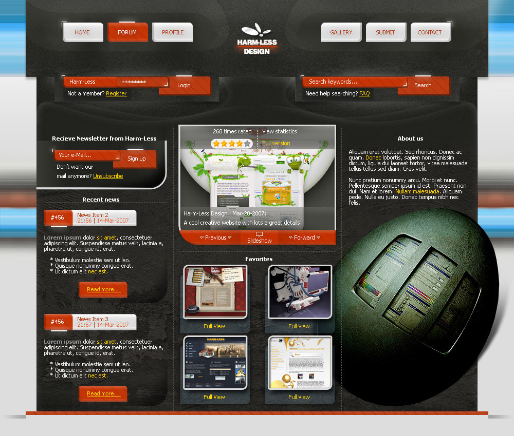
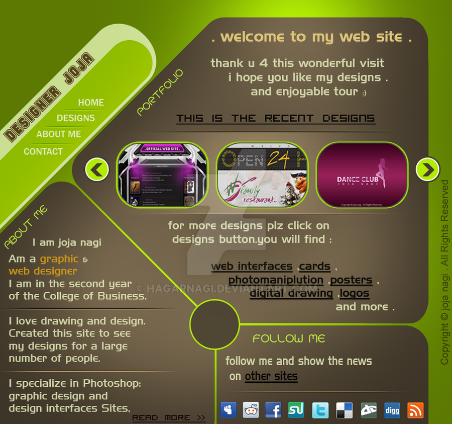
Submission 3 from Harm-LessIt needs a little retouch in a few days because then I have the right images, and header is a bit boing, but right now I want your opinion of what you think is missing.
- See other one here and other here -
Just a test for the new website of Pramari .
Text and content are just examples!!
This is Web 2.0 style if you didn't noticed
")
And I'm getting better in this style, but thats what I say
")
Logos for Pramari (by =inde-blokcrew ).
For more designs for Pramari, look at the page of *badboythemer
Team:
Related content


Comments: 43


Hey, ik heb er nog twee in mijn scraps
Maar bedankt voor het bericht
👍: 0 ⏩: 0

do u really think the green shade goes with the blues... ?
👍: 0 ⏩: 0
Thanx, do you know more about pramari now, robert said you know more
👍: 0 ⏩: 1

if you meen if i got any news... no i dont, im getting the thought that i got burned :/
👍: 0 ⏩: 1
I need to contact those guys, because I heard we are not the only ones who have this opportunity (can be different but thats what I heard). So I need to contact those guys so show them what we created. Do you know the e-mail address we used to communicate (send me in a note.
BTW, they told us if we where still interrested everytime, I hope Robert said "yes" all times.....
👍: 0 ⏩: 1
Thanx, going to write it right now
👍: 0 ⏩: 1
...oh and by the way.... im designing your logo
 (Wink)")
👍: 0 ⏩: 1
Oeh great, your the man
👍: 0 ⏩: 1


i like the center nav , but the rest i prefer your other ones  (Smile)")
👍: 0 ⏩: 1
Yeah I asked Robert but he said Inde knows more about the status of pramari
👍: 0 ⏩: 1
ahh ok , well i am glad someone does
👍: 0 ⏩: 0

[link]
the best is the one here but i likie the new header
👍: 0 ⏩: 1

thanx, he likes it
Lucky me, thats its not "totally" wrong
👍: 0 ⏩: 1


yah, very good layout.
👍: 0 ⏩: 1
Thanx, which of the three is the best?
👍: 0 ⏩: 1
I guess this one is better than others..
👍: 0 ⏩: 1
thanx for your opinion.
👍: 0 ⏩: 1
you're welcome guy..
👍: 0 ⏩: 0

Oh, you love the buttons
Mmm, a few don't think so, but I'm glad they turned out better in this design.
And I'm glad you commented
👍: 0 ⏩: 1

I like this one, it shows a new concept and the curves give it a great effect.
👍: 0 ⏩: 1

mooie
translated:
nice
👍: 0 ⏩: 1

leuk idee, maar op het eerste zicht .. die middenheader was even schrikken
x
👍: 0 ⏩: 1
Because of the color or what?
I know its need a bit work some time
Anyway thanx for the comment
👍: 0 ⏩: 1
What you think of this color?
[link]
👍: 0 ⏩: 1
mmmm its better in gray but it was like too intense, or something.
👍: 0 ⏩: 1
Yeah, you are totally right, its a bit of a problem
👍: 0 ⏩: 0