HOME | DD
 henrideacon — Crayola Color Picking Chart
Published: 2007-04-14 06:25:49 +0000 UTC; Views: 16375; Favourites: 73; Downloads: 5227
Redirect to original
Description
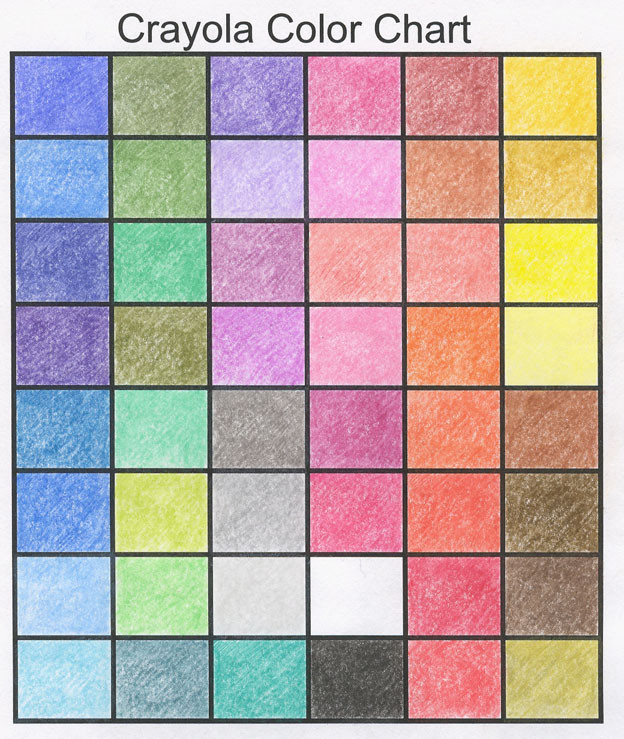
A color picking chart for Crayola. Each pencil was applied with medium pressure.The colors in each column are:
Deep Blue - Light Blue - Navy Blue - Bright Purple
Green Blue - Dark Blue - Sky Blue - Sea Blue
Pine Green - Sap Green - Emerald Green - Olive Green
Turquoise - Apple Green - Lime Green - Sea Green
Violet - Mauve - Purple - Orchid
Dark Grey - Grey - Light Grey - Aquamarine
Red Purple - Rose Pink - Coral - Pink
Maroon - Red - White - Black
Indian Red - Dark Tan - Peach - Orange
Orange Red - Scarlet - Crimson - Red Orange
Golden Yellow - Tan - Yellow - Lemon Yellow
Brown - Sepia - Dark Brown - Gold
Related content


Comments: 10


Very helpful! Thanks a lot for submitting this awesome chart!

👍: 0 ⏩: 0

")

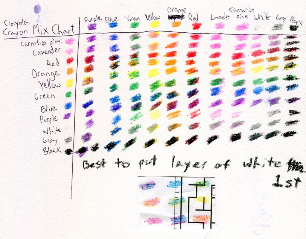
I mainly use these charts as a visual guide for deciding which colors may work well together, or working out a color scheme for a picture. Much easier to see how each color looks on paper than trying to imagine it by looking at each pencil.
👍: 0 ⏩: 1

ooooo ok, yes that could b very useful
👍: 0 ⏩: 0

in what was can i use 'applying pressure' with the color pencils?
👍: 0 ⏩: 0

Nice chart, this'll really come in handy when I'm trying to color since my quick charts always look bad, and I never seem to get the right color.
👍: 0 ⏩: 1
Glad that it might help. I have also created a chart for the Faber-Castell "Classic" pencils in the red box, with some comments.
[link]
👍: 0 ⏩: 0