HOME | DD
 himynameiznate — Jark Is THE Man

Published: 2002-10-19 05:38:28 +0000 UTC; Views: 1296; Favourites: 11; Downloads: 178
Redirect to original
Description
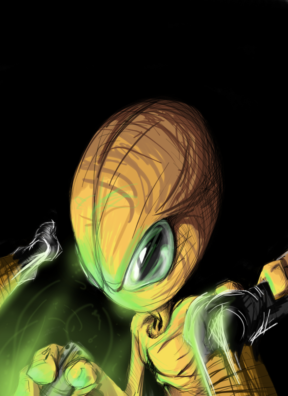
Okay, I know exactly how this is going to come across."Just more admin brown nosing...."
But alas, I have no real reason to kiss any behind here. This is purely done out of gratitude to the man who gave us this place, and who makes the show go.
But this is also the first in a series.
The next on the list (in a general order):
spyed
fuzzydemon
hextr1p
brazensix
And more as I begin to think of em...
Related content


Comments: 33


Hey, I would like to use this in a digital manipulation due to recent events. I ask because you simply have the best Jark brownnosed piece of art I've seen, and because of the recent events. I will give you full credit for your work, and I will give you final approval rights on the artwork (if it's not something you want your artwork associated with, you can back out). All I need from you is an OK, and I'll give you a rough draft and a final for approval. Thanks for your time Nate.
👍: 0 ⏩: 1

Sure thing  (Smile)")
👍: 0 ⏩: 1
I appreciate it Nate. The piece is in my gallery if you'd like to see it. See ya' in yellow on the 7th
👍: 0 ⏩: 0

Nice one Nate, I'm really diggin' the "master yoda" type thing. Your style seriously rawks!
👍: 0 ⏩: 0

really cool interpretation ov a well walked path.
damn cool idea
👍: 0 ⏩: 0

I can't tell where his left arm is coming from. It seems to be extruding from his crotch.
👍: 0 ⏩: 0

Very nicely done man. I love the muscle contour and the glowing rod is perfect. Excellent take on the man.
If you do me i'll fall outta my chair.
👍: 0 ⏩: 0

thats looks awesome, and yea his left arm does look a bit awkward.
👍: 0 ⏩: 0

This is incredible Nate! Very nice work But you have to do $attila !!
👍: 0 ⏩: 0


awesome, original style aswell! Although he has no penis which is kinda frightening
👍: 0 ⏩: 0

hehe.. this looks awesome. I have a bit of crit for it though.
First, what I think is done really well..
First and foremost is your line work, and the stylisation of the figure. I really like the confident shapes and contours, particularly on the hands.
The shading.. especially the highlight gradients, which really bring out the form.
Now some things that I think could be improved..
The arm on the right (his left) looks quite awkward. The forearm and elbow don't seem to join up to the shoulder.. and if they did, the upper arm would be too long. I actually think that that part of the arm can be removed altogether, coz it's really all hidden behind the giant fist.
I like the variable-width lining, but it seems a bit unbalanced in places. Maybe there's too great a range of thick and thin lines, but perhaps more importantly, in some places the thick part of the line is on the wrong curve (just my opinion.. I'm no expert).
Some bits of the colour go outside the lines (eg on his left fist, just under the eye, etc). Pretty pedantic I know.. but things like that can really irk me on drawings that are as clean as this.
Following up what hextr1p said.. I don't really agree with him, in that I think the ellipse works fine. But I do think that the opacity should be toned down a bit.
'tis great work though. Your drawings always have a rockin' style
/me drools at the thought of being nate-ified
👍: 0 ⏩: 0

*LoL* I KNEW this would come out looking sweet. When you showed me the lineart version, I could already get a sense of what you were going to do to it colorwise, and this just pops! Seriously, your cG'ing skills just continue to improve. I also like the presentation. This would come off well as a print. However, I have to give a bito' crit here. While the rest of the image looks great, and a lot of thought went into this, the shadow just lacks the luster of the rest of the image. Looks like it was just thrown in there. So if anything, clean up the shadow to fit the hoverJark, and this piece is even sweeter than it is now.
.H3X.
👍: 0 ⏩: 0

this so 0wns me. i love the style that you used in drawing this. you rock!
👍: 0 ⏩: 0

LOL
awesome work man
as usuall
cant wait to see fuzzy and b6
👍: 0 ⏩: 0


...and all this time I though he was THE weird yellow alien??
Seriously though dude, nice illustration. It'd make a sweet ass poster!
👍: 0 ⏩: 0

one of the best portraits that i have seen hear on dA. very well done. i cant wait to see the rest of them
👍: 0 ⏩: 0

Hey Nate, this is really slick. I dig it! Excellent composition, I've seen several of these portraitures and this is by far the best composed piece. Will this, and the others, be available for print on ?
👍: 0 ⏩: 0

.. you tell him to stop sticking that.......nm that ...
anyways very cool fear the floating jark.
👍: 0 ⏩: 0


hehe..
Its really cool.. nice colors and all..
I do believe you when you say you only did as a sign of gratituted..
thats very nice from you.. keep up the good work!
(ahem)
👍: 0 ⏩: 0


Oooo, that's dope. Honestly, I love the design. I think, however, that it would be better slightly smaller. Also, some of the edges have a little bleeding color going on that's distracting.
👍: 0 ⏩: 0


Just more admin brown nosing....
haha! kidding
very nice, looks great!
👍: 0 ⏩: 0