HOME | DD
 hNsM — Escalart Webdesign
Published: 2010-05-21 21:32:49 +0000 UTC; Views: 6212; Favourites: 19; Downloads: 134
Redirect to original
Description
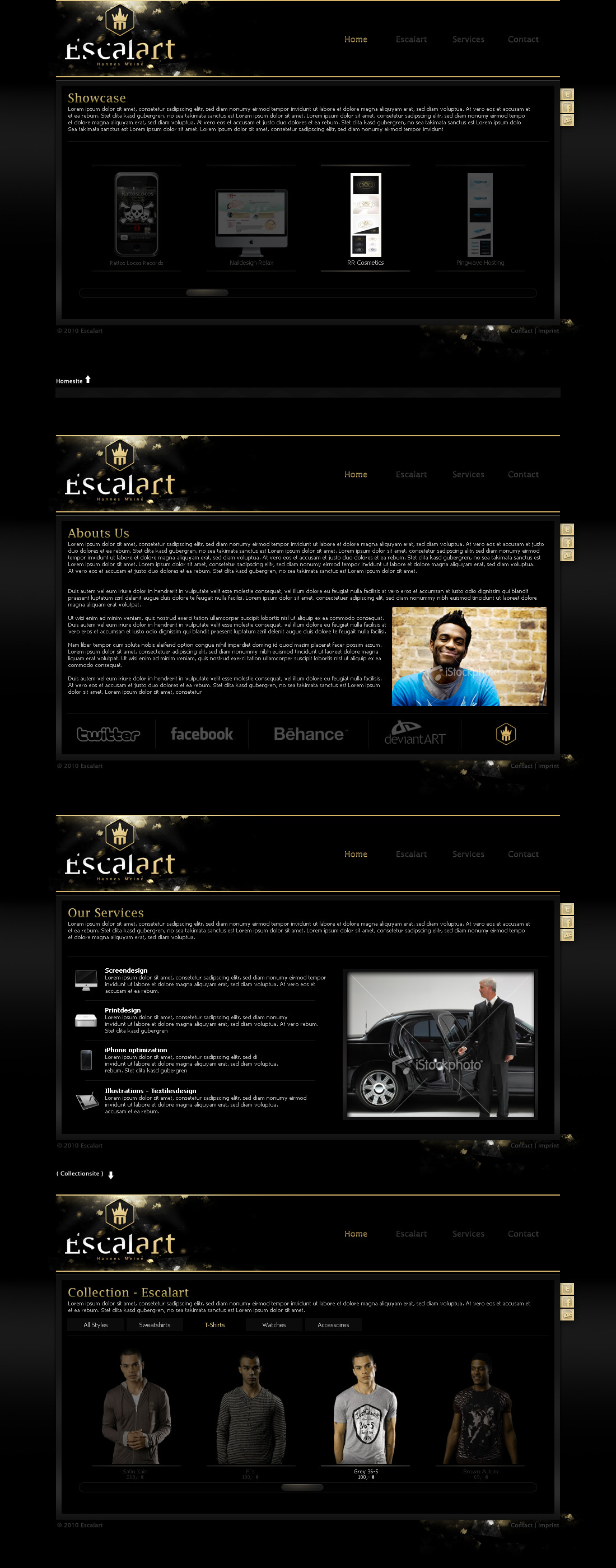
Escalart WebdesignUpdates Soon
iStockphotos only placeholder.
Related content


Comments: 24

Great style, good colourse and functional structure! Congraz!
👍: 0 ⏩: 0

Great design! Overview and graphical excellency are given, nice scrollbar, not too many items at one time to look at.
Maybe though, if someone wants to browse fastly to get a quick overlook and not look at every shirt/copmuter/etc solely, he might get a little frustrated, because he can only see 3 items at a time. (And when i go t-shirt shopping, i only look at the items which catch my eye immediately) So maybe a total overlook page could help?
👍: 0 ⏩: 0

Very slick. i really like it. Brilliant Colour Scheme  (Smile)")
👍: 0 ⏩: 0


sieht gut aus, das einzigste was mich stört ist dass das Design so dunkel ist. Logo gefällt mir wie bereits gesagt sehr gut!
👍: 0 ⏩: 0

looks good man, look forward to seeing it live soon
👍: 0 ⏩: 1
")


Die Navi gefällt mir nicht, genauso wie die drei rechtsbündigen Buttons. Ansonsten kommt das ganze recht schick rüber. Was mir natürlich am meisten gefällt sind diese grafischen Details beim Logo. Gute Arbeit mit wenigen Mängeln.
👍: 0 ⏩: 1

okay, von dir bekommt man wenigstens kritik
Navigation wollte ich recht schlicht halten, ohne besonderen rollover oder sonstigem.
Mal sehen wie ich schnell ich die online bekomme, brauche mal langsam eine page
👍: 0 ⏩: 1
Ja das ist mir schon klar. Aber schlicht geht auch schön!  (Wink)")
👍: 0 ⏩: 0

Gute farben und Ideen, gefällt mir ganz gut. Nur ein tick zu dunkel
")
👍: 0 ⏩: 0


Great! It's awesome, and good choice of this gold color.
👍: 0 ⏩: 1

