HOME | DD
 Hodremlin — Hodremlin's Drawing Tutorial - Shading Part I

Published: 2014-05-16 18:18:34 +0000 UTC; Views: 4348; Favourites: 118; Downloads: 50
Redirect to original
Description
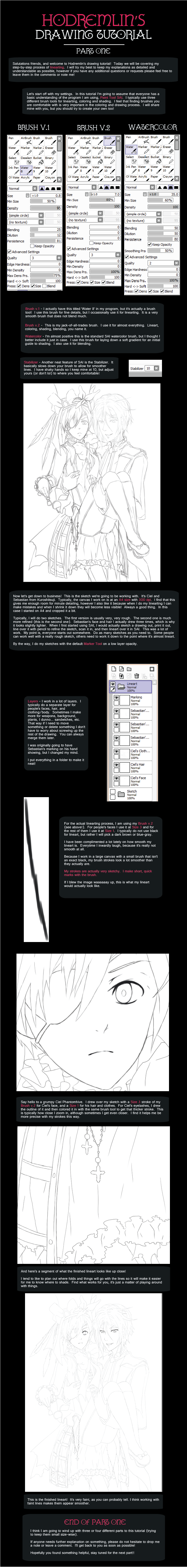
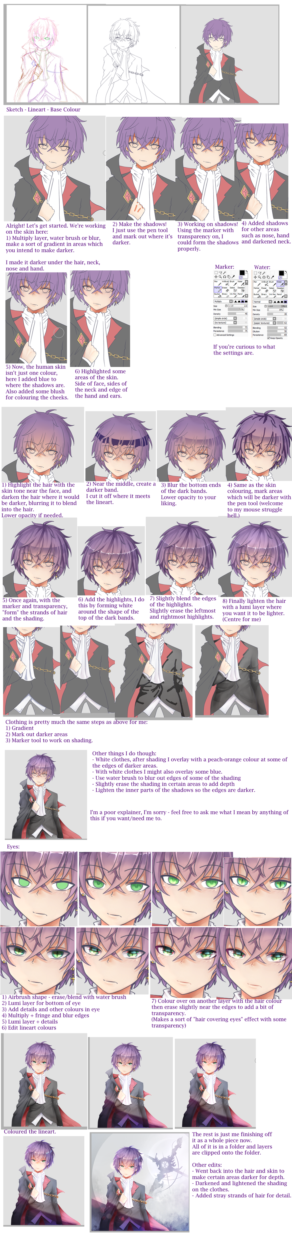
:Part One :Aaaaand, the second part is here! Part three should be up shortly since I have finished the actual piece! This part deals with coloring in the base colors and then how I shade in skin. Hopefully you can find something useful from it, and as always if you have any questions please feel free to leave them in the comments or note me!!
 Tumblr!!
Related content


Comments: 20

Oh, I love your artstyle so much. I used to follow your stuff before I deactivated my account! So I made a new one.
I was wondering if you have Part 3 uploaded or will upload soon? These are very helpful! The only tutorials I've seen that are so in depth. It means a lot to a person like me lol.
You're probably my favourite online artist to be honest! Can't wait to see all your artworks again, I actually made this account to look back at your art. (Is that creepy? lol sorry ahaha) but yeah! love your stuff.
👍: 0 ⏩: 0

Thank you for the awesome tutorial!! I will definitely try it out
 (Smile)")
👍: 0 ⏩: 1

Thank you! I'm glad you found it helpful!!
👍: 0 ⏩: 0

How do you make backgrounds? D:
I use firealpaca.
I really want SAI but it doesn't work with Mac D:
👍: 0 ⏩: 1
I've actually never heard of Firealpaca before, but it looks pretty similar to SAI from what I just google'd.
For the background in this tutorial, I made the diamonds in Adobe Illustrator and pasted the png file into my drawing. I put a gradient image beneath the pattern on Multiply and then put a gray color on top of it. In the middle of this tutorial you can actually see my Background folder that holds the three layers. For backgrounds in general I just create a folder to hold the background layers underneath the character I want to color in to keep them separate.
I'm not sure if I'm answering your question or not, haha. I believe someone actually made a hack of SAI that is compatible with Macs, however pressure sensitivity for tablets doesn't work with it. I hope they come out with a version of SAI that is compatible with Macs soon!
👍: 0 ⏩: 1
Yeah! I tried that SAI, it's really bad. D:
I have Adobe Illustrator... I just don't know how to use it ;-;
I also don't know how to post a PNG file into my drawings.... D: I know I'm bad. ;-;
If you check my profile you can see I need a lot of improvement.
Firealpaca has the blending tool, with normal, multiply, add, overlay and screen
Can you tell me what these mean?
Thanks if you reply. >.<
👍: 0 ⏩: 1
I'm going to look into the program you're using a bit more and then I'll get back to you with a better explanation! (Probably tomorrow or Monday since I have to work today, but I'll definitely help you out!)
👍: 0 ⏩: 1
Aw! ;-;
Thank you >.<
It's free so.....yeah. X3
Thanks very much~ <3
👍: 0 ⏩: 1
(Adobe Illustrator is REALLY hard to learn how to use at first. Illustrator is a vector-based program as opposed to a raster-based program like Photoshop, SAI, or FireAlpaca. Illustrator isn't something you can just learn overnight so don't feel bad if you think it is difficult!)
To put a PNG file into a drawing I usually just select the image and then paste it into my drawing. It's really as simple as copy and pasting, and will create a new layer that I pasted it on. PNG files are nice because white will appear transparent! So when I pasted the image of the diamonds into my background only the dark parts showed up, the rest was transparent!
So I looked into this program a bit more. From what I am seeing here in FireAlpaca, you can pretty much do the entire tutorial that I posted.
Honestly it seems a lot like SAI and probably has almost the same capabilities. A lot of the functions are the same, just named different things. Like in SAI, there's this thing called the 'Stabilizer' that will make your pen strokes smoother, and in FireAlpaca it's just called 'Correction'. I'm guessing this program is pretty much like how GIMP tried to copy Photoshop. From what I am seeing here in FireAlpaca, you can pretty much do the entire tutorial that I posted.
I honestly don't think that you really need that much improvement, your artwork is very good!
Blending modes are in FireAlpaca, SAI, and Photoshop. They are kind of like filters that people use on photography, but they can also be used in painting!
Usually what I do when I use blending modes is a create a new layer over another layer. I would then clip that layer to the layer below by selecting the 'Clipping' option. Now when I go to fill in this new layer that I have just created, I will not spill out any of my color on to another area (so I'm basically coloring in the lines). You can either use a brush to color in small sections with a new color, or use the paint bucket to fill the whole thing in.
It's probably going to be easier to explain this if I just show you some examples.
Link to image!
This is a drawing I'm working on right now. The picture on the left is how it looks without any blending modes at all. The second picture is after I created a new layer and applied a Clipping Mask above his scarf and filled it in with a bright green color with the Paint Bucket Tool. The third picture is after I turned the blending mode to Multiply. The fourth picture is after I lowered the Opacity of the layer to 15% with the Multiply function still on. The fifth picture is back on Normal but with 15% opacity.
The other ones will have similar functions. Luminosity and Overlay typically make things lighter. I sometimes use this for highlights.
You might notice that the last two images (fourth and fifth on the right side) look pretty similar. The Multiply function actually allows some of that blue from his scarf to show through.
Blending modes are something that you really just have to try and play around with. I use them sometimes if I want to change the mood of a drawing (so I will fill the entire drawing with a layer of blue and then set it to Multiply to make it look like a night scene or something.
I hope that was a bit helpful. Sorry it took so long for me to respond too, I've been working my summer job and haven't had too much time. If you have any additional questions though please feel free to ask (I can also clarify more on this stuff too if it is confusing!).
👍: 0 ⏩: 1
Oh, it's okay~ You helped me a lot so the time I waited was all worth it!
Your WIP is amazing!
I understand a little better now... Thank you so much for explaining and actually using the program for me.
It really helped a lot~~
But, now I have a few more questions >_<
I'm so sorry~~
But
1. Where's the Correction?
2. Now... Let's talk about Canvas Sizing.
I'd draw much more than I do now digitally if I knew about the Canvas Sizing....
What would you recommend?
Sorry, but if I make it too big it becomes pixellated... And when I make it too small, the drawing I'm trying to draw won't fit...
It's really confusing and annoying >.<
Sorry~
But these are the last things I'll ask you, I promise!
👍: 0 ⏩: 1
Late reply again (sorry, been super busy with work!)
Correction should be at the top of the screen near File, Edit, etc. It's right under it. It has values set from 0 - 19. 0 will make your strokes very fast, while 19 will make them slow, yet smooth. I personally set mine at 10, but that's because I have shaky hands.
As for Canvas Sizing, I typically work in A4 at 300 dpi. When you create something, you can always make it smaller without losing quality, but you can't always make it bigger. I find it easier to make things large then shrink them down if I need to. On the internet, everything is set at 72 dpi, but I like 300 dpi in case I ever need to print something out. dpi stands for 'dots per inch' which means there are 300 pixels per inch at 300 dpi. The less dpi you have the more pixelated the image will look. I usually zoom way in when I draw something too, usually working at about 200% at my canvas size. Too big of a canvas might make your computer slow down though, so I wouldn't recommend doing that. A4 or US Letter at 300 or 350 dpi is usually a good size for digital artists.
You can ask me as many questions as you want (you aren't bothering me!). I think it is important for all artists on here to help each other out because that's how we all grow and improve as a community!!
👍: 0 ⏩: 1
Thank goodness because I have more questions. >_<
I never knew what DPI meant... I was always wondering why my drawings would come out so pixelated!
I have a friend who uses 1000 dpi.... Would you recommend that?
All I really want is the smoothest of lines so when I zoom in you can actually see pressure D:
How do you get A4?
On Firealpaca I don't think that's a fixed setting...
Or is it?
👍: 0 ⏩: 1
Then hopefully I have the answers, ahaha.
1000 dpi seems excessive to me. I've never heard of someone using it that high before, actually. If I tried to make it 1000 dpi on my computer my program would probably stop working because that would be a HUGE file.
dpi makes the most difference when you want to print something or scan something in. You will still get smooth lines at 72 dpi, but if you zoom in they will look a lot more pixelated than if it was 300. Once you upload something to the internet it is automatically converted to 72 dpi, even the deviations we submit. I work at 300 dpi because it makes it easier for me to draw that way and if I ever wanted to print something out I know that I would have a quality image to work with. I could also resize the image to make it slightly larger without it becoming pixelated. 300 dpi is the number I see a lot of artists on here working at, which is why I originally chose it.
A4 is internationally sized paper. At 300 dpi my canvas size would be 2480 x 3507 pixels (21 cm x 29.5 cm). I sometimes work in US Letter size too (which is 8.5 inches X 11 inches). It's just a commonly used paper size, which is why I picked it. There are really no rules or restrictions when choosing size, but I personally prefer to work larger. You can always shrink something down without losing a lot of quality, but you can't always make it larger without making it look pixelated.
👍: 0 ⏩: 1
Ah, I see. I haven't experienced my program to stop working yet so I don't know exactly know what happens~
I changed mine to 600, I found it better to use ")
I checked online and I got the dimensions!
With my program I can enlarge without pixellating, so that's a plus!
👍: 0 ⏩: 1
Haha, your computer is probably better than mine then!
600 dpi is normal for when you scan things in, so that sounds like a good number to be working at!
I think once you find settings you're comfortable with you will find that your artwork will improve a lot! I'm glad you're getting things working, and if you ever have any other questions please feel free to ask at any time!!
👍: 0 ⏩: 1
Maybe you're right!
I'm trying to draw Christie Monteiro in a fullbody pose -I might stop drawing her actually- and the thing is, It's really out of proportion D:
I'm a HUGE perfectionist so it's really annoying to get the anatomy and proportions all wrong haha...
I've drawn her on paper before, I'm contemplating on scanning it, but when I scan things it turns really small, and I have to zoom in, which makes my pensize way too big, or pixellated. Dx
I need help with that, I think.
I'm better at drawing when I do it on paper, not when I do it digitally >_<
It's so frustrating!
👍: 0 ⏩: 1
I can totally relate! I'm a perfectionist as well, most of the time anyway (sometimes I do get lazy...).
A lot of people don't think that proportions are important when they draw Anime because it's 'cartoons', but I believe that understanding proportion will greatly improve your art. Are you using a reference for proportions? A lot of times if I'm having trouble with a pose I stand in front of a mirror and take a picture of myself doing the pose, then look at it as a reference on my computer. I find that this has helped me out a lot. There's also tons of stock images online, or sometimes I will even use a picture of someone cosplaying the character as a reference. I didn't use to use references at all, but once I started I found that my drawings really improved.
What type of scanner are you using? I'm sure there's a way to change the settings of the scanner to fix your problem. Usually it will give you an option of what size you want the file to be (this is a place where dpi comes in again haha). Or, sometimes if I want to trace over a drawing that I scanned in, I will scan in the drawing and open it in SAI (or in your case FireAlpaca). Then I open a new document in the size that I want (my case A4 300dpi). I copy and paste the other image into my new file and enlarge it up to the size I want. This will make the scan pixelated, but my pen size will be correct when I trace over it at least.
It's totally fine that you're better doing it on paper, there's nothing wrong with that. Everyone has their strengths and weaknesses when it comes to drawing. It took me several years before I felt comfortable drawing from scratch on the computer, I used to always have to draw everything out on paper too. Now I find that I'm really bad at drawing things on paper...
👍: 0 ⏩: 1
That seems like a great tip... I might use it!
So many sketches I've done... And only one is good enough hehe xD
Do you have an email? I could send it to you~
I'm drawing the Vocaloid Oliver.
If I could get your help while I do my colouring or something like that it would help a lot~
The scanner is not mine, it's the schools. I recently found out I could change the DPI on the scanner so that makes me happy!
How do you clip a photo on Firealpaca?
I know how to make it the actual base but then it makes my canvas size tinier than It should be... And I mean SUPER DUPER Tiny D:
I don't think I can copy and paste a photo....can I?
Oh wow! o:
It's amazing how everything can change after practicing ^_^
👍: 0 ⏩: 0

I thought he was a girl at first before I started watching the show. I guess that still translates into my drawings of him. xD
👍: 0 ⏩: 0