HOME | DD
 Hoho-There-Lover-Boy — Rebel Blood (Updated)
Published: 2015-04-09 16:27:31 +0000 UTC; Views: 342; Favourites: 3; Downloads: 0
Redirect to original
Description
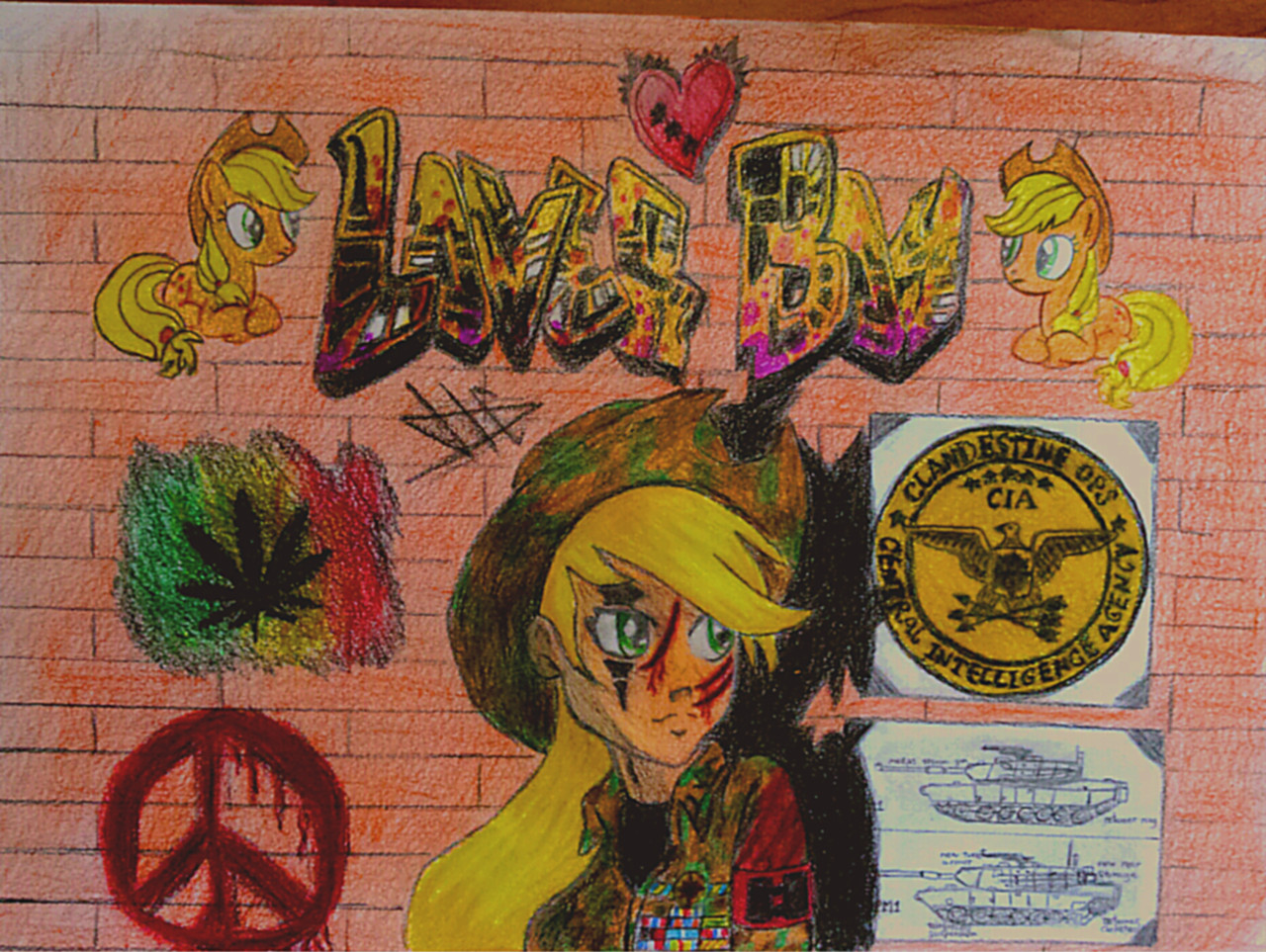
(More colored and brighter light)So finally I've finished the goddamn profile picture. I've been working on this for quite a while, I hope it was worth it.
Applejack is totally stolen from fav.me/d5oxeab and the rest is just some random shit.
Tell you thoughts on the comments, I always want to hear your opinions.
Related content


Comments: 24

Do you actually smoke weed or is that just to make you look tougher
")
👍: 0 ⏩: 1

Yep I have smoked weed, but I'm not that of a smoker, I don't like it at all, even less for tobacco, I'm more of a drinker than a smoker.
On the picture and on real life I use the symbol to represent the freedom of choice and not actually the marijuana.
Cool that you ask, as it was intended to cause some effect.
👍: 0 ⏩: 1
Ah cool...? XD
What do you mean?
👍: 0 ⏩: 1
c: idk I was just wondering
👍: 0 ⏩: 0
I'm glad you like it
What do you like from it concretely?
👍: 0 ⏩: 1

I love the design! And, you are good at coloring!! Everything is awesome!
👍: 0 ⏩: 1
Yay, thanks.
Still, I by myself don't really like but I don't know why, something seems wrong, that's why I try to discover what is correct and what is incorrect on this picture.
But it seems no one really knows either.
👍: 0 ⏩: 1
It looks pretty good to me. I don't see anything wrong in it either.
👍: 0 ⏩: 0

Esto se ve tan genial!! Tiene tantos detalles y todo se ve bien detallado ")
👍: 0 ⏩: 1
Thanks
Claro!
o setas si quieres (son lo mismo)
(Aunque en la imagen mas bien sirve como simbolo de la libertad, pero da igual)
Por cierto, que es lo que mas te gusta de la imagen?
👍: 0 ⏩: 1
Bueno en si todo en el dibujo me gusto, pero si tuviera que elegir alguno iria por el tanque
👍: 0 ⏩: 1
Vaya! Lo del tanque si que no me lo esperaba, solo es un pequeño detalle
Puede ser de que haga mas en el futuro ya que suelen quedar bien, pero no lo tengo claro ya que resultan ser dificiles de dibujar por los minusculos detalles y por no poder equivocarse (ya que no puedes borrar cosas pequeñas)
👍: 0 ⏩: 1
Ok! En todo caso me gustaria mencionar que yo aprecio y me gustan los pequeños detalles en un dibujo y comprendo lo dificil que puede ser el dibujar a lapiz y papel, por eso siempre he apoyado a los artistas tradicionales, por lo comlplejo de su trabajo. De todas formas, sigue dibujando tan genial como hasta ahora
👍: 0 ⏩: 1
Lo facil con el lapiz es de que puedes crear dibujos en sucio muy deprisa y sin mucho pensar y quedan realmente bien, lo complicado es poner detalles y colorear/sombrear ya que no puedes equivocarte y no tienes ningun tipo de ayuda como en el digital las capas.
Por ejemplo dibujar un caza y un par de effectos es muy facil, ahora lo dificil es poner todos los detalles, sombrearlo correctamente y colorearlo.
sta.sh/0plj61a9no8
Ahora me lo pregunto, porque no deberia hacer mas de estos dibujos a este estilo?
sta.sh/0f4u4hj0m1q
👍: 0 ⏩: 1
Ambos se ven increibles! La verdad me encanta tu estilo es algo que no he visto en cualquier lado más
Y si, hay cosas que solo se pueden hacer en digital y otras en lapiz :3
👍: 0 ⏩: 1
Eso crees? Yo creo que no tengo ningun tipo de estilo en particular, puedo hacer casi todos los que vea, pero el mio son solo un puñado de lineas repetidas una y otra vez cuando dibujo con lapiz y mezclar negro o blanco con colores cuando los coloreo. No es un estilo del todo creo yo.
Eso es totalmente cierto :3
👍: 0 ⏩: 0

Holy bong this is nice. I love the design of it all.
👍: 0 ⏩: 1
Holy bong XD
What is what you most like of it?
I think I need to make another photo, because it turned much brighter than it actually is, there are white reflections all over the picture and it isn't supposed to be that way.
👍: 0 ⏩: 1
... There is still something wrong with my phone, lately it takes blurry pictures.
👍: 0 ⏩: 1
Oh yeah? That sucks ")
👍: 0 ⏩: 1
The phone sometimes makes great pictures and sometimes not, I don't know.
The graffiti is simple, letters with some lines and bubbles on it.
This can help you www.graffiticreator.net/
O yeah the thing with Applejack is a special subject, there are only a few people who likes to see the MLP characters with blood, I'm pretty sure that if I would make it identical to the original , much more people would have liked it, but that would have been shit, because it's just the same has the original from another person (The one here is actually also the same, but extremely modified).
The background is easy, just straight horizontal lines and then some vertical lines (One row yes, one row no, one row yes...)
👍: 0 ⏩: 1
Ah interesting, thanks for the tips good chap!
👍: 0 ⏩: 0