HOME | DD
 Holy-Promethium — Blog+Portfolio Design
Published: 2007-03-28 17:34:20 +0000 UTC; Views: 1184; Favourites: 6; Downloads: 44
Redirect to original
Description
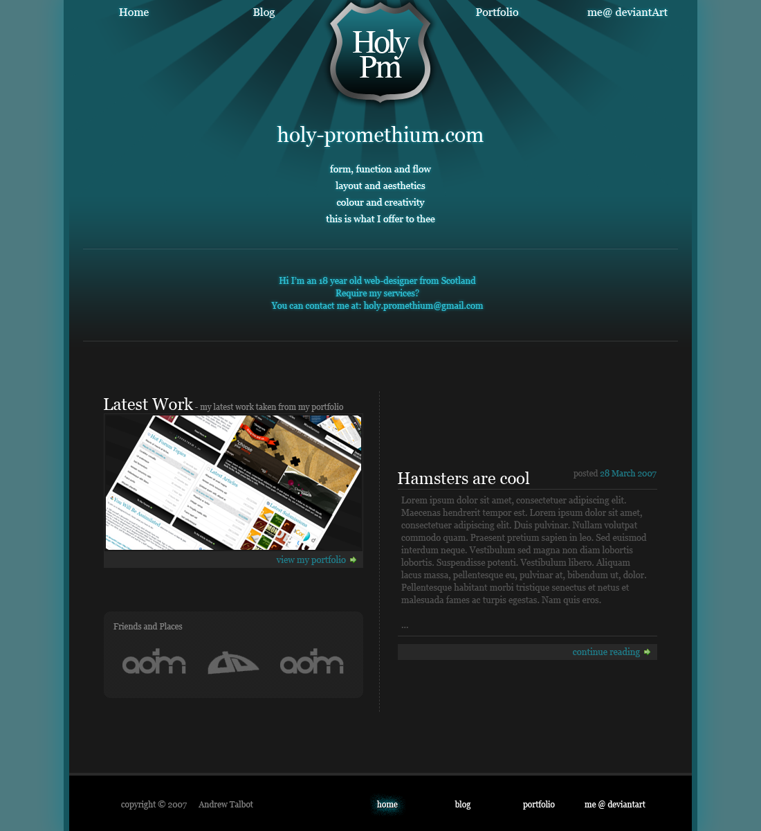
Redid it, decided to do a seperate deviation for it seeing as its not really that similar to the last version.Background probably needs changing, and the little rhyme thing... I may need to have another look at it, I did it in a rush.
Anyway, apart from that I'm pretty satisfied with how it turned out.
Comments appreciated.
Related content


Comments: 14

 (Smile)")

Nice design
though the top part looks a bit 'wasted', for it contains much emptiness..
👍: 0 ⏩: 0
Nice design
though the top part looks a bit 'wasted', for it contains much emptiness..
👍: 0 ⏩: 0

nice but i hate that brush ")
👍: 0 ⏩: 1

It isn't a brush, I had to use Polar Coordinates on some vertical rectangles in Photoshop.
👍: 0 ⏩: 0

Its a good spot, but think about using the empty space a bit more.
👍: 0 ⏩: 0


block?
this isn't to your par my friend, just looks rushed and theres nothing that jumps out at me that makes me say "wow".
As much as I like elusive I dont particularly like his style that much and this reminds me of it.
You can do better.
P.S sorry for sounding like an asshole.
👍: 0 ⏩: 1
I don't know if it was necessarily block, but more of a want to try something new out.
Though, when you mention what you do, I can see what you mean...
Expect a third attempt.
👍: 0 ⏩: 0

You spelt hamster wrong
It's really nice, love the colours
")
👍: 0 ⏩: 1
No... I didnt...
Thanks for the praise though
👍: 0 ⏩: 0

i think it has a bit too much outerglow, but thats just my opinion, i dont like outerglow ")
👍: 0 ⏩: 1
I dunno, I quite like it.
👍: 0 ⏩: 0

Well i really do like this. you have alot of nice work
👍: 0 ⏩: 0