HOME | DD
 Holy-Promethium — The Magic Circle Website
Published: 2008-03-23 15:47:26 +0000 UTC; Views: 3185; Favourites: 21; Downloads: 144
Redirect to original
Description
Client:Class Work
Done in:
Photoshop CS3
Time:
3 days of development, as well as a few hours of thumbnail sketching.
Solution:
Assessed class project for my Graphics Course.
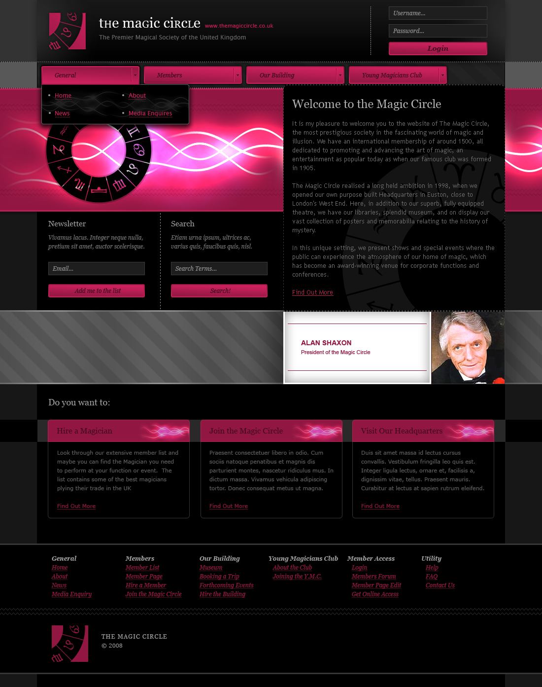
Brief was to create a website focused on either Magic, Science, Space, Film Festival or Gardening.
I decided to go a different direction to everyone else and do a re-design rather than a completely new website, the re-design is based on the official magic circle site which you can find here: [link]
Tried to get it to look "Magical" through the use of effects and colours that I would generally associate with magic (Purple and Black).
My most important task was to try and organise the information beyond the current Nav, Header, Content Area solution currently used as well as categorising the navigation to make it easier for users to find the relevant information (as well as the 3 boxes on the home page for 3 common uses of the site for quick-finding).
Hope you like, all comments welcome.
Related content


Comments: 19

 (Smile)")


What font is that for "general", "members", "our building"?
👍: 0 ⏩: 1
Awesome, thanks! Works perfectly with the design.
👍: 0 ⏩: 0


You always produce good work
👍: 0 ⏩: 1

We'll agree to disagree on that one 
👍: 0 ⏩: 0

nice, but I think the magenta buttons needs an update. they doesn't match the style of the design.
👍: 0 ⏩: 1
I would've thought colouring them the same purple/pink would've tied them in.
What would you suggest?
👍: 0 ⏩: 1
The color is good but the effects are not good.
👍: 0 ⏩: 0

nice layout, but duuuuuude thats one serious ugly MOFO ")
👍: 0 ⏩: 1
Yeah. Unfortunately he's a magician, and the actual president of the magic circle.
He could do the sawing a box in half "trick" on you if he hears you say that  (Wink)")
👍: 0 ⏩: 1


")