HOME | DD
 tehacesequence — Elegant abstract
by-nc-nd
tehacesequence — Elegant abstract
by-nc-nd
Published: 2008-09-09 03:59:03 +0000 UTC; Views: 14054; Favourites: 82; Downloads: 426
Redirect to original
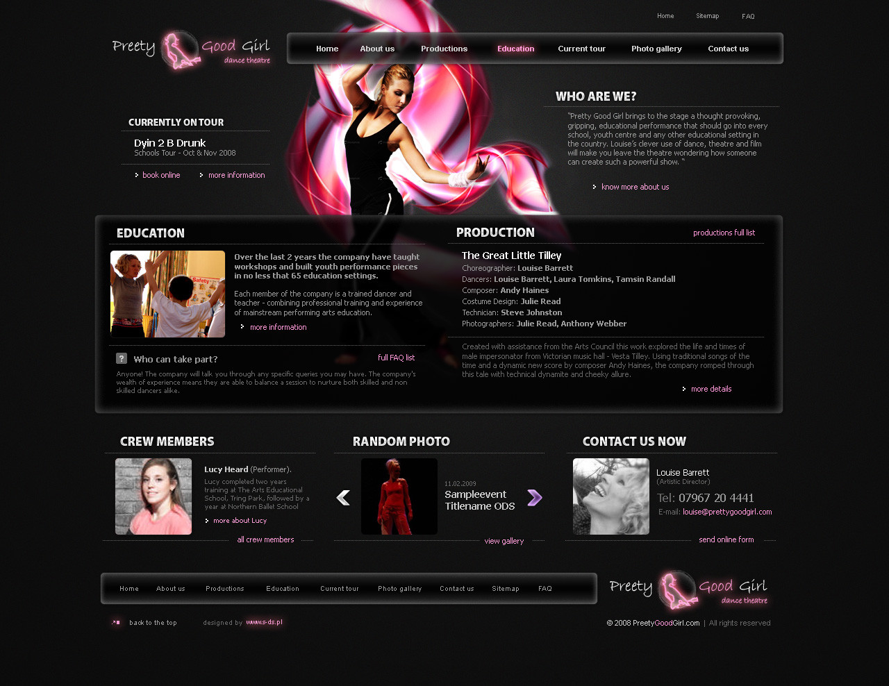
Description
thx for watching ;] any activity (fav&com) already appreciatedRelated content


Comments: 31

")

really nice simple beautiful design, I love it!
Awesome!
👍: 0 ⏩: 0


awwwesome dude. like all of your work of course.
if i may lend a critique, I somewhat agree with ~kakarottt . As cool as the design is, since its for a dance studio, it might be good to go even more heavy with the graphics (at least on the home page), and less with the text.
Though this is a flash site, this is a good example: [link]
Just an idea - keep up the sweet work!
👍: 0 ⏩: 1

will revisit if the client allow to ;] can't find time to do it for my own pleasure
👍: 0 ⏩: 1
definitely know what you mean...time = money!
👍: 0 ⏩: 0


i think that the woman does a lot  (Smile)")
anyway nice concept
👍: 0 ⏩: 1
it's the first client request to change her ;/ thx
👍: 0 ⏩: 0

rizpixel [2008-09-10 06:41:46 +0000 UTC]
header is really nice speailly pink colored effect .i like it
👍: 0 ⏩: 1

The logo says preEty, not pretty
It seems like you tried to adapt your style for something less 'corporate'... It didn't work 100%. Something about the big box in the center with "EDUCATION" and "PRODUCTION", doesn't relate to the "WHO WE ARE" and "CURRENTLY ON TOUR" bits.
That and my first thought for a design for a dance studio would be a nice big image... heavy in the visual/graphic department, and then informational elements playing on the 'motion' of the graphic. similar, but different o_O
My abilities can't match yours, but i hope my critique might spark an idea.
")
👍: 0 ⏩: 1
I'm doing something more in the style you've talking about right now, took some time to finish thought, thx for your oppinion, at first I want to put that woman and lay the design around her but client refuse that idea, so that's where the boxes comes from ;] thx again for your comment
👍: 0 ⏩: 0


weaker than your usual output dude. something is off. but i cant put a finger on it. not that it's not good. just not up to your usual excellence
👍: 0 ⏩: 1
:] noticed that already, but it had a potential ;] maybe some day... probably not
👍: 0 ⏩: 0

 (Wink)")


very impressive...i like the level of detail in content
👍: 0 ⏩: 0


Ogólnie to jak dla mnie trochę to wszystko za ciemne.
👍: 0 ⏩: 0