HOME | DD
 hotiron — CS5 Binder Style

Published: 2010-05-05 19:56:37 +0000 UTC; Views: 27000; Favourites: 213; Downloads: 7273
Redirect to original
Description
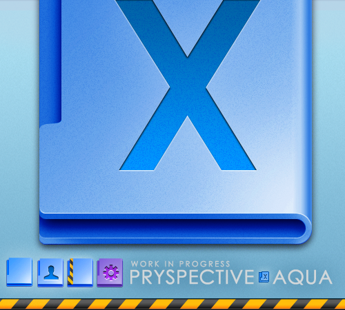
These are based on the psdtuts+ address book tutorial which I've been playing around with lately. I think they make cool binder-style CS5 icons to replace the sort of flat and unexciting new CS5 "book" style default icons. There are 42 ICNS, PNGs & ICO files for 1- of the most popular apps plus generic and blank versions. Let me know if you want others.Related content
Comments: 78

Good point. I run both Vista and Win7 in Parallels5 but I haven't tried modding anything there. I run one or two apps with just CrossOver bottles and that's about it now-a-days.
👍: 0 ⏩: 0

Not bad mate but I would give the cover a little noise it's a bit to smooth.
👍: 0 ⏩: 1

I'm adding some texture now, thanks for the tip!
👍: 0 ⏩: 1

no worries good work keep it up
👍: 0 ⏩: 1

This release has a lot more texture on the book covers and bindings & slightly more noise and lighting.
👍: 0 ⏩: 1

Definit improvement I made a book folder icon for myself with the Death Note cover , I'll post a pic to my scraps for you to check out when I get a chance.
👍: 0 ⏩: 1

Sorry took so long was on my laptop which was in the west wing
[link]
👍: 0 ⏩: 1

frankly I'm keeping the old version with the previous font... this one looks also good!
👍: 0 ⏩: 1

sorry...found it... the name was wrong... CS5_DPs_Book_8_blank should be CS5_Ps_Book_8_blank
thanks for sharing anyway!
👍: 0 ⏩: 1

I updated this with a new look to the text (Asia font) and the number "5" (for CS5) in subscript. The download has eight of the more popular app icons in it now.
👍: 0 ⏩: 0

you forgot to include the PS book... there's only the blank blue book in the pack
👍: 0 ⏩: 0

looking great... better than the default CS5 icons!
👍: 0 ⏩: 0

That's good, if you had AI will be better
👍: 0 ⏩: 2

I updated this with a new look to the text (Asia font) and the number "5" (for CS5) in subscript. The download has eight of the more popular app icons in it now.
👍: 0 ⏩: 0

I added sample ICNS files for most of the suite plus the same in blank colors in the download.
👍: 0 ⏩: 0

I agree with =Gor0n
I really like the concept, only that cs5 text won't be visible on smaller formats.. But i guess it's not that important..
👍: 0 ⏩: 2

I updated this with a new look to the text (Asia font) and the number "5" (for CS5) in subscript. The download has eight of the more popular app icons in it now.
👍: 0 ⏩: 0

Yeah, thanks. I made the text changes in this preview.
👍: 0 ⏩: 0

Too much shadows on the letters 
👍: 0 ⏩: 2

I updated this with a new look to the text (Asia font) and the number "5" (for CS5) in subscript. The download has eight of the more popular app icons in it now.
👍: 0 ⏩: 1

Better text effects 
👍: 0 ⏩: 1

Thanks, I just finished a new preview too (because I have been using these and am starting to warm up to them). I am working on from-scratch 16px and maybe 32px smaller versions and then I will take down the -WIP-.
👍: 0 ⏩: 0

Yeah, you're right. I changed the text depth and remade a few of the highlights in this new preview.
👍: 0 ⏩: 0
