HOME | DD
 Hullabaloo2 — Aprodite and the Erotes II
[NSFW]
Hullabaloo2 — Aprodite and the Erotes II
[NSFW]
Published: 2005-11-21 22:01:41 +0000 UTC; Views: 31625; Favourites: 709; Downloads: 2013
Redirect to original
Description
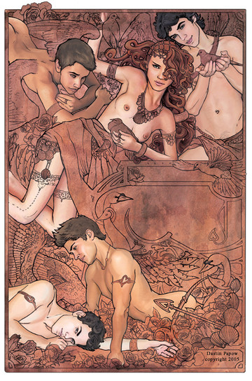
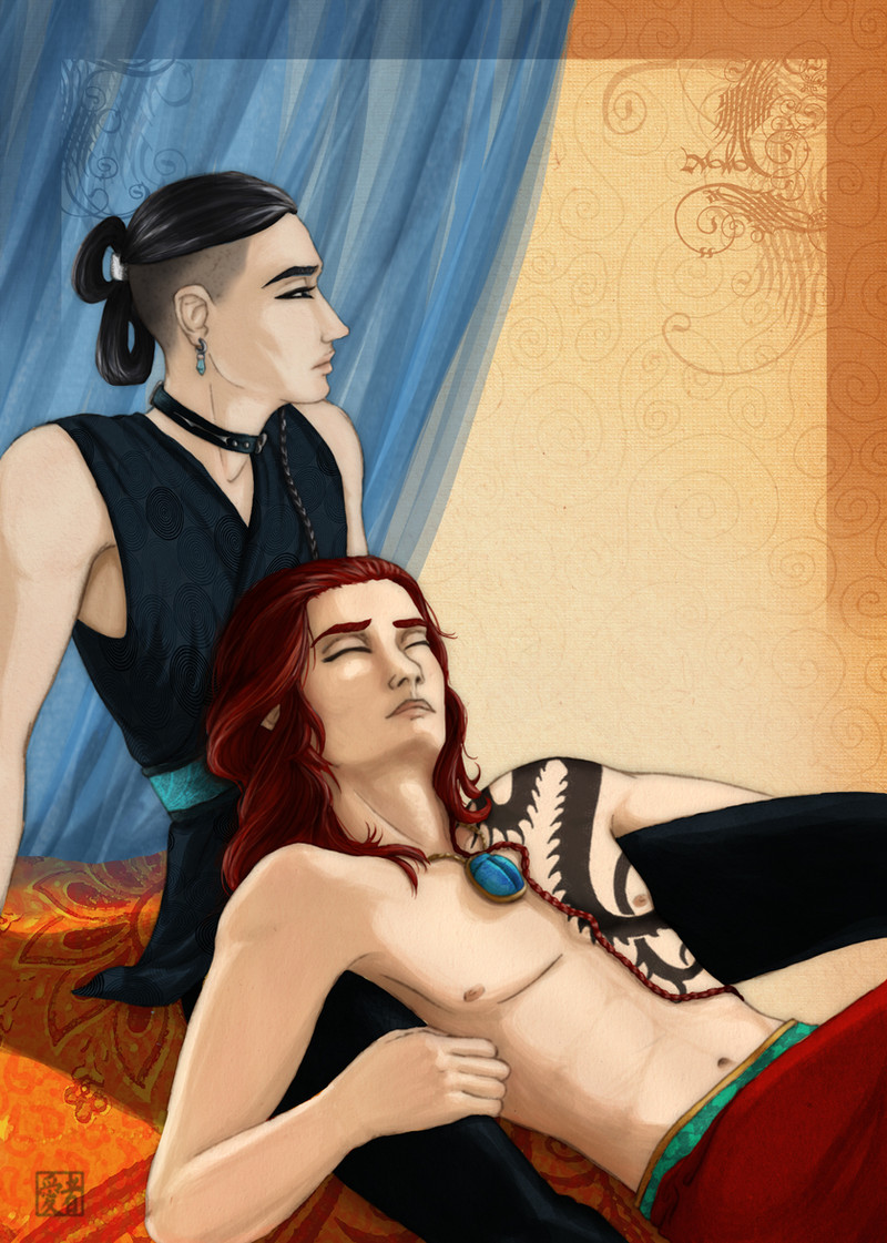
This is a test.This is my first full rendering digitally.
Should I push it further or keep it as is?
This is the second version of this piece. I intend on painting the whole thing, including all the borders and flowers. But my teacher wanted me to leave it like this. So I thought I'd post it for feed back. Look at the first version (Flat color) for a very detail description of the content. Photoshop.
I would appreciate opinions and constructive critism since this is an inbetween stage (even though its also a finished version).
Related content


Comments: 106

sorry but this as a whole is a great piece! i dont have to comment on anything..your colors compliment your linework and the realism is just so amazing!
👍: 0 ⏩: 1

Yea I have accepted this as the way this peice is supposed to be so I will not push it further. Thanks for taking a look at it.
👍: 0 ⏩: 0

a while ago, and i'm sure you've made a decision by now... i think this looks great as is. pushing it further, to me, would take away from its charm
👍: 0 ⏩: 0

")


This is an exquisite picture! I agree with your teacher, I love it just the way it is. The figures are so eye-popping as the only "finished" portions of the picture, but the light texture in the background keeps things interesting. I also love your linework, and all the little details in this.
👍: 0 ⏩: 0

Buon giorno.
Sono del Brasile ed ho trovato il relativo lavoro molto buon.
Congratulazioni!
Giustificazione se scriverà male. Sto utilizzando un traduttore in linea.
---
Olá.
Sou do Brasil e achei seu trabalho muito bom.
Parabéns!
👍: 0 ⏩: 0


this piece is amazing, thank you for your intellectual analysis of my work.. if I was as good with words as I am with pictures I would be able to sum up how fantastic I find this picture.
👍: 0 ⏩: 1

Wow. This is just gorgeous. I've seen a lot of such sensitive renderings of images like this from women, but not that many from men. Which makes this picture kind of special. I lov the delicacy with which all the figures are rendered and outlined. The colour is earthy yet still quite powerful, very sensual. I think if I'd have liked to have seen anything more on this, and it stands very well as is, it would have been some very warm greys where the figures have wings, as the fact they are angels is almost completely obliterated by the monotone colouring of the rest. Just tinting the reddy colour with a little pale grey and adding that to the wings would just help that become a little clearer. It's a truly beatufiul piece of art, it has a quality to it that sings, something I've only seen in artworks where the artist truly believes in what he or she is doing, where they put a little of themselves into it.
👍: 0 ⏩: 1
Thank you for your wonderfula nd well constructed words. What can I say, I guess I have a sensitive side haha... I just appreciate beauty. Have you ever seen art nouveau?Its very sensitive and done mostly by men originally. I guess I just don't see all men's work as rough and hard.
👍: 0 ⏩: 1
Good point about art nouveau... and all the golden age of illustration masters. I take that back, then, but still beautiful artwork.
👍: 0 ⏩: 0


Wow, great use of art nouveau style!
👍: 0 ⏩: 0

i absolutely love this the way it is.. the skin pops out so wonderfully against that earthy burgundy. yum <3
👍: 0 ⏩: 0

I'm probably too late to change anything... but anyway ; here of course, the depth in the color is by far better (to my liking) than the "flat 2D" you did before... but there's a charism of color that I liked on the "flat 2D" that is not here... I think I can guess what you art theacher like on this one, leaving it like this... but it feel a little uncomplet to me. Maybe if the wings and the bird were colored too... ?
👍: 0 ⏩: 0


This does look good. The color choice really suits the mood of love and tenderness. I would add a bit of darker or lighter colors at certian spots within the browns to heighten the shapes. (like the Blind erotes' wings for example) Overall it's great. Keep it up!
👍: 0 ⏩: 0

This is beautiful! The colors really work well together.
👍: 0 ⏩: 0

OMG this is beautiful and so much more amazing than the original version (which was great itself) i cant wait 2 see what it looks like finished
👍: 0 ⏩: 0

I love this just how it is. I think if you painted the rest of the picture it would take the focus of the figures and perhaps make the picture too busy.
But the picture is very beautiful, the colours are pleasing to the eye and the figures are very well drawn. I particularly like the woman, she looks very seductive.
👍: 0 ⏩: 0

I reckon your teacher is right - it looks so unique like this....Kinda like your own hybrid version of art nuveau and realism. I love the faces on the figures especially.
👍: 0 ⏩: 0

I love it! I love bold outlines, it's so hot. The tones are awesome.
👍: 0 ⏩: 0

Wow, this is really romantic and sensual too! Very nice work... Very detailed too! Fabulous indeed.
👍: 0 ⏩: 0

it is very beautiful, i enjoy the concept very much.
👍: 0 ⏩: 0

 (Smile)")
Hmmm I kinda see where you get that from. But I never really looked at him before. He's really romantic. I see the same sensitivty in mine and his work.
👍: 0 ⏩: 1

that's an art nouveau artist, and yes you got "both of you the same" sensivity
👍: 0 ⏩: 0


i kept looking at this one, and thought that if you felt like pushing it even further, you could overload the center-right square with detail , but keeping the same coloring throughout, to maintain the contrast of the figures' skin...that's really strong
still love it
nice rendering of the birds!
👍: 0 ⏩: 1
I agree- it used to be a calander, but this version is not. So I am going to do some swans with chicks in the frame. I think that will look nice.
👍: 0 ⏩: 1
ahh --- mega duh...i just saw it in your gallery....that's what that space was for... i still curvy spinny flowery detailing so that there's no empty space, what was that called from art history...."horror vacui" fear of the void...
👍: 0 ⏩: 1
My friend robin always says that about me! Fear of space... haha!
👍: 0 ⏩: 0

without viewing your flats and just going off of what you said, i will share with you what a teacher once told me when i was faced with the same dilemma:
complete the assignment and do what the teacher wants. after that, do whatever the hell you want to it. if you feel its not complete, keep working til you get closer. if your like me, i never feel like a piece is done.
the best thing about working digitally is that you can practice and experiment as much as you want - and as much as the harddrive will allow.
it looks great, but i would love to see what materialzes if you push it as far as you intend. the best discriptions can never be appreciated by the listener as it would be if viewed in reality.
mho.
👍: 0 ⏩: 1
Beautifully said. I do intend on leaving this as a version in itself, and persuing my own agenda. Thank you.
👍: 0 ⏩: 0

wow... awesome work...
I agree with your teacher... leave it as is...
simplicity makes it elegant...
👍: 0 ⏩: 0

This is absolutely remarkable. As a finished image, it succeeds quite well--the contrast between the skillfully rendered skintones of the characters and the lovely lineart and texture of the background is pure eye candy. Fantastic work!
👍: 0 ⏩: 1
Thank you. That means alot to me!
👍: 0 ⏩: 0

It's outstaning, awesome, so beautifull, I love each character, so much going on, so many beatitull details.
I also like better this one, than the previous, not sure why though, maybe because the color are "stronger" in this one. Can't wait to see the other pieces of the calendar

👍: 0 ⏩: 1
Thank you. You have beautiful work yourself.
👍: 0 ⏩: 0

Daily Deviation....pictures that get the most attention on this site.
👍: 0 ⏩: 1
OH! Thank you :smile:
👍: 0 ⏩: 1
| Next =>