HOME | DD
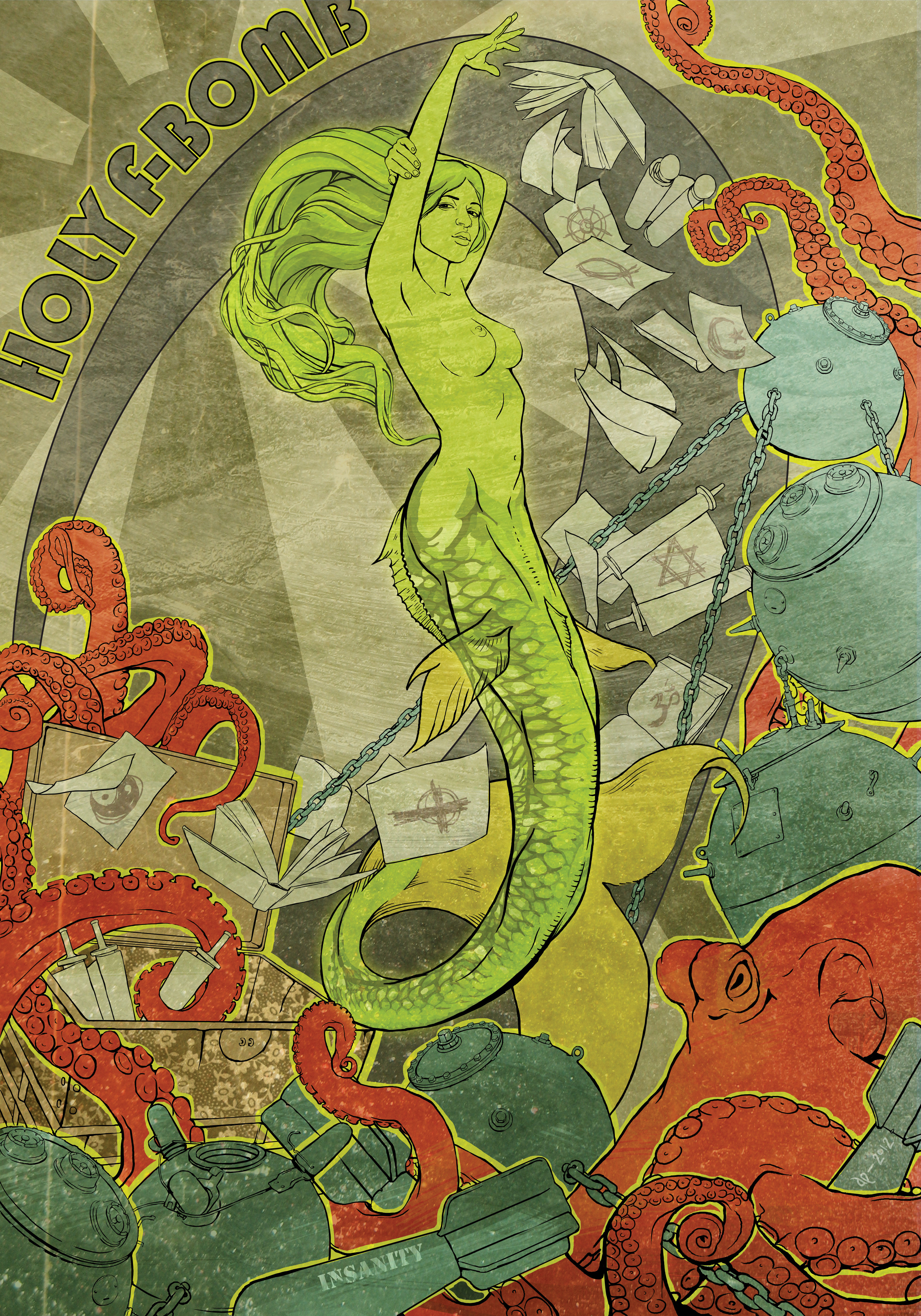
 Hullabaloo2 — Holy F-Bomb
[NSFW]

Published: 2011-01-29 00:41:13 +0000 UTC; Views: 3803; Favourites: 141; Downloads: 58
Redirect to original
Description
Hurray! My first new artwork in a very long time. I am working to illustrate again. I am very excited to be back.Many more to come.
Let me know what you think.
Here is an alternate version that I thought was nice. I will leave it up for a bit to get feedback.
fav.me/d389cic
Related content
Comments: 18

She's beautiful! I love the extra little fins on her tail & the tail's musculature. She'd look exotic with webbed hands like: sandcastler.deviantart.com/art…
👍: 0 ⏩: 0

I prefer this version. Message and writing aside, I think this one has much better colors - the green of the mermaid here really contributes to the illustration, as does that neon contour around the bombs and the octopus. Also, upper-left looks a bit empty in the alternate version.
Nice work!
👍: 0 ⏩: 0

2 words... freakin....awesome! i like the subliminal messages it has
👍: 0 ⏩: 0

I prefer the alternate. It lets you concentrate on the beauty and details of your art, rather than the emotions the words bring in on their own.
👍: 0 ⏩: 0

I agree that the text in the right hand corner is at first a little uncomfortable, but it definitely adds something. This is a very mature Dustin compared to what we've seen in the past. The title and the script together with the blow up of the religious icons is very powerful. It takes a minute to get used to it, but this piece is saying a LOT more than just a beautiful illustration and is not captured in the other piece. I also love the 70s look of it with the gray sun background and the popping colors.
If you can change the script and still get that powerful emotion of how horrible war is and how horrible people are to one another in the name of religion and god, then you night consider it, but I don't know what else you could possibly say.
👍: 0 ⏩: 0

I like this piece more, although both are interesting on their very own way. This one is stronger because you have chosen a theme, I think the theme in the other piece is not as visible and strong present as here. Besides I really like how you worked with colourcontrasts on a very saturated (got this word from a translater so I don't know if it's correct English, sorry) way. You don't let it get to you. The green and red work together perfectly and complement eachother. The only thing I "don't like" is the text in the upper left. I don't think it is necessairy and in my opinion it doesn't add something to this piece. But beside that I love it.
I'm so glad to see new work of you, it's been a long time and you were one of the first I admired here on DeviantArt.
👍: 0 ⏩: 0

I like the other version more. It's more simple and has nice colors.
👍: 0 ⏩: 0

Thanks brandon! I am so very glad to get back into my work. If you know of anyone in your network looking for illustration work send them my way!
👍: 0 ⏩: 0

It's awesome to see a new illustration from you. I absolutely love the composition here!!! I think that I prefer this version more than the other. There's nothing I can critique; your skill and concepts are absolutely inspiring to me.
👍: 0 ⏩: 0

Although I don't understand the concept/what you're trying to get at (Which I highly recommend you discuss in the artist comments), this is an awesome piece of artwork. The effects, colors, line-art etc. all add up to a job well done.
👍: 0 ⏩: 0


