HOME | DD
 Hyena27 — Elements ANB Comic Cover
Published: 2011-10-24 03:28:30 +0000 UTC; Views: 2441; Favourites: 27; Downloads: 8
Redirect to original
Description
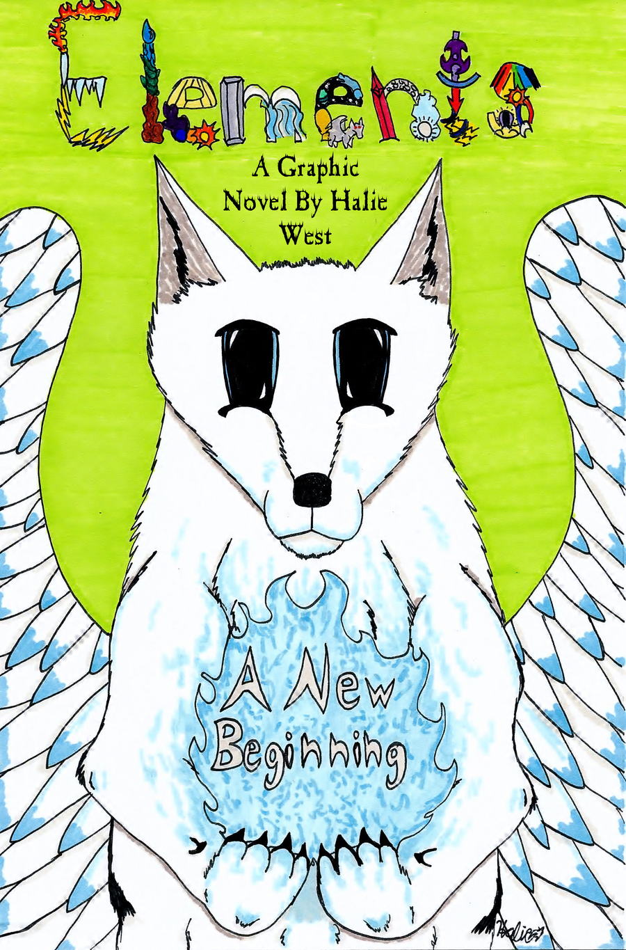
First Page:[link]Heres the cover to my comic
") Finally it's finished. Please tell me what you think! So thats Devan the Goddess of Elements.
Finally it's finished. Please tell me what you think! So thats Devan the Goddess of Elements.Art/Comic/Character(c)*Hyena27
Related content


Comments: 48


Impact
I really like how you did the colouring, alot effort put in. The title is a bit too fancy with all the elements. Try a more simpler one with slight fancy wording, and a bit of every element around it. The front legs are a bit too high and the wings need that border over the top. Love the fire effect. Make the ears less pointy. The backgroubd should have maybe a forest, setting, or protaganists or antagonists on it. The title is very creative, as is the wolf's anatomy. Try not to have the flames held. But awesome job!
👍: 0 ⏩: 1

Thanks for the critique!
I see what you mean about the title and anatomy.
Thanks for the watch

👍: 0 ⏩: 1

Overall
Vision
Originality
Technique
Impact
I've been meaning to read your comic for a while now, but I kept on forgetting, so I'm doing it now before I forget XD
So first things first, the layout:
The layout of this cover is pretty good, the colouring is very neat and tidy, it's bold and stands out, but it doesn't distract you from the wolf or the title itself, well done, that's quite challenging e.deviantart.net/emoticons/t/t… " width="15" height="15" alt="

The background is neat and calm looking, but it looks a little empty.
I like the title, I find it clever that you've done it with the shapes of different elements, I think that you could have made it stand out more though, and I like how you did "A New Beginning", the fire makes it clear and noticeable.
Now then, the anatomy:
Not much for me to point out here because I'm not so great at anatomy. I'd say the wolf's front legs don't look right, they look too high up on the body, the paws also don't look correct. The ears are wrong, wolf ears aren't pointed. The wings aren't so great, they don't look real enough to fly, feathers aren't the same size, I'd suggest either finding tutorials on bird wings, or referencing birds in flight.
The eyes aren't very good, they're too long, wolf eyes don't look like that at all, the pupils and irises are also too big, more the pupils. In eyes, the pupils are smaller than the iris, you've made the wolf too cute looking. But the fur effects are pretty good, I like how you did it. I look forward to reading your comic, it looks good e.deviantart.net/emoticons/s/s… " width="15" height="15" alt="
 (Smile)")
👍: 0 ⏩: 1
Thanks for the critic! I see what you mean on the anatomy. I struggled with those arms")
Thanks again!
👍: 0 ⏩: 1
I struggle when it comes to drawing anatomy too XD
I understand that with the eyes, I'm just saying that they're unusual to look at and sort of ruin the animal, they give it a flat look.
No problem

👍: 0 ⏩: 1
Yay I'm not aloneX3
I see what you mean, I'm going to work on making them look more realistic even in by syle. I see what you mean about them looking flat.
👍: 0 ⏩: 0


Is this in print yet? If so, what kind of feed back are you wanting?
👍: 0 ⏩: 1
No this is not a print why? I just want to know what you think of the cover
👍: 0 ⏩: 1
Sorry, I meant in print as is it printed as a comic yet- in which case it's a bit late to change things. Are you just wanting positive feedback and not constructive?
👍: 0 ⏩: 1
No its has not. The comic is not finished yet. I'm not sure if this comic will be printed though, I'm taking this one as a learning expirience for my next comic, unless I'm really happy with how it came out and I decide to print it. I'm looking for constructive critisism.(sorry my speliing is not amazing)
👍: 0 ⏩: 1
The first comic is always a difficult one to do. There's alot of learning curve, but the biggest learning curve isn't actually the comic making but the PRINTING its self. I mean, if you're happy not printing any of your comics (which frankly is the cheaper option) then all my critique would be on personal preference. IF you were printing it, or wanting it to be printing standard, I have a heap of tips and ideas. It all depends on how serious you are with comic making 
👍: 0 ⏩: 1
Thats true. Oh really? I've been so invested in coming up with a plot I didnt think about the printingD: I'm planning on printing my comics if people wanted a copy and I could figure out a way to do that. Wow I did not even know the printer could not handle some colors. Does that go for all printers? Oh I see. Oh so hot pink would not print right? That kills my friends character that was going to appear in my next comic. I would be happy to hear them! I've been trying to get all the information I can only comic making and printing tips would really help. Thank you!
👍: 0 ⏩: 1
Sweet
With the comic it's self, I had troubles reading it. I assume it's read left to right. 
Panels should read primarily top to bottom, then right to left. The way to show if you're reading down or right is the positioning of the panels. In the case of the page I linked, the panels read as the top three left to right, the left two under them, then the large panel of the guy looking at his class mates. [link] This page has ineffective panelling as it's not clear that it reads down the columns as there's not clear gap between them.
That's some stuff to think about right now as you're doing the comic. You can start thinking about what size you want it to be when it's printed too cause when you scan it, you want a version of it that is 300dpi so that it prints nice and sharp. If you decide not to do these things cause you don't wnat to redo everything then it's cool- keep it in mind for the next comic. IT's good practice cause it gives the reader some room to take it all in and not be cluttered. The pages I've linked were printed at A4 (210 × 297mm or 8.3 × 11.7inch) and have just the right amount of coverage at that size if that helps. Your comic would have to print at that size too for it to be readable. If you make less panels, you could make the paper it's printed on smaller.
Hope this helps
👍: 0 ⏩: 1
Ok. Yes looking back on some of my panels made me laugh. I am re-drawing about half of my comic. Since I probably wont be printing this comic I will keep this in mind for my next one
Yes it is left to right.
Its comic sans ms(noob text choice haha) Oh thanks! I will have to find some cool text to use form that site. Oh I see. You are a good artist
Yes my spelling is horrible. I bet I could get my friend to do that. She is good with grammar and spelling.
Oh I never noticed my panels did not flow. I should start paying attention to paneling in the comics I read. Yes, I made the mistake of writing in speech bubbles first. Then I had to digitally go over them, making them large and awkward. I have learned not to put in any speech bubbles in my next comic to avoid this. Oh ok I see what you mean.
Oh ok. I always had my panels read left to right unlike a manga. Oh I see.
Ok thanks! I will keep this stuff in mind for my next comic since my current comic is actually completely drawn out and colored. Ok I see. Thank you so much! I never really thought about printing sizes or anything about printing even though I wanted my comic printed.
👍: 0 ⏩: 1
Don't laugh too loud. They're your building blocks to getting better. The more you do, the better you get at them. A few handy things to do that I forgot to mention is making a script. This sounds stupid, but know what is on the page and who is saying what helps SO MUCH. I mostly got away with no script with the Narcolepsy stuff I have posted so far cause I've published a few comics now and knew how much room to give stuff. A few panels I had to shove about, but it turned out ok cause I let the expressions of the characters write it for me. I wont do that for the rest of the story though cause it's a frustrating process. If you map out the page with the script in sketch stage like this [link] (imagine that the speech bubbles were done by hand) then you can digitally ink them later cause you'll know what's in the bubble with the script. If you make a script, make it sorta like this [link] It's vaguely the script for the first 10 pages of my comic the Final Sunset.
Sorry- I ask if it's left to right cause some people do right to left and it's SO frustrating cause the comic is written in english (what- are Japanese going to read it and be impressed? O.o )
Do you still want thoughts on the cover?
👍: 0 ⏩: 1
I dont think its stupid. I have been working on a script, mainly plot ideas. A script sketch page is a good idea.
Thats ok. Lol. I opened my friends comic and got confused then she told me to start from the back and I was like "What?"
Sure that would be great. Thanks again for all the tips, you have really helped.
👍: 0 ⏩: 1
I know a few artists like that T.T I donno why they'd write a comic back to front. I can only guess it's 'because it's cool' or something. 
")
Anyways- the moral of the story is if your art looks better big, print it big, but smaller is cheaper, do the cover in colour, but the internals in grey scale to lower the price. Well... Untill you're famous and can get thousands printed at once like DC and Marvel.
Just a few thoughts... >.>
👍: 0 ⏩: 1
Oh haha I see. I guess they are trying to do it manga style.
Oh:/ dang. I never knew I ould have to be careful with the colors I used. Thanks for checking. Is there a way I could check that myself or something? Thats a good idea.
I was plannig on it for my next comic. Yes, I read about it being more expensive. Hmm... Oh man this is more to think about than I orginally thought. I'll have to think about that. Maybe I could draw the comic in color then change it to grayscale if color is too expensive.
Oh ok. Thanks for the tips;D
I read about "bleeds." I got tips from this website on what size of paper to use and how much room to use for a bleed. I'm think of maybe doing panels like this [link] with white spacing between them.
I see what you mean. Iwas looking at it and thought that title is cool but confusing. I will probably change it. Oh I see. Oh I will probably be crediting a lot of people too.
Thanks again!
👍: 0 ⏩: 1
Well, I use Photoshop, and you can convert the colour scale to CMYK with that, but it's best to do the whole thing in the colour scale you intend on printing it in ie- colour covers should be done in CMYK (unless it's not printed in which case the standard RGB is fine) and black and white pictures in grey scale. what happens if you translate a colour picture to greyscale is that often the seperation between two objects will be a colour hue (lets say the difference between red and green), which is fine in colour, but those colours can look the same if translated to grey scale if their luminosity isn't chosen well. If you do the picture in grey scale straight off, then you know what it's output will look like and you'll separate objects with shading rather than with hue. If you have a phtoo editor, tranlate one of your pictures into grey scale and see what I mean. IT wont be as cool in grey scale. If you do it in lineart or grey scale first, the result will be more contrasting and more interesting cause of it. Sideline point- more white the better. My latest comic has alot of light in it, but my last was tone heavy. Only person that looked at my comic labelled my last comic as 'the dark comic'. Not cause of the story, but the toning. Full grey scale toning doesn't look good in print. [link] It looks alright on screen, but the screen can't handle grey scale tone, so it turns it into a flat grey. When printed, that flat grey is printed in black dots, and those black dots can be VERY dark. The IRL print of this is very different.
If you do white boarders, add the bleed onto the boarder. You can draw to the edge of the page- just don't put your text boxes near the edge [link] See how the text boxes avoid the edge? I have bleed in this. In print, they're alot closer to the edge. I tend to give 10mm of white space from the edges of the page to allow for a gap of white, and to have a bit of padding so it doesn't come near touching.
The big thing about comics is don't clutter. If it's not important, take it out. More background art the better, and pace the comic by adding panels and simplifying them. The more panels you read, the slower an action is. Um... yeah. All for now >.>
👍: 0 ⏩: 1
Oh ok. I dont have photoshop. Oh ok I see. Oh I did not know that.
Ok. Yes I see it. Oh ok.
Got it. Oh ok. I looked back on some comics like Guardians Off White, and Chakra and noticed a lot of backround art. Oh thanks^^
👍: 0 ⏩: 0

i like the bright background, everything shows up nicely against it. Devan is nicely centered, the blue fire really pops against her fur. the title is clever, the way tou twisted all of the elements in there.
👍: 0 ⏩: 1
you're welcome, i don't have premium so i can't do a formal critique...
👍: 0 ⏩: 1
i think you can get it with points, but i am broke and there don't appear to be many in circulation... sigh. either way, there are two people that i would donate points to, you and ~darkdex52 (for a new messenger bag) and that would be all of my points right there.
👍: 0 ⏩: 1
Yes you can. 636 points I believe will get you a 3 month membership. Oh, I got mine in trade for a bookmark I drew. Aww thats nice. You should put a donation box thing on your page if you dont have one already.
👍: 0 ⏩: 1
click edit page on your prophile. You can move things on your page around and on the bottom of the thing that pops up when you click edit page find the donation box. Drag it onto your page. Its kinda hard to explain and I suck at explaining
👍: 0 ⏩: 1
yeah, i found the edit page button, found some stuff. my donation pool isn't even a donation puddle yet, cuz it's empty, but hey. it'll fill up eventually, right?
👍: 0 ⏩: 1
Ok good you found it
👍: 0 ⏩: 1
cool! do we have unlimited amounts of llamas to give?
👍: 0 ⏩: 1
Yup, and they are free to give
👍: 0 ⏩: 1
well, that's a bright spot in my day!
👍: 0 ⏩: 1

Amazing, I simply love this
I can clearly see all the effort you put in it
👍: 0 ⏩: 1
Thanks!
Yay
👍: 0 ⏩: 1
