HOME | DD
 hyperblade416 — Dust in the Wind
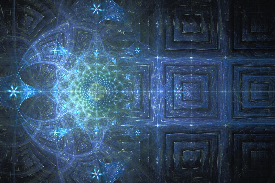

Published: 2010-03-09 01:31:35 +0000 UTC; Views: 534; Favourites: 18; Downloads: 15
Redirect to original
Description
*sigh* I really don't like it. I'm not quite sure what else to say. Does anyone know how to get rid of the faded grains in the upper left hand corner?Entry for *f--l--A--r--k 's (god, that's a pain to type) Apophysis Challenge #19. [link]
Related content


Comments: 12


Let me add two advices to the already valuable help given by Sparky: raise the quality of the render (around 10,000-20,000 depending on how smooth of an effect you want to get) and, most importantly, use a very low gamma threshold! I usually put a value between 0.002 and 0.0025 there, while the default is 0.01. I noticed it helps a huge lot in getting rid of the black spaces. And, play with xaos too. Try many variants on all transforms.
Now let's get to the fractal: I love it! It has a swirly, galactic-like feeling. The only thing is, maybe gaussian blur would have been better than the regular blur. Your choice, anyhow, I just don't like the circle that much, but it's a matter of aestethics.
👍: 0 ⏩: 1

Lol, thanks so much for the advice. I'll rerender it and see what I get!  - :D")
 (Wink) - ;)")
👍: 0 ⏩: 1
Yep, I was suggesting you to smooth it more, not to remove the blur completely
Hope the suggestions will do well!
👍: 0 ⏩: 1
Well I tried the gaussin blur and really didn't like it all that much but I rerendered it and now I think the grains are pretty much gone. Thanks!
👍: 0 ⏩: 1
Yes, it looks a lot nicer! Colors are more bright and vivid too. Good job
👍: 0 ⏩: 1
Yea, I was really pleased when I increased the saturation. I like the blue-ish ghostly glow it has now. Thank you!
👍: 0 ⏩: 0

Oh I forgot to add it looks pretty good to me I like the wispy look that you captured in much of the fractal.
👍: 0 ⏩: 1
Lol, I barely used and blur for that too. I was surprised by how much blur effect I could get by just moving the transforms around. I really havn't had much practice with curl yet so this was a good learning experience.
👍: 0 ⏩: 0
What did you render it at?
Few things you can try in the future.
Post process editing should be check marked when you render.
1.Raising your contrast up
2.lowering gamma
sometimes raising the gamma can help with bright spots on the other hand
3.lowering your brightness can help alot with this.
4.Also increasing the filter radius from .06 up to 1-2 depending on the fractal this will cause slight blurring at 2 so you may want to pick a happy medium of all of these. This setting also increases the length of time it takes to adjust any setting changes so always change it last.
👍: 0 ⏩: 1
Alright, thanks Craig. I'll try those out. I really appreciate the advice!
👍: 0 ⏩: 0