HOME | DD
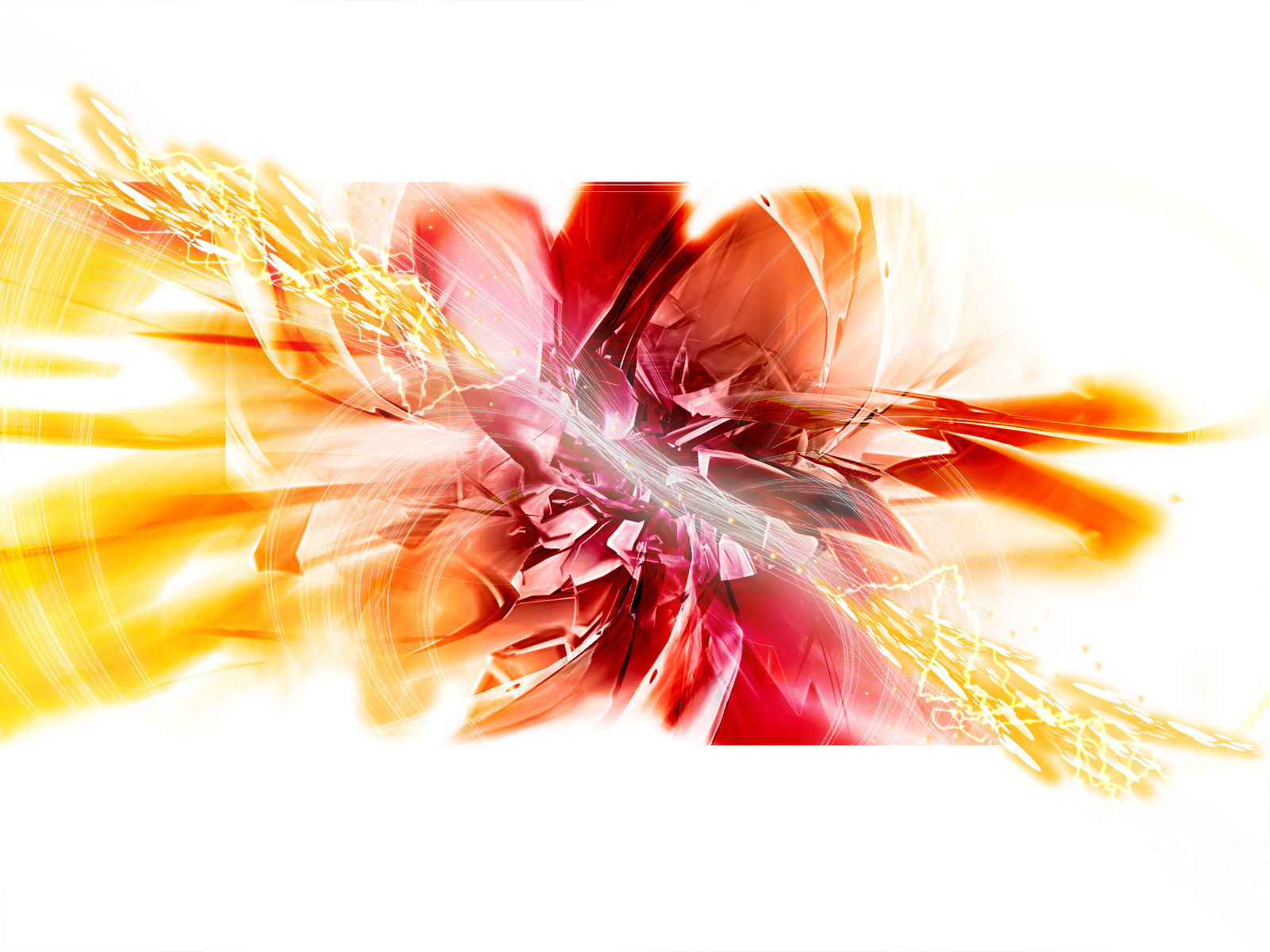
 iceworx — Magnetic Center
Published: 2006-03-22 05:45:58 +0000 UTC; Views: 2412; Favourites: 26; Downloads: 669
Redirect to original
Description
3DSMax + Photoshop + BryceI think I used just about every render I've made in the last 2-3 months on this one... and some of the colors are different for me. Hope ya like
 (Smile)")
Related content


Comments: 16

I just totally love this because it's more open and white from the others... It's just amazing! BTW, do you work in a company or so? I mean, why do you make these and spend so much time making renders and these wallpapers, just to upload them on dA? Take care!
👍: 0 ⏩: 1

No I'm not a professional, I just really enjoy creating things like this
improve my skills 
👍: 0 ⏩: 1
Well, you ought to be a professional... Haven't you ever thought about it? 
")
👍: 0 ⏩: 1

I've told him that forever. Ice man... still think that you should be doing this professionally. Hope all's well.
~jim
👍: 0 ⏩: 0

i love the 3d render and the colors alot, the colors seriously are well done, cause it basically compliments your rendering and the swirls add a nice touch~ the abstracted feel at the background is real sweet... the fact the colors are warm, makes this whole piece a well balanced piece~ XD
👍: 0 ⏩: 0


the colors are superb 
👍: 0 ⏩: 0

Just got into your work and I've looked at a lot of the renderings, but I like the color scheme of this one exceptionally. Lighter colors are nice from time to time, and for some reason it just works well on this one.
Or, well, at least that's my opinion.
👍: 0 ⏩: 1
I agree. Take a look at the original, which I submitted to my scraps [link] the lighter version IS much better
👍: 0 ⏩: 0

itlooks, energetic, hope that makes sense.
it seems almost like an electrical enery surge...that may just be due to the fact that I am still carrying a charge and so electricity is on my brain though.....
👍: 0 ⏩: 0


Beautiful piece! Not too bright, and i love the parts that "burst" out of the frame!
👍: 0 ⏩: 0


great work!
👍: 0 ⏩: 0
