HOME | DD
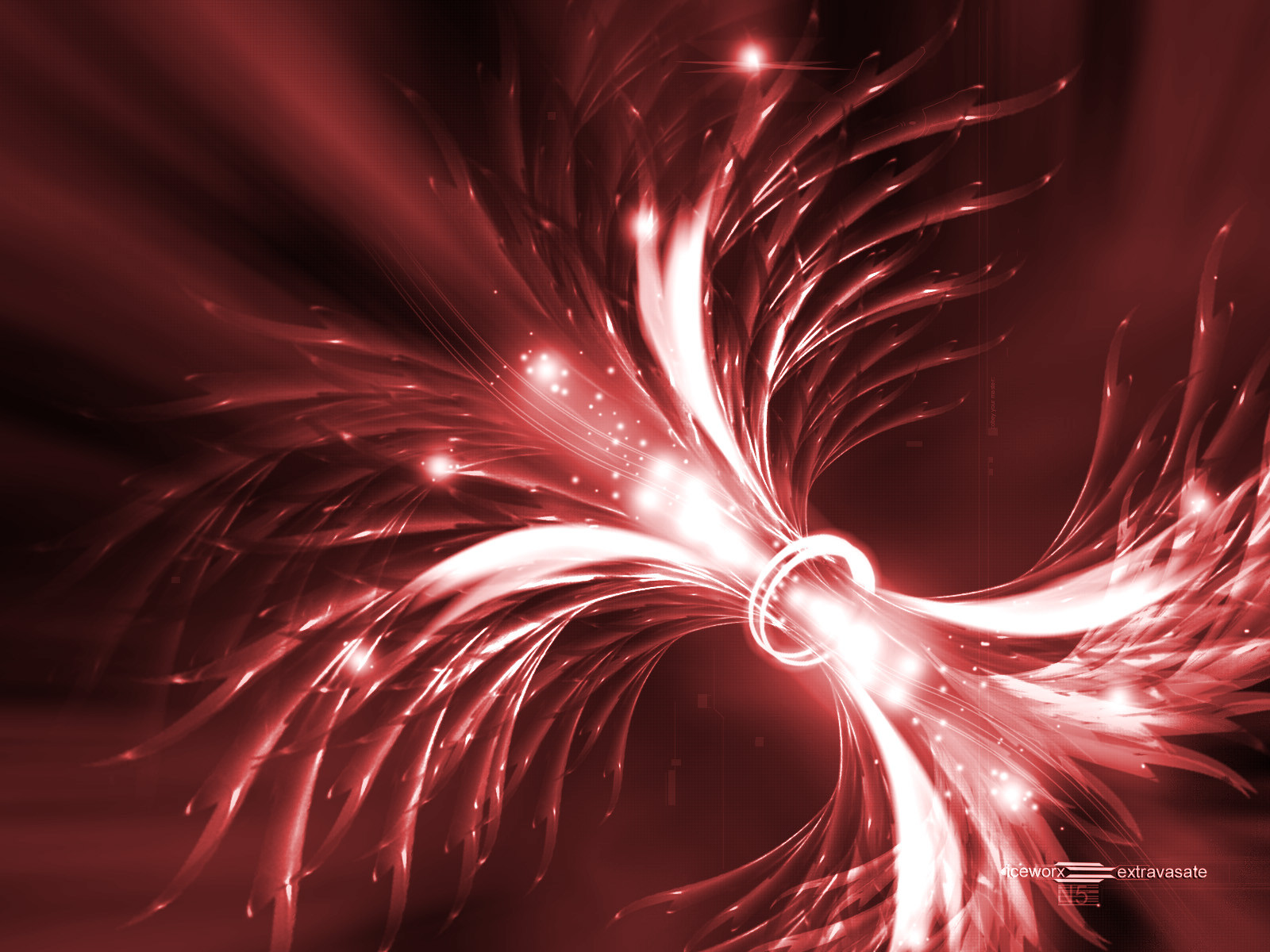
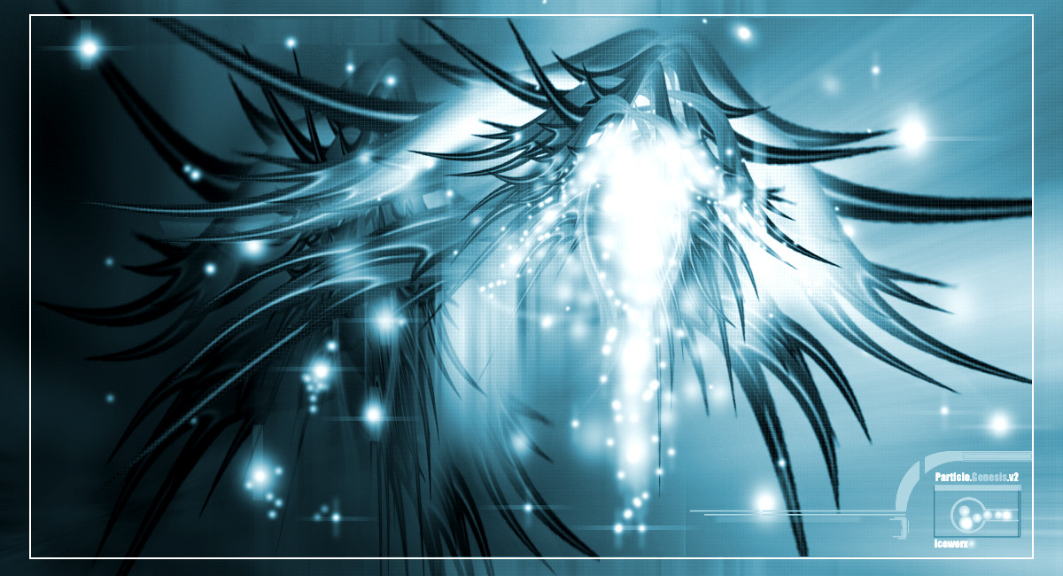
 iceworx — extravasate v1
Published: 2003-04-11 06:46:00 +0000 UTC; Views: 3373; Favourites: 21; Downloads: 1766
Redirect to original
Description
This one started off with the intention of using some brushes made by *trigness ..... sorry Court, I didn't see a way to make them fit. They do kickass, I've already got another one started using some of 'emAnyway, made completely with Photoshop 7, mass quantities of caffeine and Metallica's ..And Justice for All cd.
The zip file has got a bunch of color variations... check em out
Related content


Comments: 28

= photoshopz masta. he's like "OMFG PHOTOSHOP WTF ARE YOU DOING!?" and photoshop goes "WhaTevaz You Say, Seckay BiaTch" and he's like "daaamn straight!"
lol yea I know im weird... but if not i'd be sooo boring ^_^
👍: 0 ⏩: 0

its awesome work but IMO it's kinda blurry (: congratulations anyway
👍: 0 ⏩: 0


:iconfavorites:
This is just awesome! It has great flow like most of your art
Thanx for the perty new wallpaper!
-
👍: 0 ⏩: 0


SIMPLY AWESOME ! the composition and colors... ITS JUZ GREAT ! i love this.. and the red is cool. ^_^
👍: 0 ⏩: 0

Bleh
freakass colors dude!
good brushing 2
Its verry vivid!
gj
Tsun
👍: 0 ⏩: 0


That is just amazing man!
Crazy shapes and forms! Awesome work, keep it up.
👍: 0 ⏩: 0


wow..that's sooo pretty reminds me of those lamps with the nylon thing-a-ma-jigs sticking out and glowing lights at every tip
👍: 0 ⏩: 0


damn man! that is just too fuckin sweet! i love it!
great concept and colors, the color just seem to jump out at you.
keep up the good work man, i'm glad to see your submitting stuff again!
👍: 0 ⏩: 0

Uber Photoshop work. I am totally blown away by this! Big ups to you on this! +fav
👍: 0 ⏩: 0

Oh my word...probably one of the most amazing PS works ever...I still don't believe you didn't use a 3D prgm
👍: 0 ⏩: 0

This is great... great color... Pure Photoshop pieces are awesome... and this is one of the best i've seen. Keep up the work man, I'll be watching for even more pieces. +Fav
👍: 0 ⏩: 0

I like this one alot.. it reminds me of an abstract version of those little attack cruisers in Star Wars.. the white ones. Yeah... tired... bye.
👍: 0 ⏩: 0

mmmmm so sweet man
you should scale it down a bit so I can put it on my desktop
1024x768
👍: 0 ⏩: 0

I would have to agree with what the person above said - It does stand out very much.
Wonderful. It almost reminds me of either force fields or of 2 Pulsars next to one another as seen from Nasa telescopic spectrum photographs (I think).
It looks perfect to me.
👍: 0 ⏩: 0

Concept: 10/10
Colour: 10/10
Linework: 6/10
Overall: 9/10
Comment: Very cool! I love the colour in this because I know from experience that it's hard to make red look good and you have done a superb job. You've gotten a big fat 10 for concept because you've created something here that stands out from the scores of abstracts on DeviantART. The linework was marked down ONLY because I thought the highlights on the lines were a bit too harsh. Other than that, this deviation is perfect. Excellent job, you're getting a !
👍: 0 ⏩: 0

Oh yea! love it...
Is this realy just made in PS?!
+fav!
👍: 0 ⏩: 0


You got your creativity back, that's all that matters. This is purely dope.. I love the color and the lighting is awesome. I'd definitely put this on my wall (and yes, I lied.. I thought I was going to bed, but apparently I'm not
)
👍: 0 ⏩: 0

very nicely done! the colors are o so crisp and very vibrent (sp). the spray lights almost seem to feed backwards drawing my attention to the middle ring beautiful work
👍: 0 ⏩: 0
