HOME | DD
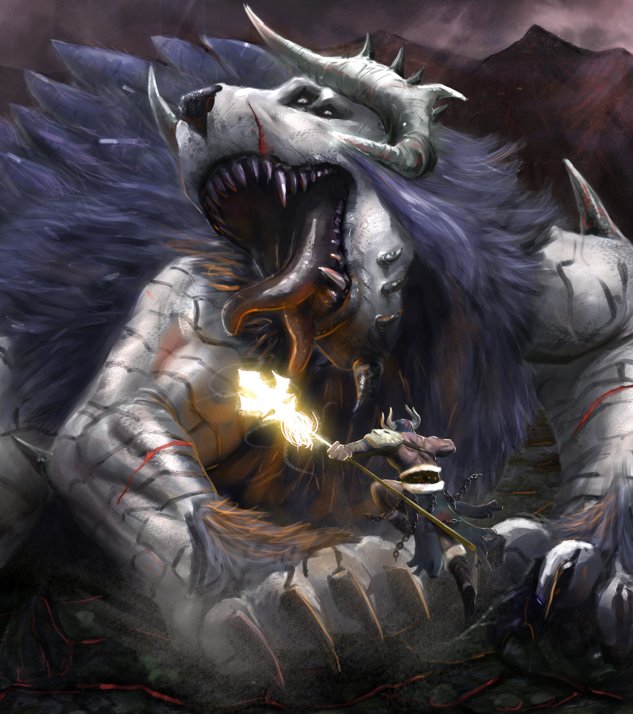
 ImmarArt — Fenrir vs Vidar
Published: 2010-04-07 03:53:02 +0000 UTC; Views: 16076; Favourites: 150; Downloads: 1163
Redirect to original
Description
I entered this in a competition and did not win. The theme was Norse mythology. I want to become a better artist and i need to know what i can improve on. I need your help! please provide explanations as to what i did wrong and what i can do better. once I have read through your suggestions i will add them and submit the new and improved version! thanks in advance!!Related content


Comments: 14

Good interpretation of part of the predicted fight between Vidar and the embodiment of chaos and senseless destruction Fenrir.
Depending on which translation and interpretation of the predicted aftermath of Ragnorak, Vidar's predicted victory enables the rebirth of the Nordic pantheon but of course this is disputed and argued quite a bit. I see it as a metaphor for the temporary fall of wisdom (Odin) at the hands of chaos (Fenrir) only for wisdom to eventually return after chaos is beaten. It all goes along with rebirth after death.
👍: 0 ⏩: 0

i know that i shouldn't say anything about this because i can't even draw one of this Fenrir's claws correctly, but you are lacking some detailes on Fenrir.
1. the wounds on his limbs are a little to cleanly cut and the one on the left(right from Fenrir's perspective) looks like it goes all the way through his bone.
2.his mane and fur are covering a bit too much of the details of his body.
that's everything i can spot that you can improve, but otherwise this is just a minblowing essence of art.
--
Megi Óðinn sjá hættur lífs þíns,
og Þór vernda þig fyrir þeim.
Megi Loki skemma fyrir óvinum þínum,
og Heimdallur verja leiðina heim.
--
Llamas in Pyjamas
👍: 0 ⏩: 0

This is a great work, but it reminds a fight of a hero and a demon instead the ragnarok with Vidar and Fenrir. The wolf has 4 eyes and 2 horns on the head, so it's not like Fenrir, the terrible bringer of the Odin's end.
But it's a great great work! I love it!
(Sorry for my english, i'm an ignorant italian!)
👍: 0 ⏩: 0


the fenrir s position is very strange and for those who dont know how the legend turn on at the end they can think of the most famous part of the lengend the killing of odin by the wolf
draw the result more than "the way to" you know
also the "arm" of the wolf are really human ish maybe a more wolf turn out can be better appreciate
but your style is awesome guys keep up ^^
and sorry for my bad english i m french
👍: 0 ⏩: 0


I'm agree with Mercury80
- The dust cloud isn't needed in my opinion
- Monster body should be a little more detailed
- Probably mountains far away should blend with the smoke and clouds of the air
But I have also to say that you paint so much better than me...so I can't give you grat advices xD
👍: 0 ⏩: 0

Well i kinda have to agree with Kuroijager there are some places that have nice detail and some that don't.
When going to more detail, i have to say the hair, on the beasts arms is the worst and seem kinda random, but the hair in general could use some more work. On the back of the beast, well you could live with it, but i am sure it could be better and would leave overall better feeling to this picture.
The dust cloud i think it is? Well it's kinda needed and then again not, i don't know exactly but something feels not right with it, maybe its the atmosphere and when u see Volcanic stuff u don't expect it to be like a desert when the ground is hit.
The arm wounds on the monster are to me too fake.. The head wound is awesomely done, maybe it has something to do with the darker color a little.
And the background the mountains are they supposed to be far away? or close? As it leaves you with mixed understanding, if its far away, then they are too clearly seen if they are close then not enough detail like on the lower part of the picture.
Well that's all in my opinion, just a note I'm no great artist and surely cant pull this kinda picture off  (Wink)")
 (Smile)")
👍: 0 ⏩: 1

i really appreciate all of the feedback. i agree with all of you so far. i'm already working on these issues!
👍: 0 ⏩: 0

")


I'm not exactly knowledgeable about this sort of stuff and I don't know if its just the effect that you were intending... but I think that the only problem with it is inconsistency. The man looks extremely detailed and draws the eye immediately to that spot but the rest of the painting doesn't share that same level of definition. I don't know just a thought
I think it looks extremely awesome as it is though!!!
👍: 0 ⏩: 0
