HOME | DD
 inde-blokcrew — Surpy logotypes 2nd revision
Published: 2007-03-20 16:53:14 +0000 UTC; Views: 5385; Favourites: 77; Downloads: 122
Redirect to original
Description
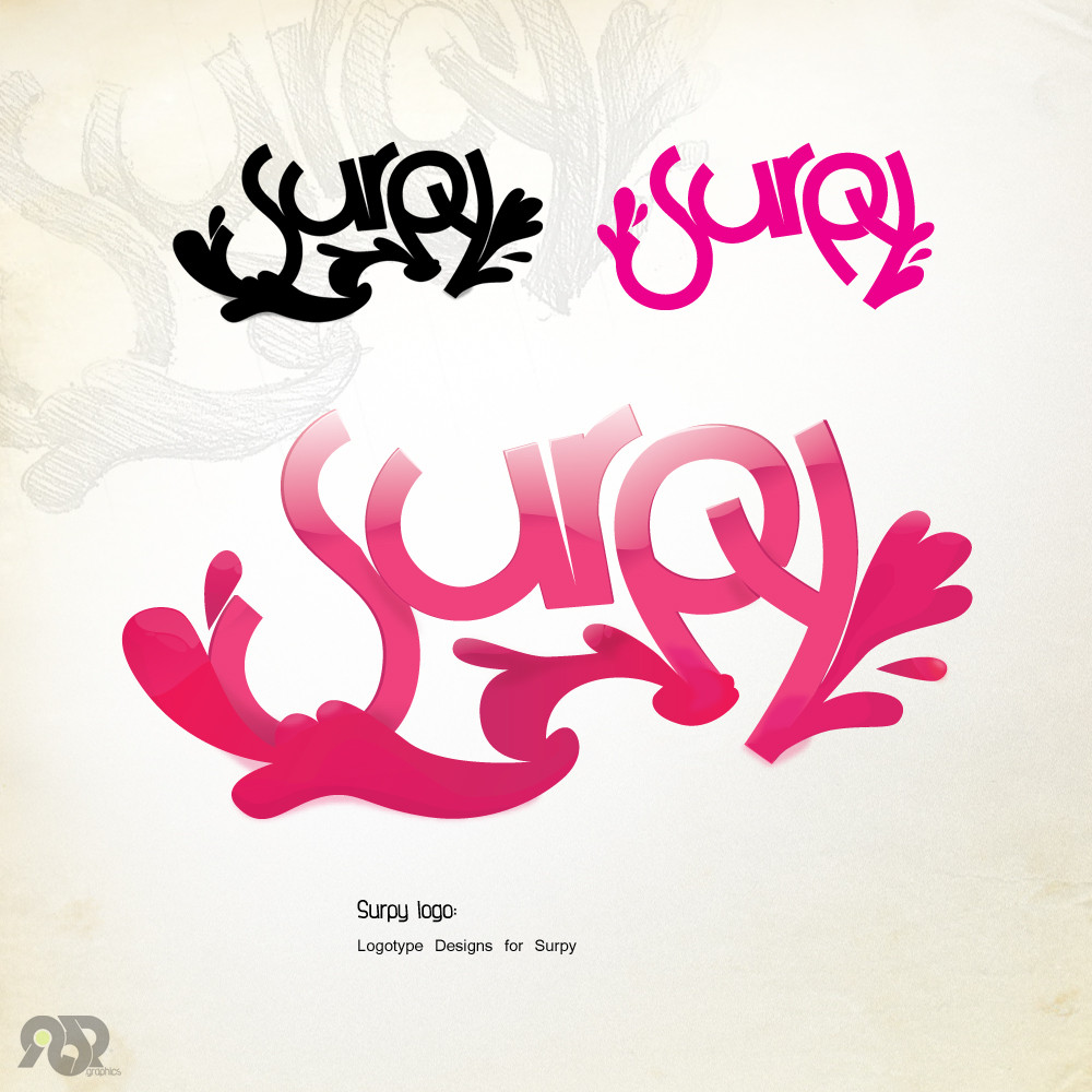
Surpy logotype, i think this matches his style a lot!anyway, sketched before the finalized in illustrator, the preview is how it actually looks, nothing added in ps all the glows and shadows are in illustrator, this is by far my best logo...for now
 (Wink)")
added one more small logo just for fun and made some slight changes to the main logo
client links:
[link]
[link]
Related content


Comments: 134


That's absolutely sweet man! *jealous*
👍: 0 ⏩: 1
")


you know about vectors, thanks man!
👍: 0 ⏩: 0


neat work. fits good with the client-style!
good job on that
👍: 0 ⏩: 1

This is striking sweet 
Keep it up mate

👍: 0 ⏩: 1

Its hot and pretty well matches the artistic style of the client so thats good...In my personal Prefrence i like more urban abstract type logos And this one is a bit too...."funky" or whatnot for my personal tastes but its a great job.Hell,I wish i could use illustrator!
👍: 0 ⏩: 1
thanks man! im happy that you saw that it matches, i though after time that it was in my mind just because i was excited! thanks again!
👍: 0 ⏩: 0

maybe u have some idea to make "ebonita" logo ? ^_^
👍: 0 ⏩: 1
 (Smile)")
👍: 0 ⏩: 0

dude.. simply, you rock.. i love how you make logos that have a strong stand-alone basis form, and how you enhance them so nicely with shadows and so on to give them depth.
👍: 0 ⏩: 1
thanks a lot man! i appreciate it
👍: 0 ⏩: 0

I am a huge fan of this logo!
Fav!!!!!
👍: 0 ⏩: 1

very very nice
all ur work is wow
👍: 0 ⏩: 1

it is prettier in pink than in black but i like it!
👍: 0 ⏩: 1

The second looks cool... nice glass effect.
👍: 0 ⏩: 1


very nice indeed, only thing i really dont like is the break in the S and P, even though it was intentional, people may think it is a screw up. Thats the hardest thing about making intentional flaws...they have to look like you meant it (sorry...hard to explain! lol)
But the colour scheme is nice, and the design itself is great.
few little flaws, the 'y' and the splash is unaligned at the bottom right corner, need to align that properly. and there is something about the bottom of the P that doesnt look right, not sure what it is though, maybe the bottom of the P needs a slight colour difference so you can see the difference between the P and the splash? not sure, keep working at it and im sure you'll win with that design!
👍: 0 ⏩: 1
i didnt want to divide the p from the splash... yes the thing you told about intentional.. is correct, anyway, i think that this logo had enough work on it, id prefer to make a new one if this is not liked by the client and not jiggle with this one anymore, an artist must know where to stop... i really appreciate comments like this one presenting the problems specifically and not randomly
👍: 0 ⏩: 1
yes good point! yes it always helps when people point out things, helps heaps! dont get it much these days though ")
👍: 0 ⏩: 1
well, he favd it... no mail or note from him though yet, hes probably out for today!
👍: 0 ⏩: 2
congrats! you both got what you wanted! :joy:
👍: 0 ⏩: 1

i'm not out!!! i'm Back lol.
Foooking hell man, this is amazing. I was gonna ask if you would be able to design a few more variations, but i like this the way it is. Dont think it'd get much better lol.
Like it a LOT!!!!!!
I'll be basing my new ident around this logo, redesigning my image over the course of the next few weeks.
Thanx again.

👍: 0 ⏩: 1
well as i said this is my best so far! i also think that this cant get better, if i only repair it a bit...
👍: 0 ⏩: 0


XaaaaxAxa re ton siropakia re
Xmmmm
Kaloutsiko to logotypaki pitsiriko kaloutsiko
(kala min varas re ")
👍: 0 ⏩: 1


nia nia nia nia nai mono ego to eida na to ftiahnei live nia nia nia nia nia
👍: 0 ⏩: 1
| Next =>