HOME | DD

inde-blokcrew — Surpy logotypes 2nd revision

Published: 2007-03-20 16:53:14 +0000 UTC; Views: 5385; Favourites: 77; Downloads: 122
Redirect to original
Description 
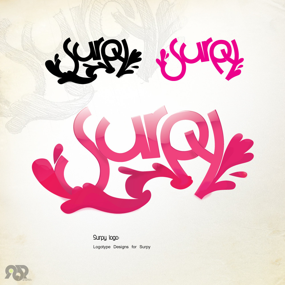
Surpy logotype, i think this matches his style a lot!

anyway, sketched before the finalized in illustrator, the preview is how it actually looks, nothing added in ps all the glows and shadows are in illustrator, this is by far my best logo...for now

added one more small logo just for fun and made some slight changes to the main logo

client links:
[link]
[link]
Related content
Comments: 134

inde-blokcrew In reply to ??? [2007-03-20 23:11:11 +0000 UTC]

👍: 0 ⏩: 0

controlthepixel In reply to ??? [2007-03-20 22:22:22 +0000 UTC]

I dont know what to say about this one.

It's a great logo.

But I don't love it. o.o

👍: 0 ⏩: 1

inde-blokcrew In reply to controlthepixel [2007-03-20 22:41:47 +0000 UTC]

o.0 ....ok

👍: 0 ⏩: 0

SteaM10 In reply to ??? [2007-03-20 22:06:01 +0000 UTC]

I love it

👍: 0 ⏩: 1

inde-blokcrew In reply to SteaM10 [2007-03-20 22:43:45 +0000 UTC]

to diorthosa ligo, tsekare to pali!

👍: 0 ⏩: 1

SteaM10 In reply to inde-blokcrew [2007-03-20 23:02:10 +0000 UTC]

Better alla koita stis oures tou P kai Y exeis kanei smudge katalathos

👍: 0 ⏩: 1

inde-blokcrew In reply to SteaM10 [2007-03-20 23:07:45 +0000 UTC]

... smudge den ginete sto illustrator, einai blur kai epitides

👍: 0 ⏩: 1

SteaM10 In reply to inde-blokcrew [2007-03-21 11:28:52 +0000 UTC]

e einai eleos tote

👍: 0 ⏩: 1

inde-blokcrew In reply to SteaM10 [2007-03-21 20:08:51 +0000 UTC]

ton pairneis, des to kainourgeio...

👍: 0 ⏩: 1

SteaM10 In reply to inde-blokcrew [2007-03-22 00:04:37 +0000 UTC]

Olo kainourio kai kainourio

👍: 0 ⏩: 1

inde-blokcrew In reply to SteaM10 [2007-03-22 00:09:43 +0000 UTC]

!!!

👍: 0 ⏩: 0

Hallaserke In reply to ??? [2007-03-20 19:54:37 +0000 UTC]

i like it!

👍: 0 ⏩: 1

inde-blokcrew In reply to Hallaserke [2007-03-20 22:48:02 +0000 UTC]

me too!

👍: 0 ⏩: 0

MolotovRuss In reply to ??? [2007-03-20 19:45:10 +0000 UTC]

That second one is fantastic!

👍: 0 ⏩: 1

inde-blokcrew In reply to MolotovRuss [2007-03-20 22:49:53 +0000 UTC]

yes the whole point is in the 2nd one! thanks a lot, i heave edited some mistakes in it recheck and tell me please!

👍: 0 ⏩: 1

MolotovRuss In reply to inde-blokcrew [2007-03-21 07:06:45 +0000 UTC]

Oh wow man, really good. It's flat, it's glossy, beautiful colourful, great shapes.

👍: 0 ⏩: 1

inde-blokcrew In reply to MolotovRuss [2007-03-21 20:15:46 +0000 UTC]

thanks

👍: 0 ⏩: 0

Gmarconato In reply to ??? [2007-03-20 19:04:28 +0000 UTC]

Great Work , the color of second logo its nice.

👍: 0 ⏩: 1

inde-blokcrew In reply to Gmarconato [2007-03-20 22:50:20 +0000 UTC]

👍: 0 ⏩: 0

dsmag In reply to ??? [2007-03-20 18:44:15 +0000 UTC]

gr8 logotype

👍: 0 ⏩: 1

inde-blokcrew In reply to dsmag [2007-03-20 22:51:00 +0000 UTC]

thanks man!

👍: 0 ⏩: 0

Chentoolive In reply to ??? [2007-03-20 17:58:09 +0000 UTC]

This is great stuff !! 8)

👍: 0 ⏩: 1

inde-blokcrew In reply to Chentoolive [2007-03-20 22:52:42 +0000 UTC]

👍: 0 ⏩: 0

turjuque In reply to ??? [2007-03-20 17:52:38 +0000 UTC]

👍: 0 ⏩: 1

inde-blokcrew In reply to turjuque [2007-03-20 22:53:07 +0000 UTC]

its better now aint it?

👍: 0 ⏩: 1

turjuque In reply to inde-blokcrew [2007-03-21 10:42:58 +0000 UTC]

yes it is
I especially the glass one

👍: 0 ⏩: 1

inde-blokcrew In reply to turjuque [2007-03-21 20:11:03 +0000 UTC]

👍: 0 ⏩: 0

desanty In reply to ??? [2007-03-20 17:09:00 +0000 UTC]

yeah good logotipe it looks good it those glows

👍: 0 ⏩: 1

inde-blokcrew In reply to desanty [2007-03-20 22:56:10 +0000 UTC]

oh yes i like those glows a lot!

👍: 0 ⏩: 0

jvgce In reply to ??? [2007-03-20 17:01:12 +0000 UTC]

funky and nice.....

👍: 0 ⏩: 1

inde-blokcrew In reply to jvgce [2007-03-20 22:56:27 +0000 UTC]

👍: 0 ⏩: 0

8AndAHalfTales In reply to ??? [2007-03-20 16:58:14 +0000 UTC]

u-u-u-uuuuuuuuuuuuu gamato

👍: 0 ⏩: 1

inde-blokcrew In reply to 8AndAHalfTales [2007-03-20 16:59:40 +0000 UTC]

riding the bamboo...

👍: 0 ⏩: 0


<= Prev |