HOME | DD

inde-blokcrew — Surpy logotypes 2nd revision
Published: 2007-03-20 16:53:14 +0000 UTC; Views: 5385; Favourites: 77; Downloads: 122
Redirect to original
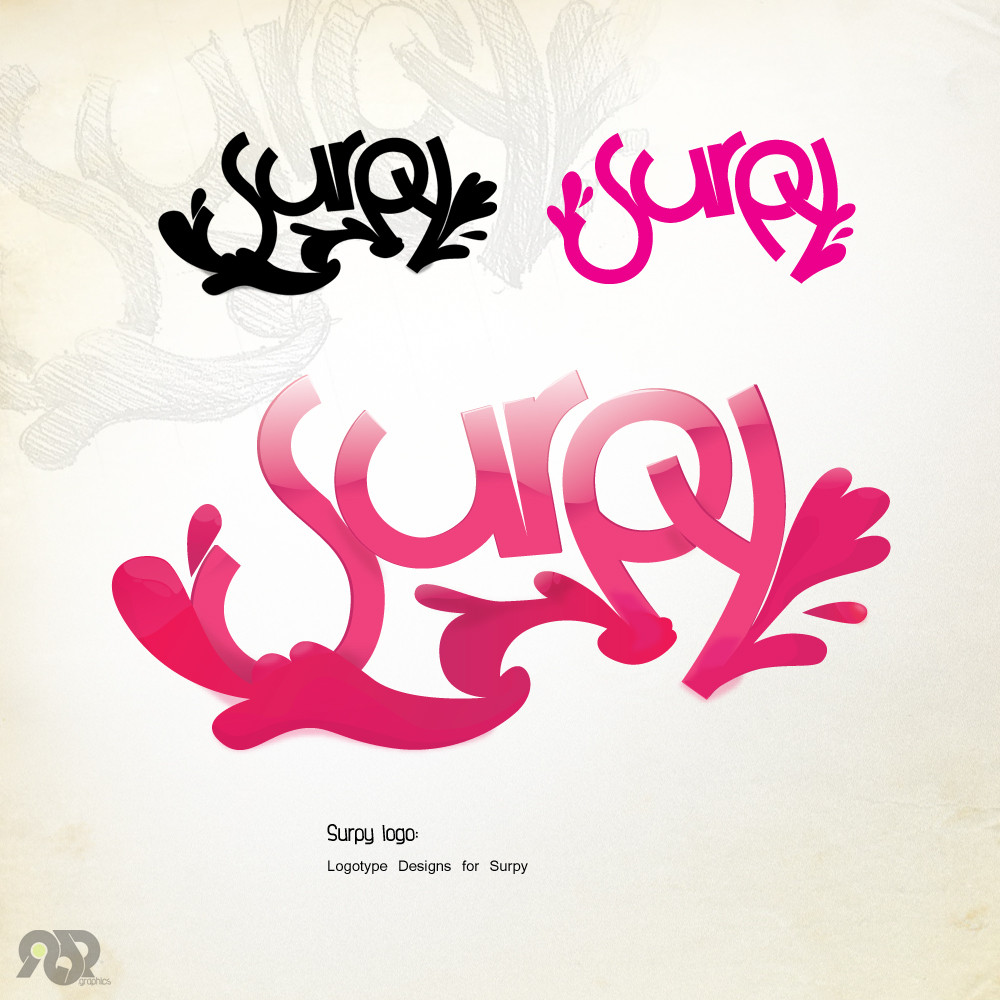
Description Surpy logotype, i think this matches his style a lot!

anyway, sketched before the finalized in illustrator, the preview is how it actually looks, nothing added in ps all the glows and shadows are in illustrator, this is by far my best logo...for now

added one more small logo just for fun and made some slight changes to the main logo

client links:
[link]
[link]
Related content
Comments: 134

muriloVM [2007-05-29 03:20:39 +0000 UTC]

wowww awesome o//!

👍: 0 ⏩: 1

inde-blokcrew In reply to muriloVM [2007-05-29 10:05:50 +0000 UTC]

thanks

👍: 0 ⏩: 0

Hibi--chan [2007-04-17 09:40:17 +0000 UTC]

great logo
i love the effect you did on bottom one

👍: 0 ⏩: 1

inde-blokcrew In reply to Hibi--chan [2007-04-17 15:44:51 +0000 UTC]

thanks man!

👍: 0 ⏩: 1

Hibi--chan In reply to inde-blokcrew [2007-04-18 07:43:45 +0000 UTC]

woman indeed

👍: 0 ⏩: 1

inde-blokcrew In reply to Hibi--chan [2007-04-18 20:42:00 +0000 UTC]

....ok then ... thanks woman!

👍: 0 ⏩: 1

Hibi--chan In reply to inde-blokcrew [2007-04-20 16:25:57 +0000 UTC]

👍: 0 ⏩: 0

K1L-3M-AL [2007-04-17 00:33:41 +0000 UTC]

great work... I love how your showed your development!

👍: 0 ⏩: 1

inde-blokcrew In reply to K1L-3M-AL [2007-04-17 00:39:23 +0000 UTC]

thanks man, well it had to be remade

👍: 0 ⏩: 0

K1L-3M-AL [2007-04-17 00:33:40 +0000 UTC]

great work... I love how your showed your development!

👍: 0 ⏩: 0

antonia333 [2007-04-13 06:26:53 +0000 UTC]

Great work!

👍: 0 ⏩: 1

inde-blokcrew In reply to antonia333 [2007-04-13 13:06:50 +0000 UTC]

thanks!

👍: 0 ⏩: 0

efilArt [2007-04-11 14:43:45 +0000 UTC]

amazing.

👍: 0 ⏩: 1

inde-blokcrew In reply to efilArt [2007-04-11 18:23:07 +0000 UTC]

thanks!

👍: 0 ⏩: 0

sp00ny [2007-04-09 12:19:59 +0000 UTC]

That is just beautiful.

Really nice job.

👍: 0 ⏩: 1

inde-blokcrew In reply to sp00ny [2007-04-09 21:47:13 +0000 UTC]

thanks i appreciate it

👍: 0 ⏩: 0

root-15 [2007-04-05 20:56:50 +0000 UTC]

awsomee

👍: 0 ⏩: 1

inde-blokcrew In reply to root-15 [2007-04-06 04:56:36 +0000 UTC]

thanks!

👍: 0 ⏩: 0

Merendil [2007-04-04 15:30:35 +0000 UTC]

Great work...

👍: 0 ⏩: 1

inde-blokcrew In reply to Merendil [2007-04-04 20:37:52 +0000 UTC]

👍: 0 ⏩: 0

marmar [2007-04-03 13:22:30 +0000 UTC]

Absolutely cute!

👍: 0 ⏩: 1

inde-blokcrew In reply to marmar [2007-04-03 13:57:28 +0000 UTC]

thanks!

👍: 0 ⏩: 0

mistercreevy [2007-03-30 15:35:10 +0000 UTC]

propa dope!, you got tha skills

👍: 0 ⏩: 1

inde-blokcrew In reply to mistercreevy [2007-03-30 16:16:01 +0000 UTC]

thanks tagger

👍: 0 ⏩: 0

Femontanha [2007-03-30 02:25:22 +0000 UTC]

wow!

👍: 0 ⏩: 1

inde-blokcrew In reply to Femontanha [2007-03-30 02:30:06 +0000 UTC]

👍: 0 ⏩: 0

jtobinj [2007-03-29 19:49:59 +0000 UTC]

Sweet

👍: 0 ⏩: 1

inde-blokcrew In reply to jtobinj [2007-03-29 23:34:58 +0000 UTC]

👍: 0 ⏩: 0

elusive [2007-03-29 18:52:30 +0000 UTC]

too

👍: 0 ⏩: 1

inde-blokcrew In reply to elusive [2007-03-29 23:35:45 +0000 UTC]

👍: 0 ⏩: 0

elusive [2007-03-29 18:52:19 +0000 UTC]

Looks great. How do you make the bending shine on it? With a path or something? haha

I usually don't have wavy shine is why I ask.

👍: 0 ⏩: 1

inde-blokcrew In reply to elusive [2007-03-29 23:37:05 +0000 UTC]

well it is really complex... i take the gradients and make them end on the letter colour... then have some blurs on them and small glows here and there... just imagined a sirup splat when making it

👍: 0 ⏩: 1

elusive In reply to inde-blokcrew [2007-03-30 12:57:28 +0000 UTC]

Looks great

👍: 0 ⏩: 0

knorke [2007-03-29 11:05:19 +0000 UTC]

Wow. Great work... I like the shiny effects on the final version. Good job!

👍: 0 ⏩: 1

inde-blokcrew In reply to knorke [2007-03-29 15:48:18 +0000 UTC]

thanks a lot!

👍: 0 ⏩: 0

Bloomy021 [2007-03-29 10:44:03 +0000 UTC]

Very nice !!

👍: 0 ⏩: 1

inde-blokcrew In reply to Bloomy021 [2007-03-29 15:51:39 +0000 UTC]

thanks !!!

👍: 0 ⏩: 0

niponwar [2007-03-29 02:47:37 +0000 UTC]

impressed... very nice good gpaphics!

👍: 0 ⏩: 1

inde-blokcrew In reply to niponwar [2007-03-29 15:59:58 +0000 UTC]

thanks!!

👍: 0 ⏩: 0

juggernautical [2007-03-29 01:04:01 +0000 UTC]

beautiful work on the shiny finish! that effect is what i'm learning in one of my uni courses right now, you've inspired me to have another crack at the gradient mesh tool! lol!
great work!

👍: 0 ⏩: 1

inde-blokcrew In reply to juggernautical [2007-03-29 16:01:27 +0000 UTC]

well... its not mesh tool its something ive been working on for some time, all custom glows gradients and gaussian blurs mesh tool is good enough but i dont like it

👍: 0 ⏩: 0

F0XXX [2007-03-29 00:37:58 +0000 UTC]

Looks very nice and it does fit the style nicely as well.

👍: 0 ⏩: 1

inde-blokcrew In reply to F0XXX [2007-03-29 16:03:33 +0000 UTC]

thanks well it came out when i saw surpys gallery! sketched right away! and here it is!

👍: 0 ⏩: 0

kailor [2007-03-28 23:33:01 +0000 UTC]

It is perfect. Congratulations for the idea and the colors.

👍: 0 ⏩: 1

inde-blokcrew In reply to kailor [2007-03-28 23:38:45 +0000 UTC]

thanks a lot!

👍: 0 ⏩: 1

kailor In reply to inde-blokcrew [2007-03-28 23:43:16 +0000 UTC]

welcome

👍: 0 ⏩: 0

zLk [2007-03-28 21:56:17 +0000 UTC]

Freakin' nice!
Awesome job my friend!
goes to right now.

👍: 0 ⏩: 1

inde-blokcrew In reply to zLk [2007-03-28 22:19:00 +0000 UTC]

thanks a bunch!

👍: 0 ⏩: 0

denghao [2007-03-28 21:41:34 +0000 UTC]

perfect reflection

👍: 0 ⏩: 1

inde-blokcrew In reply to denghao [2007-03-28 22:19:30 +0000 UTC]

thanks! worked a lot to accomplish!

👍: 0 ⏩: 0


| Next =>