HOME | DD
 infinitussollux — A valid deviation title

Published: 2006-01-21 11:38:34 +0000 UTC; Views: 82; Favourites: 4; Downloads: 12
Redirect to original
Description
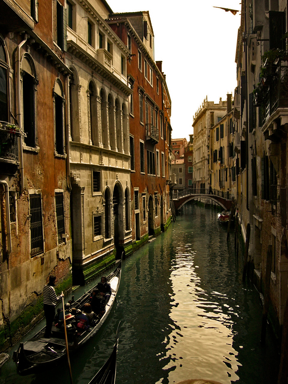
I get a kick out of the categories..I'm putting this under horro & macabre.. Well, I've been thinking about printing some postcards, what do u think of this one? I think I should get rid of that label on the left.. I like the concept, its a department, like a state, and its called La Libertad, Liberty..and its right in the Pacific Ocean..I want to work the concept/phrase in, should I change it? what should I add? tips?Related content


Comments: 16

this is gorgeous but i'd definately suggest getting rid of the title on the side and just giving it a clean white frame...but it's a beautiful shot nontheless.
👍: 0 ⏩: 1

thanks, what do u think would be best, a thick or thin frame?
👍: 0 ⏩: 1
hm, i think...not too thin but not too thick either...haha that sounds very vague...but something like...modest-sized. perhaps? or was what i just said completely useless
 (Wink)")
👍: 0 ⏩: 1
no sense at all! how about I add a white frame and I'll let you know, see if you like it..
👍: 0 ⏩: 1


vergon, y tripias un borde si la hago postal?
👍: 0 ⏩: 0
que tripias..le dejo el 'label' a la izquierda o q muera?
👍: 0 ⏩: 0

Yeah the border on the left is really screwing up this wonderful pic... This shot is just perfect! Very nice cap!
 (Smile)")
👍: 0 ⏩: 1
Thank you.. but hey for a postcard, what would you suggest, just the photo, or a border? or something else?
👍: 0 ⏩: 1
Maybe just a white border..? Simple and pure...like the pic

👍: 0 ⏩: 1
like your avatar? haha, seems like you really like those white borders! I'll give it a try..
👍: 0 ⏩: 1
Yeah like my avatar ")

👍: 0 ⏩: 1
yep, you're avatar does look good, with that frame..
👍: 0 ⏩: 1