HOME | DD
 informer — CodeSIGN - WEB-V1

Published: 2004-09-24 08:16:35 +0000 UTC; Views: 26487; Favourites: 141; Downloads: 7739
Redirect to original
Description
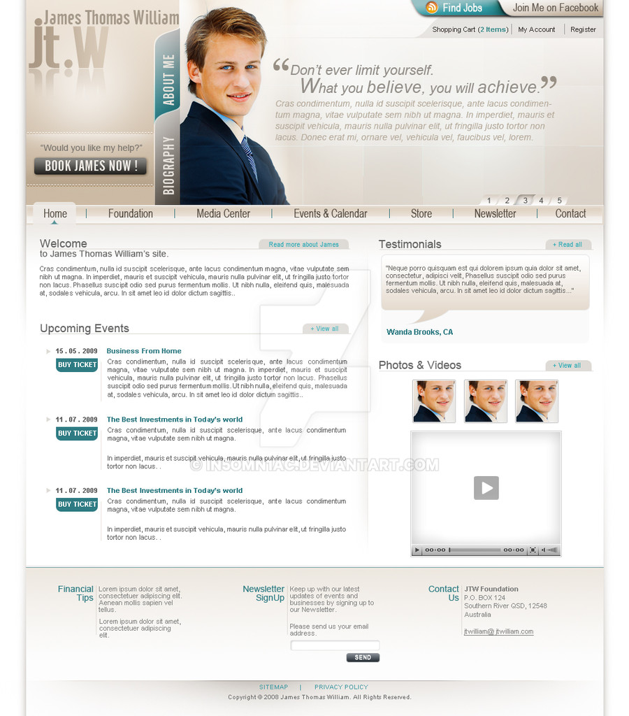
Just an experiment design. Bit Windows based and classic design.Related content


Comments: 52


i love it, great job. wish i could make designs like this
👍: 0 ⏩: 0

Good layout
Fantastic idea
I am really loving how u have managed with minimal colors
👍: 0 ⏩: 0


very creative design... do you mind if i try a similar style for my own webpage?? 
👍: 0 ⏩: 1

Dear friend thank you so much for admiring my design and its much appreciated. Brother, this site is actually designed for the company I'm starting up and I just wanted this to be unique. I wouldn't mind u designing a similar page but make sure that u don't do the extact design. haha ok. Kewl.
👍: 0 ⏩: 1
thanks bro. no worries, i shall make it look quite different (color scheme and face)
you can keep a track of it here >> [link]
i would appreciate comments as well
 (Wink)")
👍: 0 ⏩: 0

")
Thank you so much dear friend. much appreciated for spending ur time on commenting.
👍: 0 ⏩: 0


amazing design. very eye-appealing... good job, that must be my favourite coming from you.

👍: 0 ⏩: 1

so conceptual.so different...just loathe it!wow....u a winner dinesh!

👍: 0 ⏩: 1
Letr me check it. Thanks buddy.
👍: 0 ⏩: 1

No problem. I always hate when I find typos in my work.
👍: 0 ⏩: 0

AWESOME work =O really.. good work, ill try to make a web site inspired on that layout but all flashy and kewl eye candy animations
Maybe after my exams x_x
 (Smile)")
👍: 0 ⏩: 1
Oh Thank you so much for admiring it.
👍: 0 ⏩: 0

excellent design, clean and cutting layout.
the only negative thing is that the small fonts
look slightly blurred but that might be the jpg
compression. Still, I'd consider a nice pixel
font, FFF harmony could possibly fit in quite
well I think...just a suggestion.
The rest is very cool.

👍: 0 ⏩: 1
Thanks so much for spending
your valuable time on commenting
and for your support. Much appriciated and
yes the fonts are too small that that is
an requirement from my team members
who are going to be part of my company.
By the way your avator is cool man and is
it possible for you to design a good animated avatar
for me. please.
👍: 0 ⏩: 1
hey, thanks for commenting on my avatar,
I'll make design for you when I got some time
and then send you the link in a note, ok ?
what I wanted to say about the small fonts :
the small fonts are fine, I like small fonts as well,
but have you tried using a pixel font instead a ttf ?
you can use them in 8 points or even smaller and
they will appear crystal-clear because they don't
get anti-aliased...this way you could read it all
even better...just a suggestion.
👍: 0 ⏩: 0

very cool, excellent colors and great interface. Good Work
👍: 0 ⏩: 0

Cool, I kinda like it... Feels like it should be very heavy to download though...
👍: 0 ⏩: 2
Yeh it is a PNG Format. Thanks so much for liking it.
👍: 0 ⏩: 0
Yeh it is a PNG Format. Thanks so much for liking it.
👍: 0 ⏩: 0

EXCELLENT WORK. Very clean..and awesome layout! Congrats!
👍: 0 ⏩: 2
Thanks so much man. Sorry for replying you late.
👍: 0 ⏩: 0

wow... it seems like a full experience visually speaking, the design looks clean, and minimal....
Great design
👍: 0 ⏩: 1
Thanks so much. Just brought out my ideas and thats all.
👍: 0 ⏩: 0

I'm'n love. For the interface, not the guy, co'mon.
Clean and beautifull.
- I can't read, the text is too small. Is it flash ? Could the font be bigger ? Does it fit in 800x600 ?
- Is it a website or a intranet ? I think it is perfect for intranets. Does it is on the web already ? Wich address ?
congratulations, you've did a really nice work !
👍: 0 ⏩: 1
Thanks so much for admiring and falling in-love with my interface. Really happy about it. Actually it is not complete Flash Development. The Interface is created using Pure HTML and Photoshop which will be converted to .Net platform very soon.
And also it is not an intranet application and when it is a intranet application, actually so much of designs are not implimented. This type of designs are done for websites as far as I know. May be some companies use these type of intranet application.
It is a style of applyin small font size and this is going to be my official website to my company CodeSign. Thank you so much for admiring my design. Much Appriciated.
👍: 0 ⏩: 0


Yes, I like it! ")
👍: 0 ⏩: 1

this is excellent, very professional and well layed out. wonderful peice man. keep it up! that grid is excellent btw
👍: 0 ⏩: 1
thank you very much and everyone liked the grid a lot and man I'm going to make use of it.
👍: 0 ⏩: 0

Very sleek, creative layout and great choice of colors! Absolutely love the grid design you integrated as well...
Btw, is that photo a stock or what? If it is I'd really like to know where you got it

👍: 0 ⏩: 1
Thanks so much buddy and I'm very proud now sayin that I'm getting a clear picture and where I actually stand in UI designing. I got the images from masterfile.com. The Best.
👍: 0 ⏩: 0

This is really nice. The grid layout and dynamic menu are excellent.
👍: 0 ⏩: 1
Thanks so much buddy and I'm very proud now sayin that I'm getting a clear picture and where I actually stand in UI designing.
👍: 0 ⏩: 0

That is so clean! Everything very well placed and good colours... Flawless.
👍: 0 ⏩: 1
| Next =>