HOME | DD
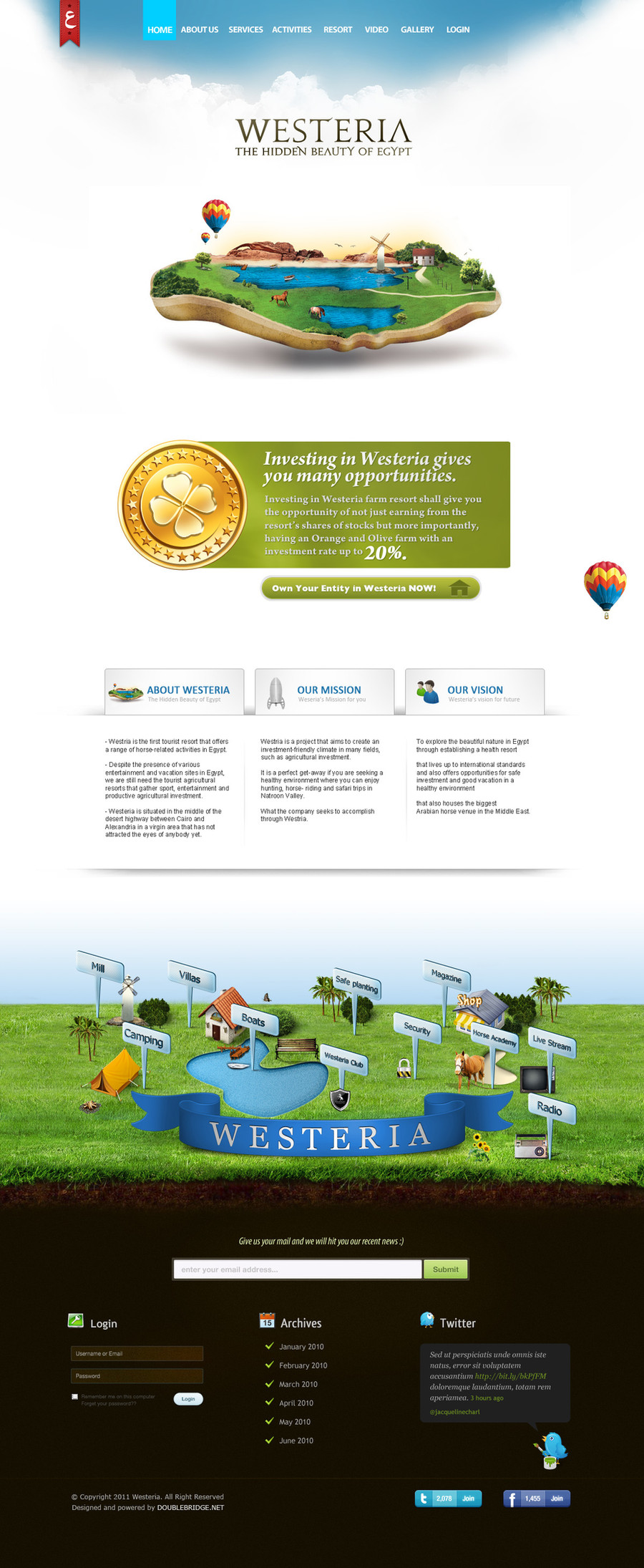
 z-design — XeonGradient XGR

Published: 2008-08-27 07:33:48 +0000 UTC; Views: 32620; Favourites: 109; Downloads: 1544
Redirect to original
Description
This is actually a major revision of a design I did last year, only I never posted it because I wasn't fully satisfied with it. It just didn't look right.So in the past few days, I pretty much redid the entire thing.
Here is the old design in my scraps: [link]
*This is just a template design. Xeon Gradient is not a real company or client. All of the text on the design is a placeholder for real content in the event the layout is bought. The logos under "OUR AFFILIATES" are designed by me as placeholder logos. I actually like the way they turned out...
**This layout IS for sale. Contact zane@zanimation.com for more details.
Special thanks to for the clouds in the header. Be sure to check out his gallery.
Other photos used on the site were obtained and paid for from stockxpert.com and istockphoto.com
EDIT 3/16/09: Revised!!!
Related content


Comments: 15

this is frickin orgasmic !!!
can you post the links to the pictures please?
especially the Background Picture
👍: 0 ⏩: 0

This is awesome! I like it a lot! To me it's simple yet technical
👍: 0 ⏩: 0

Awesome design! I love the colors and the pictures at the top!
👍: 0 ⏩: 0
very nice work. I'm just starting out in Webdesign, so it's works like this that inspire me to do better. What programs (if anything out of the ordinary) did you use? I'll critique this a little more when i find the time (yay finals week!). Great job, +watch.
👍: 0 ⏩: 0


Fresh header with saturated colors. Got a nice friendly feel to it.
You might want to play around with the alignment so that the horizont in the header images aligns with the background image. Would create some symmetry.
Also, is the white line between the two images transparent by design or by mistake? Think I would prefer to have it white like the rest of the white border.
You might want to horizontal adjust this line as well to have it align with the sidebar further down on the page. Once again, symmetry.
The logo area would need a bit of attention as the contrast is too low. The gray "Xeon" blends in with the background and the blue glowing "Gradient" looks a bit fuzzy due to the glow. If possible I would adjust the color of the text (brighter) and remove the glow. If you can't adjust the logo (as it often happens in the real world) then I would burn the background right behind the logo in order to make that part darker and thus increase the contrast. A third option could be to play around with a drop-shadow, much like you did with the upper part of the logo.
I would remove the glow around the first content area as it makes it unsharp and fuzzy, or at least add a 1px stroke before the glow.
DeFined04 already mentioned the lack of contrast in "WHO WE ARE".
I find that the three shadows above each look a bit strange, but that maybe that is just me. I would try with either one shadow or none.
Overall the design need some typographic love. Tiny, non-aliased text was maybe OK 5 years ago but hardly anymore. Small increases in font-size and leading make a huge difference in readability and usability, well worth the increase in vertical space.
Consistent use of company name. In the logo you have "Xeon Gradient", at the bottom of the blue area "XEON GRADIENT" and in the footer "XeonGradient".
Puh! Sorry for the long post and I hope you don't hate me too much. Just trying to give ya some constructive criticism.
Overall, the design has potential and with some polish it would be even better.
BTW There is a great article about web design polish over at PSDTUTS - [link]
👍: 0 ⏩: 2

Just did a revision of the whole thing, let me know your thoughts.
👍: 0 ⏩: 0
Wow thanks for that. I love constructive criticism and that link you gave me taught me some new stuff.
")
👍: 0 ⏩: 0

 (Smile)")

Who we are is a little hard to see. Other than that pretty good.
👍: 0 ⏩: 0


Cool, I like the ocean background. Also like the look of everything
Good Job.
")
👍: 0 ⏩: 0